In order to get to the Cart settings block, you need to go to Customizer → Theme Settings → Cart.
Settings
General
Cart type – the setting is responsible for the type of cart. It has several values: drawer, page;
Show product vendor – the setting is responsible for showing/hiding the product vendor;
Show cart discounts – the setting is responsible for showing/hiding cart discount form;
Show cart notes – the setting is responsible for showing/hiding cart notes;
Show tax and shipping message – the setting is responsible for showing/hiding the tax and shipping message;
Show dynamic checkout buttons – the setting is responsible for showing/hiding dynamic checkout buttons;
Show payment types – the setting is responsible for showing/hiding payment types;
Show shipping rates calculator – enable the shipping rates calculator in the cart drawer and cart page. if you have multiple currencies in your store – disable this feature. The shipping calculator does not support the store with multiple currencies;
Show compare-at-price in Cart – the option allows you to display compare-at-price in Cart.
Checkout button label – label for the Checkout button;
Terms and conditions text – the setting allows you to specify the Terms and Conditions text.
Cart notification
Show cart notification – the setting is responsible for showing/hiding the popup when adding to the cart.
Empty cart
Empty cart heading – message displayed when the cart is empty;
Show continue shopping link – the setting is responsible for showing/hiding the link;
Empty cart link text – link text displayed when the page is empty;
Empty cart link URL – URL of the link displayed when the page is empty (/collections/all – default).
Minimum order amount
Enable – enable minimum order amount block;
Goal amount – subtotal that allows the client to go to checkout;
Goal message – message to show the client if he is not eligible to go to checkout;
Goal is reached message – message to show client if he is eligible to go to checkout;
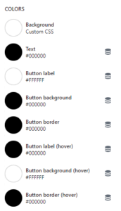
Text color – message to show client if he is not eligible to go to checkout color;
Reached goal text color – message to show client if he is eligible to go to checkout color.
Disclaimer: This feature only makes the checkout button disabled, the user still can go to checkout with a direct link.
Product
General
Product
This settings block is intended for general Product settings on the site.
In order to get to the Product settings block, you need to go to Customizer → Theme Settings → Product.
Settings
Default product image – this image will be used when the product has no image;
Enable labels – setting is responsible for whether labels will be shown on the product card. In order for the label to be displayed, a tag must be added to the product, for example, label__new the base label that will display NEW with the base color. To change the type of a label, you need to add a :type such as label__new:primary or label__new:secondary. The number of displayed labels is limited to 3, as well as a soldoutlabel in case the product is not available;
For each type of label, there are color settings. This way you can change the color of the label text: primary, secondary, base, soldout;
The background is specified for each label;
Background transparency is specified for each label using a range step range of 10%. The minimum value is 10% and the maximum is 100%.
Swatches
Enable color swatches – the setting is responsible for whether color swatches will be displayed on the product card. By default, Shopify swatches will be used. Learn more about setup swatches for product options – https://help.shopify.com/en/manual/products/details/product-category . If Shopify swatches are not added, then theme swatches will work. Color swatches depend on the Color option. If the name of the color is split, then the last word is taken and substituted into the CSS palette. There is a chance that this color will not be in the CSS palette, then it will just be a white swatch. In this case, you must add an image to Shopify files of 50*50 px size in .png format with swatch- prefix. For example, the image name for banana-yellow would be swatch-banana-yellow.png; Video guide: Color swatches setting.
Swatch option – the setting is intended for stores that have a different option for color swatches than color. For example, a user has a purely German store, whose color option is called – Farbe, thus the user will need to specify a name for this setting. The default value is Color. NOTE: This setting works only for the theme swatches, not for the Shopify swatches.
Product card
General
Product card
This block of settings is intended for general Product card settings on the site.
In order to get to the Product card settings block, you need to go to Customizer→Theme Settings→Product card.
Settings
General
Show vendor – the setting is responsible for whether the vendor of the product will be shown;
Enable quick view – the setting is responsible for whether the quick view will be enabled. Otherwise, the user will need to go to the product to see other options and add to the cart; Video guide: How to set up the Quick view.
Buttons type – a type of quick view / add to cart button (icon or text);
Show currency code – the setting is responsible for whether the currency code will be shown;
Show borders – the setting is responsible for whether borders will be added to the card;
Border color – card border-color;
Border color (hover) – card border color on hover;
Object fit image – the setting is responsible for stretching the image. If Cover(default) is selected – the image will take all the space available for it, that is, it will stretch as much as possible, and if Contain – it will retain its proportions;
Image width – the setting is responsible for the width of the block. If Cropped(default) is selected – the block will be limited, and if Full width – the block will be stretched across the entire width of the product card;
Quick view background – adds a background for the Quick view button on the Desktop. Works if Image width is set to – full width;
Text color – product card text color.
Image
Enable image change on hover – the setting is responsible for whether the second image will be shown on hover. To add an image, you need to add the product_card.hover_imagemetafield, where product_card are the namespace and hover_image the field name. The Content type must be file, where you can allow both images and videos. Video guide: How to set up hover image.
If color swatches are disabled, then you need to add this field only to the product;
If color swatches are enabled, you must also add this field to the variant;
If color swatches are enabled and other options are present, for example, size, material, etc., then you need to add an image only to the first variant of each color.
Text button colors
Label – setting allows you to set the color of the button label;
Background – setting allows you to set the color of the button background color;
Border – setting allows you to set the color of the button border color;
Label (hover) – setting allows you to set the color of the button label on hover;
Background (hover) – setting allows you to set the color of the button background color on hover;
Border (hover) – setting allows you to set the color of the button border color on hover.
Enable labels – setting is responsible for whether labels will be shown on the product card. For the label to be displayed, a tag must be added to the product, for example, label__new the base label that will display NEW with the base color. To change the type of a label, you need to add a :type such as label__new:primary or label__new:secondary. The number of displayed labels is limited to 3, as well as a soldoutlabel in case the product is not available;
For each type of label, there are color settings. This way you can change the color of the label text: primary, secondary, base, soldout;
The background is specified for each label;
Background transparency is specified for each label using the range step range of 10%. The minimum value is 10% and the maximum is 100%.
Swatches
Enable color swatches – the setting is responsible for whether color swatches will be displayed on the product card. Color swatches depend on the Color option. The name of the color is split, and the last word is taken and substituted into the CSS palette. There is a chance that this color will not be in the CSS palette, then it will just be a white swatch. In this case, you need to add an image to Shopify files of 50*50 px size in .png format with swatch- prefix. For example, the image name for banana-yellow would be swatch-banana-yellow.png; Video guide: Color swatches setting.
Swatch option – the setting is intended for stores that have a different option for color swatches than color. For example, a user has a purely German store, whose color option is called – Farbe, thus the user will need to specify a name for this setting. The default value is Color.
For Developers
Used snippets
price.liquid – a snippet that displays price, compare_price, and unit_price. If the card is used as a stub, the default price will be $19.99.
product – the product object from which all information about the price is pulled;
price_class – a string in which you can specify a custom class;
use_variant – setting responsible for what will be taken as a basis. If true, product.selected_or_first_available_variant will be used, if false, product;
currency_code_enabled – setting responsible for whether a currency code will be displayed near the price, for example, USD for dollars;
show_unit_price – setting responsible for whether unit_price will be shown. Used for German shops.
quick-view-image.liquid – a snippet that displays the image.
image – image link.
quick-view-form.liquid – a snippet that displays the form for the submitted product.
product – the product object from which all information is pulled.
JS Event
Quick View opens when an Event with the name – product-card:quick-view:clicked is generated. In this event, handle the product is passed.
Additional information
The remaining settings (texts) are taken from the translations. Quick view:
Add to cart – setting allows you to set the text inside the “Add to cart” button;
Visit product page – the setting allows you to set the text inside the “Visit product page” button;
Close popup – setting allows you to set the text inside the “Close popup” button.
Predictive search
General
Predictive search
This block of settings is intended for general Predictive search settings on the site.
In order to get to the Predictive search settings block, you need to go to Customizer → Theme Settings → Predictive search.
Settings
Enable search by articles – setting allows to include of articles in the search;
Enable search by pages – setting allows to include of pages in the search.
Social media
General
Social media
This block of settings is intended for general settings of Social media on the site.
In order to get to the Social media settings block, you need to go to Customizer → Theme Settings → Social media.
Settings
Social accounts
Twitter – link to the store’s Twitter account;
Facebook – link to the store’s Facebook account;
Pinterest -link to the store’s Pinterest account;
Instagram – link to the store’s Instagram account;
This block of settings is intended for the general settings of the Cart reminder on the site.
In order to get to the Cart reminder settings block, you need to go to Customizer → Theme Settings → Cart reminder.
Settings
Enable – the setting is responsible for enabling/disabling the popup;
Cookie time – the setting is responsible for the period after which the cart reminder popup will be shown. It has several values: 10 minutes, 30 minutes, 1 hour, 8 hours, 1 day;
Display frequency – the setting is responsible for the behavior of the popup. If one time is selected, in this case when interacting with the popup, it will be closed for 24 hours. If the Cookie interval is selected, the value from the Cookie time setting will be taken;
Text – the setting is responsible for the text inside the popup;
Color text – the setting is responsible for the text color;
Color background – the setting is responsible for the popup background.
This block of settings is intended for the general settings of the Newsletter popup on the site.
In order to get to the Newsletter popup settings block, you need to go to Customizer → Theme Settings → Newsletter popup.
Settings
Enable – the setting is responsible for enabling/disabling the popup;
Cookie time – the setting is responsible for the period for which the popup will be hidden when it is closed. Has several values: 1 day, 1 week, 1 month, 3 months, 1 year;
Heading – popup title text field;
Text – text field for text content;
Input placeholder – placeholder for the input;
Button submit label – label for the submit button;
Button close label – label for the close button;
Image desktop – image picker for Desktop;
Image mobile – image picker for Mobile (Desktop – default);
Hide image on mobile – the setting is responsible for showing/hiding the image on mobile;
This block of settings is intended for general settings of the Age check popup on the site.
If the customer closes the popup – the redirect will work.
If the customer clicks on the main button – the popup will close and the customer can use a site.
In order to get to the Age check popup settings block, you need to go to Customizer → Theme Settings → Age check popup.
Settings
Enable – the setting is responsible for enabling/disabling the popup;
Cookie time – the setting is responsible for the period for which the popup will be hidden when it is closed. Has several values: 1 day, 1 week, 1 month, 3 months, 1 year;
Heading – popup title text field;
Text – text field for text content;
Button label – label for the main button;
Button close label – label for the close button;
Redirect link – link for redirect if the customer closes the popup. The “www.google.com” link is used by default ;
Image desktop – image picker for Desktop;
Image mobile – image picker for Mobile (Desktop – default);
Hide image on mobile – the setting is responsible for showing/hiding the image on mobile.
With this section, you can show your customer’s banner at the bottom of the page with some text about your new collections, hot sales, promotions, etc.
For Customers
General
Enable – enable popup;
Cookie time – the setting is responsible for the time until the popup is re-displayed when the user closes it;
Heading – a title of the banner;
Subheading – a subtitle of the banner;
Button label – a text of the button;
Button link – a link to the button;
Image – an image of the banner;
Products – products that will appear in the popup, after clicking on the banner;
Background color – setting allows you to set the background color;
Text color – setting allows you to set text color;
Product – setting allows you to set the product to open quick view on click;
Product description – setting allows you to set product description quick view which opens on click.
Colors
Background– background color of the banner;
Text – a color text of the banner;
Button background – a button background color;
Button text – a button text color;
Button border – a button border color;
Button background (hover) – a button background color on hover;
Button text (hover) – a button text color on hover;
Button border (hover) – a button border color on hover.
Additional information
If the setting “Products” is empty and the setting “Button link” is filled, clicking on the banner will open a link.
If the setting “Products” is not empty, clicking on the banner will open a popup with products.
To show Add gift box button in the above sections, you need to go settings of these sections. In the current Gift wrap product theme settings, you can select the product, text, and icon of the button.
You can select a product to be added to your cart after clicking on Add gift box button. This feature can be useful when you want to allow the buyer to buy additionally, for example, a gift box, a box, etc.
The gift button will appear if the selected Product is available.
In order to get to the Gift wrap product settings block, you need to go to Customizer → Theme Settings → Gift wrap product.
Settings
Product – select a product to be added to your cart after clicking on the “Add gift box” button;
Button label – text of the button;
Button icon – the icon of the button. If not set – icon from theme files will be used.
Breadcrumbs
General
Breadcrumbs
This settings block is intended for general Breadcrumbs settings on the site.
In order to get to the Breadcrumbs settings block, you need to go to Customizer → Theme Settings → Breadcrumbs.
Settings
Show breadcrumbs – the setting is responsible for showing/hiding breadcrumbs.
Seo
General
Seo
This settings block is intended for general Seo settings on the site.
In order to get to the Seo settings block, you need to go to Customizer → Theme Settings → Seo.
Settings
Hide site from search engine – the setting is responsible for hiding pages from indexing by search robots.
Checkout
General
Checkout
This block of settings is intended for general Checkout settings on the site.
In order to get to the Checkout settings block, you need to go to Customizer → Theme Settings → Checkout.
Settings
Banner
Background image – background image for the banner.
Logo
Custom image – picker image that will be displayed as a logo;
Position – logo positioning. Has several values: left, center, and right;
Logo size – choice of logo size. It has several meanings: small, medium, and large.
Main content area
Background image – background image for the main part;
Background color – background color for the main part;
Form fields – input color. It has several meanings: white, transparent.
Order summary
Background image – background image for the block with goods;
Background color – background color for the block with goods.
Typography
Headings – font selection select for headings;
Body – font selection select for plain text.
Colors
Accents – accent color;
Buttons – buttons color;
Errors – errors color.
Checkout settings
Learn more link about the additional settings in the admin panel.
Custom CSS
General
Custom CSS
This block of settings is intended for general Custom CSS settings on the site.
In order to get to the Custom CSS settings block, you need to go to Customizer → Theme Settings → Custom CSS.
Settings
Textarea – a text area where you can add your CSS code for customization.
Additional information
In this block, your CSS will be added at the end of the page, and the same custom CSS block that is in the section settings will be added to the end of the section.
B2B Quantity Rule
General
B2B Quantity Rule
Gain Theme supports B2B selling of a specific minimum quantity of items.
Quantity Increment
The number of items by which the variant can be purchased, if the variant only sells in multiples of a set quantity. This field restrict customers from buying a quantity that’s not in multiples of the quantity increment.
To set quantity rules, you need to set a value of 1 or greater for both Quantity Increment and Minimum Order Quantity. The Maximum Order Quantity field is optional, and can be left blank.
If the values for Quantity Increment, Minimum Order Quantity, and Maximum Order Quantity are all blank for the same row, then the quantity rules for that product variant are removed.
Minimum Order Quantity
The fewest number of items of the variant that a customer can purchase at the same time.
To set quantity rules, you need to set a value of 1 or greater for both Quantity Increment and Minimum Order Quantity.
This is a product page with a default template product.json
This template is used by default for the product page. You don’t need to add anything for this template to be displayed.
You can use the section “Product template” to configure the appearance and additional settings of the page.
Product (Pre-order)
Pages
Product (Pre-order)
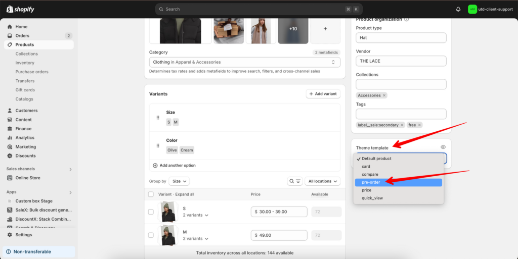
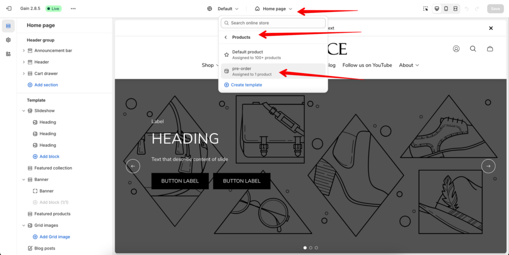
This is a product page with default template product.pre-order.json
This template can be used to show customers that the product is available for Pre-order purchase.
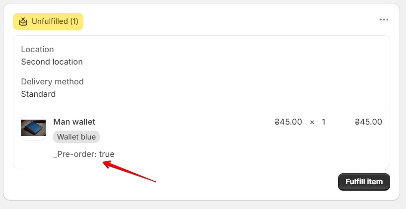
INFO: The logic of purchasing a product does not change, the only difference is changing the text of the “Add to cart” button to “Pre-order”. When a customer purchases a product, thеn in the admin panel on the “Order status page” you can see an additional property “Pre-order”:
You can use the section “Product template” to configure the appearance and additional settings of the page.
You can use a block “Countdown timer” to set a timer that indicates how long the product will be available for the Pre-order or something like this.
Cart
Pages
Cart
This is a page with a default template cart.json
This template is used by default for the cart page. You don’t need to add anything for this template to be displayed.
You can use the section “Cart template” to configure the appearance and additional settings of the page.
The section is static, it is added initially and cannot be removed.
Section settings
General
Type – header type, 3 options are presented:
Static
Sticky
Sticky (hide on scroll down)
Enable transparent header – setting allows you to enable a transparent header. This setting only works for the homepage. When the setting is enabled, the header will be transparent only in the top position, when hovering and scrolling the page, the header will have a background;
Show bottom border – when enabled, a border appears under the header;
Show borders in mega menu – the setting is responsible for showing/hiding borders between mega menu elements;
Show box shadow – when enabled, a box-shadow appears under the header;
Show language selector – when enabled in the main and mobile menus, a language selector is added;
Show country/region selector – the checkbox is responsible for enabling/disabling change of the country (currency). To manage, go to settings → payments.
Logo
Image – logo image picker, if not specified, the text name of the store will be displayed;
Image (transparent header) – logo image picker for transparent header, if not specified, the image will be displayed. We recommend using a logo of the same size as the opaque header;
Logo width – rangewith which you can specify the width of the logo from 20px to 250px on the Desktop. On the mobile, if there is not enough space, the logo will automatically shrink;
Desktop position – the setting is responsible for the position of the logo on the Desktop, either top, left (by default) or centered.
Main menu – a menu picker that will be used for both Desktop and Mobile;
Type – nested menu type selector for Desktop:
both
dropdown
mega menu
Open by – submenu opening selection selector on Desktop: By hover, By click.
Make 1st-level menu clickable – the setting allows you make 1st-level menu clickable if it has submenu. Only works with open on hover for desktop, if the menu item has a link.
Colors
Background – picker for header background and dropdown menus;
Background mobile menu – background for mobile menu;
Text – text color picker;
Text (transparent header) – text color picker for the transparent header;
Icon – picker color icons;
Icon (transparent header) – picker color icons for the transparent header;
Count text – color picker for the text of the number of items in the cart;
Count text (transparent header) – color picker for the text of the number of items in the cart for the transparent header;
Count background – color picker for the background of the number of items in the cart;
Count background (transparent header) – color picker for the background of the number of items in the cart for the transparent header;
Border – the color of the bottom border in the header and the border in the mega menu;
Megamenu image text – color for the image text in the mega menu;
Megamenu image overlay – overlay color picker for the first image in the mega menu.
Menu handle – in this field, you must specify the handle of the first-level link to which the mega menu should be added. In handle format, all letters must be in lowercase, whitespace replaced with ‘-’, e.x: if you want a sub-menu to be Home Decor, you need to enter in handle as home-decor;
Menu type – setting allows you to select the type of menu display. There are 2 types:
Tabs – in this item, the second menu level is displayed, by clicking on the items which you can select the 3rd menu level;
List – in this menu item, a menu is naturally displayed, where the second level is the title and the 3rd level is like a list under it. If the second level menu link is set to “#”, then the plain text will be displayed;
Badge text – this setting allows you to add a badge above the menu;
Badge text color – this setting allows you to set the text color of the badge;
Badge background color – this setting allows you to set the color background color of the badge.
Media item 1 / Media item 2
Image – the first image in the mega menu;
Label – the label of the first image in the mega menu;
Heading – heading the first image in the mega menu;
Link – link the first image in the mega menu.
Product – this setting allows you to display a product card. The product has a higher priority than the picture.
Block Mega menu half to half
General
Menu handle – in this field, you must specify the handle of the first-level link to which the mega menu should be added. In handle format, all letters must be in lowercase, whitespace replaced with ‘-’, e.x: if you want a sub-menu to be Home Decor, you need to enter in handle as home-decor;
Badge text – this setting allows you to add a badge above the menu;
Badge text color – this setting allows you to set the text color of the badge;
Badge background color – this setting allows you to set the background color of the badge.
Text side
Heading – the setting allows you to specify a heading;
Subheading – the setting allows you to specify a subheading;
Short text – the setting allows you to specify a text;
Button label 1 – the setting allows you to specify a label for button 1;
Button link 1 – the setting allows you to specify a link for button 1;
Button style 1 – the setting allows you to select a style for button 1;
Button label 2 – the setting allows you to specify a label for button 2;
Button link 2 – the setting allows you to specify a link for button 2;
Button style 2 – the setting allows you to select a style for button 2.
Image side
Image – the setting allows you to specify the image;
Show shadow – this setting is responsible for whether the shadow will be shown over the picture;
Shadow color – the setting allows you to specify shadow color on the Desktop;
Shadow color mobile – the setting allows you to specify the image on Mobile;
Block Mega menu images
General
Menu handle – in this field, you must specify the handle of the first-level link to which the mega menu should be added. In handle format, all letters must be in lowercase, whitespace replaced with ‘-’, e.x: if you want a sub-menu to be Home Decor, you need to enter in handle as home-decor;
Badge text – this setting allows you to add a badge above the menu;
Badge text color – this setting allows you to set the text color of the badge;
Badge background color – this setting allows you to set the background color of the badge.
Media item (1-4)
Image – the setting allows you to specify an image;
Label – the setting allows you to specify a label;
Heading – the setting allows you to specify a heading;
Link – the setting allows you to specify a link;
Link label – the setting allows you to specify a link label;
Product – the setting allows you to specify a product. The product has a higher priority than the picture.
Block Mega menu row menus
General
Menu handle – in this field, you must specify the handle of the first-level link to which the mega menu should be added. In handle format, all letters must be in lowercase, whitespace replaced with ‘-’, e.x: if you want a sub-menu to be Home Decor, you need to enter in handle as home-decor;
Badge text – this setting allows you to add a badge above the menu;
Badge text color – this setting allows you to set the text color of the badge;
Badge background color – this setting allows you to set the background color of the badge.
For Developers
Used snippets
header-menu.liquid – this snippet renders the menu on the Desktop.
menu – menu object;
menu_type_desktop – the type of submenu to display. There are two options – dropdown and mega menu;
blocks – the blocks object is passed further nested in the header-mega-menu.liquid snippet.
header-mobile-menu.liquid – this snippet renders the menu on Mobile.
menu – menu object;
is_show_language_selector – the condition by which the language selector is rendered.
header-mega-menu.liquid – the mega menu is rendered in this snippet.
menu – menu object. The first menu level is passed, from which the rest of the nested items are displayed;
blocks – the blocks object is used to display media content for a specific mega menu.
language-localization-form.liquid – the snippet is used to render the language selector.
Only one block type is available for a section – @app. This block is for apps that need to be integrated into the shopping cart.
For Developers
Used snippets
cart-empty.liquid – a snippet of an empty cart;
cart-items.liquid – the snippet contains a list of products in the cart;
lazy_load – the parameter is responsible for enabling/disabling lazy load for product images.
breadcrumbs.liquid – snippet outputs breadcrumbs;
preloader.liquid – snippet renders preloader.
Cart drawer
Sections & Snippets
Cart drawer
For Customers
Adding a Section
Video guide: How to set up Cart Drawer.
The section is static, it is added initially and cannot be deleted. The section will be added if the Drawer type is selected in the Cart global settings.
Section settings
Heading – setting allows you to set the text for the section title. By default, it is taken from translations;
Show items count in the cart – the setting is responsible for displaying the number of products in the cart;
Blocks are introduced to provide dynamic content in the cart. Blocks can also be swapped to get different combinations. Usually, this feature is not available in other themes.
Block Items
Block limit – 1
The block is responsible for displaying the products in the cart. The block has no settings.
Block Upsell
Block limit – 1
The block is responsible for displaying upsell products in the cart.
Heading – setting allows you to set the text for the block title;
Products – setting allows you to select products that act as upsells. Limit – 12 products.
Block shipping bar
Block limit – 1
Block is responsible for displaying the Shipping bar.
Free shipping amount – the setting allows you to set the amount of US money that the user must spend to fill the bar;
Shipping message – setting allows you to set the text of the message that the user sees when the bar is not filled;
Shipping congratulatory message – setting allows you to customize the text of the message that the user sees when the bar is full;
Icon – setting allows you to set the image in the congratulatory message.
Richtext
Block limit – 1
General
Text – RTE field for adding text content.
Colors
Text – color for text;
Background – setting the background color for the block.
For Developers
Used snippets
cart-empty.liquid – a snippet of an empty cart;
cart-items.liquid – the snippet contains a list of products in the cart;
lazy_load – the setting is responsible for enabling/disabling lazy load for images.
cart-footer.liquid – snippet contains buttons for payment methods, cart notes, and icons for payment methods;
payments.liquid – snippet contains icons of payment methods;
preloader.liquid – snippet renders preloader.
cart-upsell.liquid – upsell block in mini cart.
products – list of products to display;
heading – block heading;
lazy_load – the setting is responsible for enabling/disabling lazy load for images.
Additional information
Block upsell. On the desktop, the section is presented as a slider (if there are more than 3 products). At a resolution of less than 992 – the standard scroll is used;
Block upsell. Products are not displayed if they are already added to the cart;
Block Upsell. When you click on the add to cart button, Quick View is called;
Block shipping bar. Since Subtotal is displayed in this block by design, fallback logic is provided if this block is missing or hidden.
Footer
Sections & Snippets
Footer
For customers
Adding a section
The section is static, it is added initially and cannot be removed. This is done so that the Footer in the DOM will always be the bottom section.
Show top border – the setting is responsible for showing/hiding the top border;
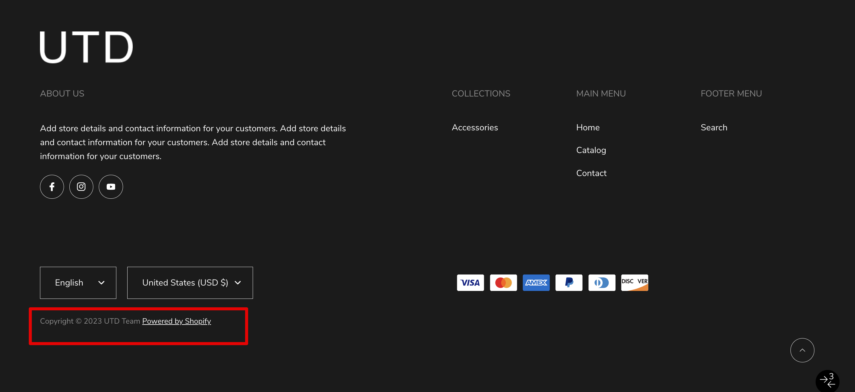
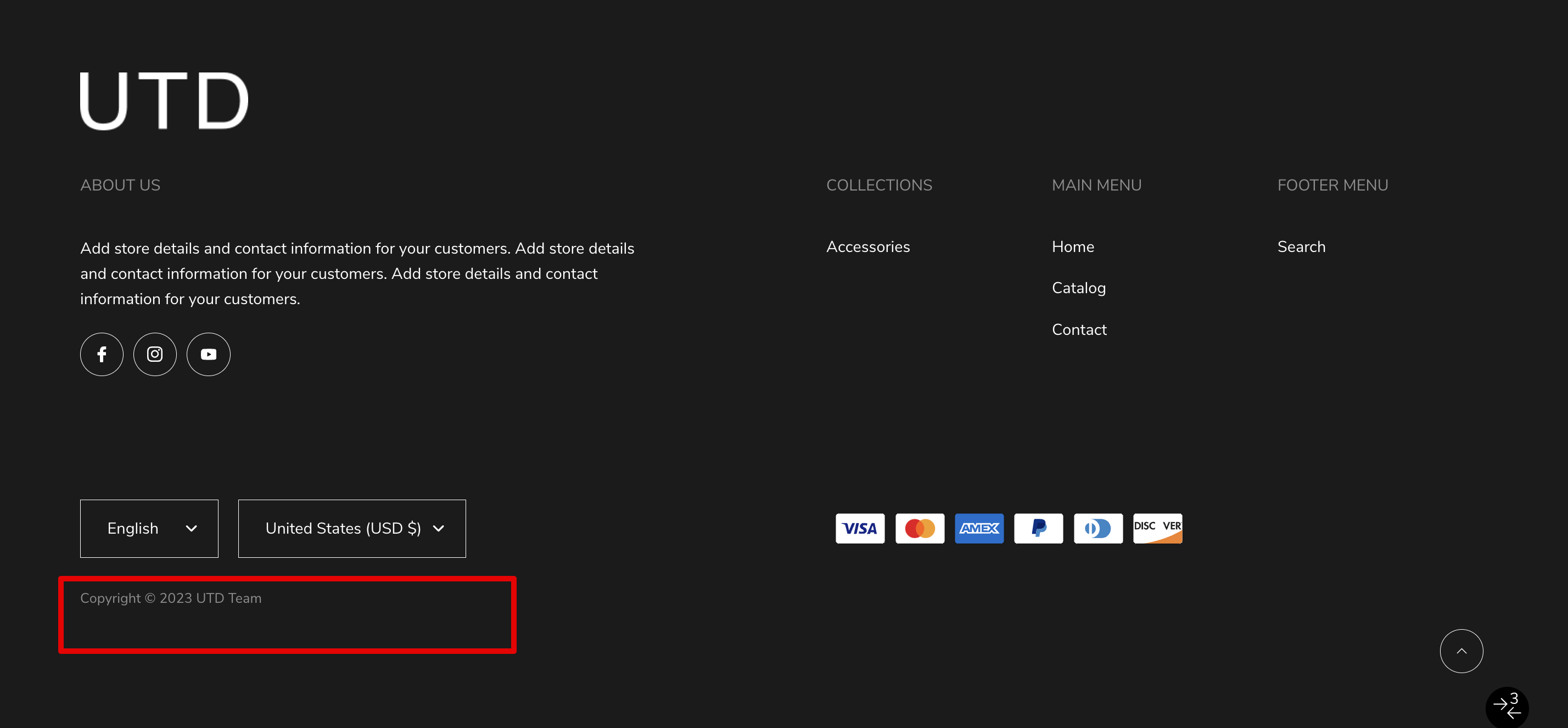
Copyright text – copyright text, where %date% is a shortcut that will be replaced with the current year;
Show back to top button – the setting is responsible for showing the scroll to the top button.
Country/Region selector
Show country/region selector – The checkbox is responsible for enabling/disabling the change of the country (currency). To manage, go to settings → payments.
Language selector
Show language selector – The checkbox is responsible for enabling/disabling language changes. To manage, go settings → languages.
Payment methods
Show payment icons – the checkbox is responsible for displaying icons of payment providers. To manage, go to settings → payments.
Follow on Shop CTA
Enable Follow on Shop – enable “Follow on Shop” which allows customers to follow your store on the Shop app. Learn more in the Shopify documentation.
Colors
Section background – background color setting;
Border top color – color setting for a top border;
Heading – setting text color for headings;
Text – setting text color for text;
Copyright text – color setting for text inside Copyright;
Link – color setting for links;
Link (hover) – color setting for links on hover;
Socials icon – color setting for social links icon;
Socials background – color setting for social links background;
Socials border – color setting for social links border;
Socials icon (hover) – color setting for social links icon on hover;
Socials background (hover) – color setting for social links background on hover;
Socials border (hover) – color setting for social links border on hover.
Blocks settings
Total block limit – 4
Block Text
Block limit – 1
Heading – text field for adding a block title;
Text – RTE field for adding text content;
Show media links – setting allows you to show/hide links to social networks.
Block Menu
Block limit – 3
Heading – text field to add;
Menu – picker menu. Only the first level of links will be displayed.
For developers
Used snippets
language-localization-form.liquid – the snippet is used to render the language selector.
class – used to add a custom class.
country-localization-form.liquid – The snippet is used to render the country selector.
class – used to add a custom class.
Predictive search
Sections & Snippets
Predictive search
For Customers
Enable search by articles – setting allows you to include articles in the search;
Enable search by pages – setting allows you to include pages in the search.
Additional information
If the Enable search by articles or Enable search by pages setting is enabled, then tabs appear in the search sidebar. If no results are found in any of the categories, then this tab will be disabled.
If the search does not return any results, then the search button becomes disabled and a corresponding message is displayed.
For Developers
The predictive-search.liquid snippet is included in the code, in the theme.liquid file.
Product Card
Sections & Snippets
Product Card
For Customers
Product rating color settings
Icon– color picker which is responsible for the color of the stars;
Text– color picker which is responsible for the color of the text.
Product card settings
General
Show vendor – the setting is responsible for whether the vendor of the product will be shown;
Enable quick view – the setting is responsible for whether the quick view will be enabled. Otherwise, the user will need to go to the product to see other options and add to the cart; Video guide: How to set up the Quick view.
Buttons type – a type of quick view / add to card button (icon or text);
Show currency code – the setting is responsible for whether the currency code will be shown;
Show borders – the setting is responsible for whether borders will be added to the card;
Border color – card border color;
Border color (hover) – card border color on hover;
Object fit image – the setting is responsible for stretching the image. If Cover(default) is selected – the image will take all the space available for it, that is, it will stretch as much as possible, and if Contain – it will retain its proportions;
Image width – the setting is responsible for the width of the block. If Cropped(default) is selected – the block will be limited, and if Full width – the block will be stretched across the entire width of the product card;
Quick view background – adds a background for the Quick view button on the Desktop. Works if Image width is set to – full width;
Rating background – background is added for Product rating on the Desktop. Works if the Image width setting is set to – full width;
Text color – product card text color.
Image
Enable image change on hover – the setting is responsible for whether the second image will be shown on hover. To add an image, you need to add the product_card.hover_imagemetafield, where product_card are the namespace and hover_image the field name. The Content type must be file, where you can allow both images and videos. Video guide: How to set up hover image.
If color swatches are disabled, then you need to add this field only to the product;
If color swatches are enabled, you must also add this field to the variant;
If color swatches are enabled and other options are present, for example, size, material, etc., then you need to add an image only to the first variant of each color.
Text button colors
Text – setting allows you to set the color of the button text;
Background – setting allows you to set the color of the button background color;
Border – setting allows you to set the color of the button border color;
Text (hover) – setting allows you to set the color of the button text on hover;
Background (hover) – setting allows you to set the color of the button background color on hover;
Border (hover) – setting allows you to set the color of the button border color on hover.
For Developers
product – the product object is passed to the card;
size(min-width: 768px) – transfer the size of the picture to the Desktop. This size is automatically multiplied by 2 and added for Retina displays (x2). If nothing is passed, the default value will be taken – 300;
tablet_size(max-width: 767px)– transfer the size of the picture to the Tablet. This size is automatically multiplied by 2 and added for Retina displays (x2). If nothing is passed, the value – size will be taken;
mobile_ size(max-width: 480px) – transfer the size of the picture for Mobile. This size is automatically multiplied by 2 and added for Retina displays (x2). If nothing is passed, the value will be taken – tablet_size;
is_lazy – this parameter is responsible for whether it will be enabled for images in the lazy loading card. This will be useful if the section in which the product cards are present will be located in the visible area when the page is loaded, we add a setting to the section that is responsible for disabling lazy loading, thus we will not slow down the page loading. If nothing is passed, lazy loading will be enabled by default.
Used snipped
product-card-image.liquid – this snippet renders images for the product card.
product – used to pull the title if the image does not have alt;
image – the picture itself is transmitted. It can be either a regular picture or a hover picture;
size – image size defined in the main snippet. Used for Desktop;
tablet_size – image size defined in the main snippet. Used for Tablet;
mobile_size – image size defined in the main snippet. Used for Mobile;
is_lazy – the parameter is responsible for whether the lazy load will be enabled for the image. If the lazy load was enabled, but js didn’t work for some reason, the image from <noscript> will be displayed.
is_hover_image – a parameter responsible for whether a class will be added to the image that is intended for images that are shown on hover.
product-card-swatches.liquid – this snippet displays color swatches.
Swatches – an object with an array of swatches.
product-rating-short.liquid – the snippet displays the rating of the product. One star (svg) with product rating below.
product – is used to pull meta fields that contain product rating data.
product-rating-long.liquid – the snippet displays the rating of the product. Five stars are made through the filling of elements with a product rating on the side.
product – is used to pull meta fields that contain product rating data.
price.liquid – a snippet that displays price, compare_price, and unit_price. If the card is used as a stub, the default price will be $19.99.
product – the product object from which all information about the price is drawn;
price_class – a string in which you can specify a custom class;
use_variant – setting responsible for what will be taken as a basis. If true, product.selected_or_first_available_variant will be used, if false, product;
currency_code_enabled – a setting that determines whether code currencies will be displayed near the price, for example, USD for dollars;
show_unit_price – setting responsible for whether unit_price will be shown. Used for German shops.
JS Event
When you click on the Quick View button, an Event with the name – product-card:quick-view:clicked is generated. In this event, handle the product is passed.
Additional information
Color swatch settings. Color swatches depend on the Color option. The name of the color is split, and the last word is taken and substituted into the CSS palette. There is a chance that this color will not be in the CSS palette, then it will just be a white swatch. In this case, you need to add an image to Shopify files of 1*1 px size in .png format with swatch- prefixes. For example, the image name banana-yellow would be swatch-banana-yellow.png. Video guide: Color swatches setting.
Color swatch settings. For example, a user has a purely German store, whose color option is called – Farbe, thus the user will need to specify the name in the swatch option setting. The default value is Color.
Labels settings. For the label to be displayed, a tag must be added to the product, for example, label__new the base label that will display NEW with the base color. To change the type of a label, you need to add a :type such as label__new:primary or label__new:secondary. The number of displayed labels is limited to 3, as well as a soldout label in case the product is not available.
The second image is on hover settings. To add an image, you need to add the product_card.hover_image metafield, where product_card is the namespace, and hover_image the field name. The Content type must be file, where only one file is allowed, namely an image.
If color swatches are disabled, then you need to add this field only to the product;
If color swatches are enabled, you must also add this field to the variant;
If color swatches are enabled and other options are present, such as size, material, etc., then you only need to add an image to the first variant of each color.
Newsletter popup
Sections & Snippets
Newsletter popup
For Customers
Enable – the setting is responsible for enabling popup;
Cookie time – the setting is responsible for the time until the popup is re-displayed when the user closes it;
Heading – setting allows you to set title text;
Text – setting allows you to set text content;
Input placeholder – the setting allows you to set the text for the input placeholder;
Button submit label – setting allows you to set the label for the submit button;
Button close label – setting allows you to set the label for the close button;
Image desktop – setting allows you to set the image for the desktop;
Image mobile – setting allows you to set the image for mobile;
Hide image on mobile – the setting allows you to hide the image for mobile.
For Developers
The newsletter-popup.liquid a snippet is included in the theme.liquid file.
Additional information
The remaining settings (texts) are taken from the translations. Newsletter popup:
In order to add a section, you need to go to Customizer → Add Section → Collection list.
Section settings
General
Heading – heading of the section;
Button link – link for the button below the section;
Button label – label for the button below the section;
Link aria-label – aria-label for the button below the section. This attribute allows screen readers to better convey information to people with disabilities;
Text alignment – text alignment of the title and product count;
Button style – style for the button below the section;
Image aspect ratio – aspect ratio of the images. Can be square, portrait, or landscape;
Show products count – show the product count of the collection under the title.
Layout
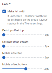
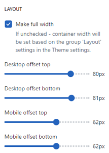
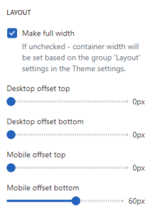
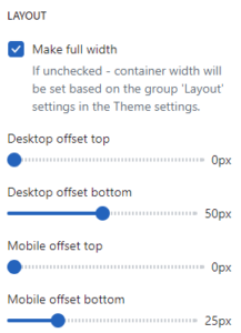
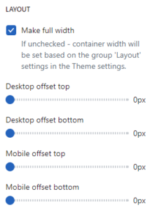
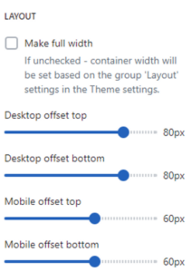
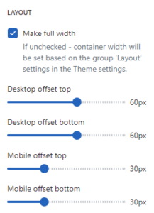
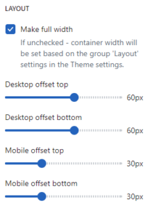
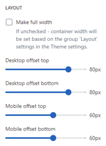
Make full width – if disabled – container width will be set based on the group ‘Layout’ settings in the Theme settings;
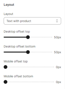
Desktop offset top – the top indent of the section on the desktop;
Desktop offset bottom – the bottom indent of the section on the desktop;
Mobile offset top – the top indent of the section on the mobile;
Mobile offset bottom – the bottom indent of the section on the mobile.
Blocks settings
Collection – collection;
Image – image picker. Use instead of collection image. If the setting is empty and the collection image is empty then an image from the first product of the collection will be shown.
Additional information
On the desktop is a grid of collection cards. On the mobile, it is a slideshow.
The section is static on a collection page template, it was added initially and cannot be removed.
Section settings
General
Show collection image – the setting is responsible for displaying the image of the collection;
Show collection description – the setting is responsible for displaying the description of the collection;
Enable product cards indent– the setting is responsible for adding indents between product cards. On mobile, indents for the wrapper also will be added;
Show color swatch in filters – if checked, the filter group with the name, that specified in the Theme settings / Product / Swatch option (“Color” by default) will be shown a checkbox like color swatch;
Show grid selector – setting allows the display of grid-view buttons. You can change the product count per row from 3 or 4 on the desktop (with a “Basic” grid layout)
Filters type– setting allows selecting view of filters: “Drawer” or “Sidebar”. Setting works only for desktop resolution. On the mobile filters will be always in the “Drawer” view;
Paginate by – the setting is responsible for displaying a certain number of cards per page when the value of the Grid view setting is With big card. The minimum quantity is 10, the maximum quantity is 50;
Paginate by (basic grid) – the setting is responsible for displaying a certain number of cards per page when the value of the Grid view setting is Basic. The minimum number is 12, the maximum number is 48;
Pagination type – the setting is responsible for the type of loading product cards.
Layout
Grid view – the setting is responsible for the display of the product grid. It has two meanings “Basic”, and “With big card”. Type “Basic” – 4 ordinary cards are displayed in a row in a grid. Type “With big card” – in the grid, ordinary cards are supplemented by large cards;
Make grid full width – a setting that is responsible for the width of the grid container with products. If the setting is ON – the container is stretched to fit the width of the screen. If the setting is OFF – container width will be set based on the group Layout settings in the Theme settings;
Desktop offset top – the top indent of the section on the desktop;
Desktop offset bottom – the bottom indent of the section on the desktop;
Mobile offset top – the top indent of the section on the mobile;
Mobile offset bottom – the bottom indent of the section on the mobile.
For Developers
Used snippets
breadcrumbs.liquid – snippet outputs breadcrumbs.
product-filters-and-sort.liquid – this snippet displays filtering and sorting.
product_list – expected to pass a collection or search object.
product-card.liquid – in this snippet, a product card is displayed.
product – passing the product object to the card;
size – we transfer the size of the picture to the Desktop. This size is automatically multiplied by 2 and added for Retina displays (x2). If nothing is passed, the default value will be taken – 300;
tablet_size(max-width: 767px) – we pass the image size for Tablet. This size is automatically multiplied by 2 and added for Retina displays (x2). If nothing is passed, the value – size will be taken;
mobile_ size(max-width: 480px) – we pass the size of the image for Mobile. This size is automatically multiplied by 2 and added for Retina displays (x2). If nothing is passed, the value will be taken – tablet_size;
is_lazy – this parameter is responsible for whether it will be enabled for images in the lazy loading card. This will be useful if the section in which the product cards are present will be located in the visible area when the page is loaded, we add a setting to the section that is responsible for disabling lazy loading, thus we will not slow down the page loading. If nothing is passed, lazy loading will be enabled by default.
Additional information
By default, 20 cards are displayed and the type of loading is Pagination;
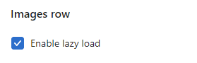
Enable lazy load – setting allows you to set lazy loading for product images;
Enable zoom – the setting allows you to enable the Zoom function that appears when you click on the image;
Show borders – the setting adds Borders inside and around the perimeter of the section;
Show arrows on mobile – the setting is responsible for whether the slider arrows will be shown in the mobile version;
Media layout – setting allows you to choose the appearance for the product image gallery:
Carousel – horizontal slider;
Stacked – vertically stacked images one below the other;
Stacked 2 columns– vertically stacked images, two images in one row below the other.
Thumbnails position – setting allows you to select the location for the thumbnails, only works if the media layout is a carousel. Has several options: left, bottom;
Media height – the setting allows you to select the size of the image. Has several options: full size, to screen;
Make smooth scroll for stacked gallery – in the Stacked , Stacked 2 columns gallery mode, it has Thumbnails on the left, clicking on which will scroll to the desired image. This parameter will determine whether the movement will be instantaneous or smooth.
Enable media scroll for stacked layout – enables scroll to variant image when changing product options for stacked layout;
General
Show message of taxes included – if taxes are included in the price of the product in the store, then this parameter will control the visibility of the corresponding message;
Show pay installments – if the store has the right to sell by installments and this feature is enabled in the store settings, then this parameter will control the visibility of the installment block;
Show share buttons – shows “Share” buttons;
Enable sticky add to cart – shows a sticky add to cart when the main add to cart is not visible.
Colors
Border colors – the setting allows you to set the section border color;
UI button color – the setting allows you to set the UI button’s color. Цill also be used for shadow color;
UI button background color – the setting allows you to set the UI button’s background color.
Layout
Desktop offset top – the top indent of the section on the desktop;
Desktop offset bottom – the bottom indent of the section on the desktop;
Mobile offset top – the top indent of the section on the mobile;
Mobile offset bottom – the bottom indent of the section on the mobile.
Icon – image before the countdown timer. (Recommended size 48×48).
Colors
Text – text before the countdown timer color.
Timer text – timer cells text color;
Timer background – Timer cells background color.
To show the countdown timer:
Create product metafield with Name: “Promo time”, Namespace and key: custom.promo_timer_date. Content type must be Date and time;
Add promo time to the product
Block SKU
SKU
Show SKU – display the SKU of a product or variant;
SKU text – You can set your text for the SKU and insert a variable into it. For example: “Art: %SKU%” will always output “Art: ” before the value.
Block Product combination
In Shopify, you can add variants to create different options for the product. Product variants are very useful, but they can be too limited if you want to create vastly different pages for each variant.
For instance, you may want to create products where colors of the product must be a linked products with each other like products, not a color variant.
If you select a color variation (on the bottom image), you are redirected to a different product page. The image of the swatch – is a product featured (main) image.
INFO: While this feature allows you to emulate variations on a given product page, internally, each product will still be an individual product. Each variation will appear as an individual product on the collection and search pages. Showing swatches in collection pages won’t be possible, either.
To add product combination, please follow the instructions below:
Create one product for each variation in your Shopify admin. If you want to create one product page per color, create one product for every color variation.
You will now need to create two product metafields: one for the actual value for the option (for instance, “Red,” “Blue,”…). And one metafield for the list of products to show.
Open “Metafields” settings (Admin/Settings/Custom data)) and click “Products”
Click “Add definition”
In the name field, write something Variation value*.* Select the Single-line-text **metafield type, and make sure that “One value” is checked:
Click “Add definition” again to create a second product metafield. In the name field, write Variation products, select “Product reference” as metafield type, and select “List of products“. It should look like this:
Once the meta fields are created, you need to add the “Product combination” block to the “Product template” section.Option name – text label for the product variations. If you create different products grouped by colors, you can set “Color” value;
Option value metafield – in this setting you need add a dynamic source from your product metafield “Variation value” that you added in the 5 step;
Products – in this setting you need add a dynamic source from your product metafield “Variation products” that you added in the 6 step;
You need filling in the information for all your products to create the link between them. To do that, in your Shopify admin, open the first product you want to link and scroll down to the “Metafields” section:For “Variation value,” enter the option value for the variation (if you want to create variations based on the color, then the variation value should hold the actual color value for this product, such as “Red,” “Blue,” “Green” etc). For the “Variation products” metafields, select all the product variations that should appear in this product (make sure to include the product itself as well).Finally, repeat the same process for every variation product by adjusting the variation value for each product (the “Variation products” metafields, on the other hand, should contain the same list of products for every product within a group).
Block Options
Show labels – the setting is responsible for showing/hiding labels for options;
Variant picker – select a view of variant options type. Note: if you have enabled a color swatch option then the option that is related to color swatch will be always like a button.
You can select Buttons
or Dropdown
Size guide option name – the name of the option for which you want to display the size guide button (most often it is “Size”). If this field is empty or the option name does not exist the size guide button will appear under the options;
Size guide general tab label – label for size guide general tab;
Size guide model tab label – label for size guide model tab;
Size guide drawer title – the title for the popup, which is called by the Size guide button;
Size guide button icon – button icon;
Size guide button label – button label;
To show the size guide:
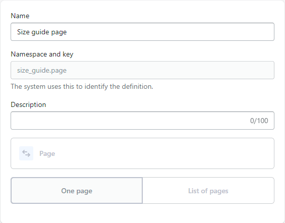
Create product metafield with Name: “Size guide page”, Namespace and key: size_guide.page. Content type must be Page;
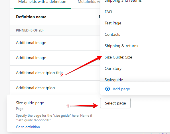
Create a page with content for a size guide (you can select a unique page with a size guide for every product. For shorts, skirts, etc):
Add a page in the product meta field (page content must not be empty);
With option Size guide option name choose in which option you want to see the size guide button;If field Size guide option name is empty or the option name does not exist the size guide button will appear under the options.
In the Size guide popup you can add information about the product model information:
Follow the steps:
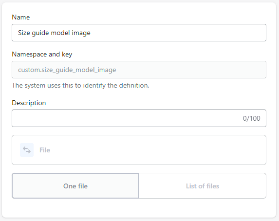
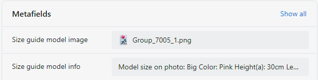
Create product metafield with Name: “Size guide model image”, Namespace and key: custom.size_guide_model_image. Content type must be file (images only).
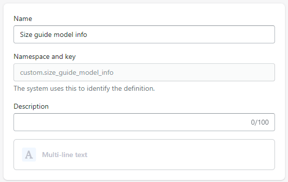
Create product metafield with Name: “Size guide model info”, Namespace and key: custom.size_guide_model_info. Content type must be Multi-line text.
Go to the product in the admin and add values to these metafields. You can set both or one of these fields to see tabs in the size guide popup.
Now when you open the Size guide popup on the product you will see tabs with the default size guide and size guide for the product model.
If one of the options is named “Color” or “Colour“, then it will be processed as a color. She will have a circle with a color on the left, which will be filled in this way:
Will try to find an image in the store that matches the name swatch-%value%.png. For example, swatch-sky-blue.png;
If there is no picture, it will try to use the right side of the value. For example the color Sky Blue will be converted to just Blue from the CSS palette;
Recommended swatch image size 30*30px.
In the 2.4.0 update, the drawer size guide has been added to open the drawer in full screen for easy viewing of the size table.
Block Quantity
Show label – will display the label for the quantity change widget.
Block Price
The block has no settings, it displays the price of the product or the selected option. Also outputs the unit cost if the product has a unit cost instead of a quantity cost.
In this block, a message will be displayed stating that taxes are included in the price;
In this block, the installment purchase form will be displayed.
Block Add to cart
Button type – add to cart button style;
Show additional payment buttons – adds “Buy it now” buttons;
Show enabled payment types – adds a list with icons of supported payment types;
Show recipient information form for gift cards – allows customers to send gift cards on a scheduled date along with a personal message (works only on a gift product).
Heading – setting allows you to set the heading for the block.
Block Sales point
You can add a simple text block with an icon.
Icon image – setting allows you to set an icon for the message;
Text – text of the block.
Block Inventory status
With this block, you can show message about product variant inventory status.
You can help customers detect which product variant has a low/high stock inventory.
If a variant is not available – the block will be hidden.
Low stock text – text that appears when variant inventory quantity is less or equal ”Low stock threshold” value;
High stock text – text that appears when variant inventory quantity is more than the “Low stock threshold” value;
Low stock threshold – a setting that allows you to select the minimum number of variant inventory quantities to show a “Low stock text” message. If the variant inventory quantity is more than the value of the setting, then “High stock text” will appear;
Button label – text for the button. Required field;
Button icon – icon for the button.
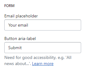
Form settings
Heading – popup title text field. Required field;
Email placeholder – placeholder for the input. Required field;
Button label – label for the submit button. Required field;
Success message – a message that the form was sent successfully. Required field.
Translations settings:
Product notify me message – a message that will be sent to the email when the user submits the form. Using “{{ product_title }}” in the message allows you to replace it with the product title Required field.
Notify me logic:
The “Notify me” button is displayed when the product is “Sold out”;
When clicking on the “Notify me” button, a popup with a form will be displayed;
The user can enter the “Email” form;
The form has two hidden fields. Message – contains the message that is specified in the translations in the “Product notify me message” field. ProductURL – contains a link to the variant of the current, selected “Sold out” product;
If the form is sent successfully, the email will be sent and a “Success message” will be displayed;
If the form is sent unsuccessfully, an “Error message” will be shown.
Block Ask a question
With this block, you can add a button to the product form that triggers a popup with the Shopify contact form (but with some additional fields).
That allows customers to send email to you with questions about the current product. The field with the product URL is filled automatically based on the product and his selected variant.
Button settings
Button label – text for the button. Required field;
Button icon – icon for the button.
Form settings
Heading – heading for popup form;
Email placeholder – placeholder for the email field. Required field;
Name placeholder – placeholder for the name field. Required field;
Phone placeholder – placeholder for the phone field. Leave blank to hide;
Product URL placeholder – placeholder for the product URL field. Required field;
Success message – text of the success message after the form submit;
Submit button label – text for the submit button.
Block Custom field
With this block, you can display a text field (input type='text‘), which will represent the line_item property of the product. When a product is added to a cart with a filled field, the value of this field will be added to the cart, checkout, and order.
Settings
Field label – the setting is responsible for the label text for the input;
Required text – the setting is responsible for the label text for the checkbox.
Custom fieldlogic:
If the Required text is not filled in, only the text input will be displayed. In this case, if the field is filled – the user information will be added to the order.
If Required text is filled in, a checkbox will be displayed under the Custom field with a message from that field. If the checkbox is not clicked OR the Custom field is empty, the product cannot be added to the cart, and the corresponding error is displayed.
Block @app
The block allows you to connect applications, such as ReCharge, etc.
Block Custom liquid
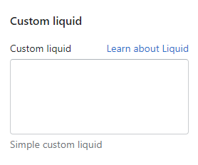
Custom liquid – setting allows you to add your liquid code.
The section is static on a Search page template, it was added initially and cannot be removed.
Section settings
General
Enable search by articles – setting allows to include articles in the search;
Enable search by pages – setting allows to include pages in the search;
Show color swatch in filters – if checked, the filter group with the name, specified in the Theme settings / Product / Swatch option (“Color” by default) will be shown a checkbox like color swatch;
Enable cards indent– the setting is responsible for adding indents between product cards. On mobile, indents for the wrapper also will be added;
Filters type– setting allows selecting view of filters: “Drawer” or “Sidebar”. Setting works only for desktop resolution. On the mobile filters will be always in the “Drawer” view;
Paginate by – setting allows specifying the number of results in the search sidebar;
Pagination type – setting allows to selection the type of pagination. Has several meanings:
Pagination – default pagination of elements;
Load more – loading a group of elements on a button click;
Infinite scrolling – loading elements on scroll.
Grid
Show borders – the setting is responsible for showing/hiding borders;
Border color – the setting is responsible for the color of the borders.
Layout
Make grid full width – if disabled – container width will be set based on the group ‘Layout’ settings in the Theme settings;
Desktop offset top – the top indent of the section on the desktop;
Desktop offset bottom – the bottom indent of the section on the desktop;
Mobile offset top – the top indent of the section on the mobile;
Mobile offset bottom – the bottom indent of the section on the mobile.
For Developers
Used snippets
breadcrumbs.liquid – snippet outputs breadcrumbs.
product-filters-and-sort.liquid – This snippet displays filtering and sorting.
product_list – expected to pass a collection or search object.
product-card.liquid – in this snippet, a product card is displayed.
product – passing the product object to the card;
size – we transfer the size of the picture to the Desktop. This size is automatically multiplied by 2 and added for Retina displays (x2). If nothing is passed, the default value will be taken – 300;
tablet_size(max-width: 767px) – we pass the image size for Tablet. This size is automatically multiplied by 2 and added for Retina displays (x2). If nothing is passed, the value – size will be taken;
mobile_ size(max-width: 480px) – we pass the size of the image for Mobile. This size is automatically multiplied by 2 and added for Retina displays (x2). If nothing is passed, the value will be taken – tablet_size;
is_lazy – this parameter is responsible for whether it will be enabled for images in the lazy loading card. This will be useful if the section in which the product cards are present will be located in the visible area when the page is loaded, we add a setting to the section that is responsible for disabling lazy loading, thus we will not slow down the page loading. If nothing is passed, lazy loading will be enabled by default.
article-card.liquid – the snippet displays the article card.
article – article object;
layout – variable to set the size of the image.
page-card.liqiud – the snippet displays the page card.
The section is static on a blog page template, it was added initially and cannot be removed.
Section settings
General
Paginate by – setting allows you to select the number of articles per page. The minimum number is 6, the maximum number is 24;
Pagination type – setting allows you to select the type of pagination;
Load more button type – the setting is responsible for the style of the load more button;
Show filter by tag – the setting is responsible for displaying the filter by tag.
Featured blog post
Blog post – setting allows you to select an additional post. It is always displayed, even if the blog is empty;
Background color – the setting allows you to set the background color for the “Featured blog post”;
Border color – setting sets border color for “Featured blog post”;
Text color – setting sets the text color for “Featured blog post”;
Date color – setting sets Date color for “Featured blog post”;
Show borders – setting enables/disables border for “Featured blog post”;
Enable image lazy loading – the setting is responsible for the lazy loading of the image for the additional post;
Button type – the setting is responsible for the style of the featured blog button;
Button aria-label – setting allows you to set the text for the aria-label attribute. This attribute allows screen readers to better convey information to people with disabilities.
Layout
Make full width – if disabled – container width will be set based on the group ‘Layout’ settings in the Theme settings;
Desktop offset top – the top indent of the section on the desktop;
Desktop offset bottom – the bottom indent of the section on the desktop;
Mobile offset top – the top indent of the section on the mobile;
Mobile offset bottom – the bottom indent of the section on the mobile.
For Developers
Used snippets
pagination.liquid – snippet displays pagination.
paginate – pagination object.
article-card.liquid – the snippet displays the article card.
The section is static on an article page template, it was added initially and cannot be removed.
Section settings
General
Banner type – the setting is responsible for the display type of the article banner. If you select the Full width setting, then the text content will be superimposed on top of the image, and the image, in turn, will stretch to the full width of the page. If you select the Container setting, then the text content will be in front of the article’s picture and, together with the picture, will be limited to the container;
Banner text color – the setting is responsible for what the color of the banner text will be if the banner type settings are set to full width;
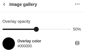
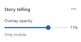
Overlay opacity – the setting changes the transparency of the overlay with black color on the image from 0% to 100%;
Show author – the setting is responsible for whether the author of the article will be displayed;
Show tag – the setting is responsible for whether article tags will be shown;
Show socials – the setting is responsible for showing share social buttons.
Related articles
Show– the setting is responsible for showing/hiding the Related articles section;
Label – text field for adding a label to the section;
Heading – text field for adding a heading to the section;
Show blog button – the setting is responsible for showing a button that leads to the blog page;
Button style – a setting that is responsible for changing the style of the button between primary and secondary.
Layout
Desktop offset top – the top indent of the section on the desktop;
Desktop offset bottom – the bottom indent of the section on the desktop;
Mobile offset top – the top indent of the section on the mobile;
Mobile offset bottom – the bottom indent of the section on the mobile.
Colors
Comment background – background color of the comment section.
For Developers
Used snippet
related-articles.liquid – the snippet is responsible for displaying the last 3 articles from the blog.
current_article_id – article id to exclude this article from suggested articles;
blog – the blog object from which the proposed articles are displayed;
label – block label;
heading – block heading;
show_back_to_blog_btn – condition for displaying the button leading to the blog page;
button_style – select the style of the button leading to the blog page.
article-card.liquid – the snippet is responsible for rendering the article card.
article – article object;
layout – layout of the article card output.
comment-form.liquid – the snippet is responsible for displaying the form for adding comments, as well as for existing comments.
socials-share.liquid – the snippet is responsible for displaying buttons for sharing.
Additional Information
Comment form – displayed if the blog has comments enabled in its settings;
Comments – displayed if the blog has comments enabled in its settings Blog posts → Manage blogs → choose blog → Comments radio button;
When navigating through pagination, when loading the anchor link, we will link back to the comments.
Default page template
Sections & Snippets
Default page template
For Customers
Adding a Section
The section is static on a regular page template, it was added initially and cannot be removed.
Section settings
This section does not have any settings in the customizer. It serves to display content that is taken from the page settings.
The section is static on a contact page template, it was added initially and cannot be removed.
Section settings
Contact information
Information heading – setting allows you to set the text for the information block;
Adress heading – setting allows you to set the text for the title of the block with the address;
Adress text – setting allows you to set the text of the address;
Phone heading – setting allows you to set the text for the title of the block with the phone;
Phone text – setting allows you to set the text of the phone;
Email heading – setting allows you to set the text for the header of the block with mail;
Email text – setting allows you to set the text of the mail;
Social heading – setting allows you to set the text for the title of the block with social networks;
Show social – the setting is responsible for displaying the block with social networks;
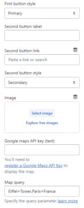
Google maps API key – setting allows you to add a Google maps API key. Learn more about how to create an API key;
Map query – the setting allows you to add a query parameter that is responsible for adding a point on the map. In our case, only the place mode has been added. You can add one point to the map in many ways. Learn more about how to add a query parameter;
Map url – setting allows you to set a link to the map;
Map image desktop – setting allows you to set the map image for the desktop;
Map image mobile – setting allows you to set the image for mobile.
Contact form
Form heading – setting allows you to set the title for the form;
Name placeholder – the setting allows you to set the placeholder for the Name field;
Email placeholder – the setting allows you to set the placeholder for the Email field;
Message placeholder – the setting allows you to set the placeholder for the Message field;
Button label – setting allows you to set the text for the button.
Layout
Desktop offset top – the top indent of the section on the desktop;
Desktop offset bottom – the bottom indent of the section on the desktop;
Mobile offset top – the top indent of the section on the mobile;
Mobile offset bottom – the bottom indent of the section on the mobile.
For Developers
Used snippets
breadcrumbs.liquid – snippet outputs breadcrumbs.
social-links.liquid – snippet displays a list of social networks.
Additional information
The social media link settings are located in the general theme settings;
If the Map url or Map image fields are not specified in the section settings, the map will not be displayed;
The section is static on a faq page template, it was added initially and cannot be removed.
Section settings
General
Heading – setting allows you to set the text for the title. If the value is not specified, the name of the page to which the template is applied is displayed.
Layout
Desktop offset top – the top indent of the section on the desktop;
Desktop offset bottom – the bottom indent of the section on the desktop;
Mobile offset top – the top indent of the section on the mobile;
Mobile offset bottom – the bottom indent of the section on the mobile.
Blocks settings
Block Question and answer
The block is responsible for displaying the question-answer pair. When rendering, it is displayed as an accordion.
Heading – accordion title, question;
Text – response, accordion content;
Icon – icon in the accordion header.
Block Category
The block is designed to group question-answer pairs by category. Rendered as a header separating a group of accordions. In addition, adding blocks of this type makes it possible to build section navigation in the form of a side menu (desktop), and a fixed category bar (mobile). Clicking on a menu item scrolls to the corresponding category.
Heading – title, category name.
Additional information
TheQuestion and answer block is not displayed if the settings for the Heading and Text fields are not specified;
The Category block is not displayed if the settings for the Heading the field is not specified.
The section is static on a password page layout, it was added initially and cannot be removed.
Section settings
General
Heading – setting allows you to set the text of the section title;
Text – setting allows you to set the text of the section text;
Success message – the setting allows you to set the text when the form is successfully submitted (If not set, it is taken from translations);
Show form – the setting allows you to show/hide the form;
Input placeholder – the setting allows you to specify the placeholder text of the forms input. (If not set – taken from translations);
Button aria-label – the setting allows you to set the text for the aria-label attribute of the button. This attribute allows screen readers to better convey information to people with disabilities;
Background image – setting allows you to set a background image;
Background image mobile – the setting allows you to set the background image on the mobile (if not set, the Background image is taken).
Colors
Overlay – setting allows you to specify an overlay;
Background – setting allows you to specify the section background color;
Heading – setting allows you to specify the text color for the heading;
Description – setting allows you to specify the text color for the description;
Input text – setting allows you to specify the text color for input;
Input Border – setting allows you to set the border color for the text input.
Layout
Desktop offset top – the top indent of the section on the desktop;
Desktop offset bottom – the bottom indent of the section on the desktop;
Mobile offset top – the top indent of the section on the mobile;
Mobile offset bottom – the bottom indent of the section on the mobile.
Additional information
For a section, it is possible to add application blocks.
The section is static on a password page layout, it was added initially and cannot be removed.
Section settings
General
Text – setting allows you to set the text of the section (If not set, it is taken from translations).
Colors
Text – setting allows you to set the color of the section text;
Background – setting allows you to set the background color of the section;
Top border – setting allows you to set the color of the section border.
List collections
Sections & Snippets
List collections
For Customers
Adding a Section
The section is static on a list collection page template, it was added initially and cannot be removed.
Section settings
General
Heading – setting allows you to set the text for the title;
Text – setting allows you to set text content;
Paginate by – setting allows you to determine the number of collections to display per page. The minimum number of cards is 6, the maximum number is 24.
Layout
Make full width – if disabled – container width will be set based on the group ‘Layout’ settings in the Theme settings;
Desktop offset top – the top indent of the section on the desktop;
Desktop offset bottom – the bottom indent of the section on the desktop;
Mobile offset top – the top indent of the section on the mobile;
Mobile offset bottom – the bottom indent of the section on the mobile.
For Developers
Used snippets
collection-card.liquid – the snippet displays the collection card.
In order to add a section, you need to go to Customizer → Add Section → Featured collection.
Section settings
Collection – setting allows you to select a collection;
Label – setting allows you to set the text for the label;
Heading – setting allows you to set the text for the title;
Link url – setting allows you to set a custom link for the button. By default selected collection url will be used;
Link label – setting allows you to set the label for the view all link;
Link aria-label – setting allows you to set the aria-label for the view all link. This attribute allows screen readers to better convey information to people with disabilities;
Button style – setting allows you to choose the style for the view all button;
Layout – setting allows you to select the number of products that will be displayed: 5 products, 10 products;
Enable product cards indent – enable if you want to add space between product cards.
Layout
Make full width – if the setting is disabled – container width will be set based on the group ‘Layout’ settings in the Theme settings;
Desktop offset top – the top indent of the section on the desktop;
Desktop offset bottom – the bottom indent of the section on the desktop;
Mobile offset top – the top indent of the section on the mobile;
Mobile offset bottom – the bottom indent of the section on the mobile.
For Developers
Used snippets
product-card.liquid – in this snippet, a product card is displayed.
product – passing the product object to the card;
size – we transfer the size of the picture to the Desktop. This size is automatically multiplied by 2 and added for Retina displays (x2). If nothing is passed, the default value will be taken – 300;
tablet_size(max-width: 767px) – we pass the image size for Tablet. This size is automatically multiplied by 2 and added for Retina displays (x2). If nothing is passed, the value – size will be taken;
mobile_ size(max-width: 480px) – we pass the size of the image for Mobile. This size is automatically multiplied by 2 and added for Retina displays (x2). If nothing is passed, the value will be taken – tablet_size;
is_lazy – this parameter is responsible for whether it will be enabled for images in the lazy loading card. This will be useful if the section in which the product cards are present will be located in the visible area when the page is loaded, we add a setting to the section that is responsible for disabling lazy loading, thus we will not slow down the page loading. If nothing is passed, lazy loading will be enabled by default.
Additional information
If more products are selected in the Layout setting than there are in the selected collection, then all the products that are will be displayed. For example, if there are 7 products in the collection, and Layout is set to 10, the result will be a grid of 7 products.
In order to add a section, you need to go to Customizer → Add Section → Featured products.
Section settings
General
Heading – setting allows you to add a section title;
Products – the setting is responsible for selecting products to display. Limit: 12 pcs. If more is selected than specified in the Layout setting, then a scroll appears. If no products are selected, then 3 placeholder cards are displayed;
Layout – setting allows you to change the number of displayed cards on the Desktop. On Mobile, 2 will be displayed, regardless of how many are selected on Desktop;
Full width – if the setting is enabled, then the section is stretched to the full width of the screen. If the setting is disabled, then the section is placed in a 1920px container;
Enable product cards indent – enable if you want to add space between product cards.
Link url – setting allows you to set a custom link for the button;
Link label – setting allows you to set a text for the button;
Link aria-label – setting allows you to set the aria-label for the button;
Button style – setting allows you to choose the style for the view all button.
Layout
Make full width – if disabled – container width will be set based on the group ‘Layout’ settings in the Theme settings;
Desktop offset top – the top indent of the section on the desktop;
Desktop offset bottom – the bottom indent of the section on the desktop;
Mobile offset top – the top indent of the section on the mobile;
Mobile offset bottom – the bottom indent of the section on the mobile.
Additional information
When creating a section, 3 placeholders are displayed.
In order to add a section, you need to go to Customizer → Add Section → Best sellers.
Section settings
General
Label – setting allows you to set the text for the label;
Heading – setting allows you to set the text for the title.
Product
Show product type – setting responsible for whether the product type will be shown.
Color
Info text color – setting allows you to change the color for the text.
Info backgrount color – setting allows you to change the background color.
Info opacity – setting allows you to change the transparency of the background.
Layout
Desktop offset top – the top indent of the section on the desktop;
Desktop offset bottom – the bottom indent of the section on the desktop;
Mobile offset top – the top indent of the section on the mobile;
Mobile offset bottom – the bottom indent of the section on the mobile.
Block settings
Collection – setting allows you to set the collection for block(setting mustn’t be empty);
Product – setting allows you to set the product for block(setting mustn’t be empty);
Image – setting allows you to set the custom image for the block (default: featured image of the product).
Additional information
Labels settings. For the label to be displayed, a tag must be added to the product, for example, label__new is the base label that will display NEW with the base color. To change the type of a label, you need to add a :type, such as label__new:primary or label__new:secondary. The number of displayed labels is limited to 3, as well as a soldout label in case the product is not available.
Enable lazy load – setting allows you to set lazy loading for product images;
Enable zoom – the setting allows you to enable the Zoom function that appears when you click on the image;
Show borders – the setting adds Borders inside and around the perimeter of the section;
Show arrows on mobile – the setting is responsible for whether the slider arrows will be shown in the mobile version;
Media layout – setting allows you to choose the appearance for the product image gallery:
Carousel – horizontal slider;
Stacked – vertically stacked images one below the other;
Stacked 2 columns – vertically stacked images, two images in one row below the other.
Thumbnails position – setting allows you to select the location for the thumbnails, only works if the media layout is a carousel. Has several options: left, bottom;
Media height – the setting allows you to select the size of the image. Has several options: full size, fit to screen;
Make smooth scroll for stacked gallery – in the Stacked, Stacked 2 columnsgallery mode, it has Thumbnails on the left, clicking on which will scroll to the desired image. This parameter will determine whether the movement will be instantaneous or smooth.
Enable media scroll for stacked layout – enables scroll to variant image when changing product options for stacked layout.
General
Show message of taxes included – if taxes are included in the price of the product in the store, then this parameter will control the visibility of the corresponding message;
Show pay installments – if the store has the right to sell by installments and this feature is enabled in the store settings, then this parameter will control the visibility of the installment block;
Show share buttons – Shows “Share” buttons.
Colors
Border colors – the setting allows you to set the section border color;
UI button color – the setting allows you to set the UI button’s color. Цill also be used for shadow color;
UI button background color – the setting allows you to set the UI button’s background color.
Layout
Desktop offset top – the top indent of the section on the desktop;
Desktop offset bottom – the bottom indent of the section on the desktop;
Mobile offset top – the top indent of the section on the mobile;
Mobile offset bottom – the bottom indent of the section on the mobile.
Variant picker – select a view of variant options type. Note: if you have enabled a color swatch option then the option that is related to color swatch will be always like a button.
You can select Buttons
or Dropdown
Size guide option name – the name of the option in which you want to display the size guide button (most often it is the “Size”). If this field is empty or option name not exist the size guide button will be appear under the options;
Size guide general tab label – label for size guide general tab;
Size guide model tab label– label for size guide model tab;
Size guide drawer title – the title for the popup, which is called by the Size guide button;
Size guide button icon – button icon;
Size guide button label – button label.
To show the size guide:
Create product metafield with Name: “Size guide page”, Namespace and key: size_guide.page. Content type must be Page.
Create a page with content for a size guide (you can select a unique page with a size guide for every product. For shorts, skirts, etc).
Add a page in the product meta field (page content must not be empty).
With the option Size guide option name to choose which option you want see the size guide button.If field Size guide option name is empty or the option name does not exist the size guide button will appear under the options.
In the Size guide popup you can add information about the product model information:
Follow the steps:
Create product metafield with Name: “Size guide model image”, Namespace and key: custom.size_guide_model_image. Content type must be file (images only).
Create product metafield with Name: “Size guide model info”, Namespace and key: custom.size_guide_model_info. Content type must be Multi-line text.
Go to the product in the admin and add values to these metafields. You can set both or one of these fields to see tabs in the size guide popup.
Now when you open the Size guide popup on the product you will see tabs with the default size guide and size guide for the product model.
If one of the options is named “Color” or “Colour“, then it will be processed as a color. She will have a circle with a color on the left, which will be filled in this way:
Will try to find an image in the store that matches the name swatch-%value%.png. For example, swatch-sky-blue.png;
If there is no picture, it will try to use the right side of the value. For example, the color Sky Blue will be converted to just Blue from the CSS palette;
Recommended swatch image size 30*30px.
In the 2.4.0 update, the drawer size guide has been added to open the drawer in full screen for easy viewing of the size table.
Block Quantity
Show label – will display the label for the quantity change widget.
Block Price
The block has no settings, it displays the price of the product or the selected option. Also outputs the unit cost if the product has a unit cost instead of a quantity cost.
In this block, a message will be displayed stating that taxes are included in the price;
In this block, the installment purchase form will be displayed.
Block Add to cart
Button type – add to cart button style;
Show additional payment buttons – add “Buy it now” buttons;
Show enabled payment types – adds a list with icons of supported payment types;
Show recipient information form for gift cards – allows customers to send gift cards on a scheduled date along with a personal message (works only on a gift product).
Heading – setting allows you to set the heading for the block.
Block Sales point
You can add a simple text block with an icon.
Icon image – setting allows you to set an icon for the message;
Text – text of the block.
Block Inventory status
With this block, you can show message about product variant inventory status.
You can help customers detect which product variant has a low/high stock inventory.
If a variant is not available – the block will be hidden.
Low stock text – text that appears when variant inventory quantity is less or equal ”Low stock threshold” value;
High stock text – text that appears when variant inventory quantity is more than the “Low stock threshold” value;
Low stock threshold – a setting that allows you to select the minimum number of variant inventory quantities to show a “Low stock text” message. If the variant inventory quantity is more than the value of the setting, then “High stock text” will appear.
Button label– text for the button. Required field;
Button icon – icon for the button.
Form settings
Heading – popup title text field. Required field;
Email placeholder – placeholder for the input. Required field;
Button label – label for the submit button. Required field;
Success message – a message that the form was sent successfully. Required field.
Translations settings:
Product notify me message – a message that will be sent to the email when the user submits the form. Using “{{ product_title }}” in the message allows you to replace it with the product title Required field.
Notify me logic:
The “Notify me” button is displayed when the product is “Sold out”;
When clicking on the “Notify me” button, a popup with a form will be displayed;
The user can enter the “Email” form;
The form has two hidden fields. Message – contains the message that is specified in the translations in the “Product notify me message” field. ProductURL – contains a link to the variant of the current, selected “Sold out” product;
If the form is sent successfully, the email will be sent and a “Success message” will be displayed;
If the form is sent unsuccessfully, an “Error message” will be shown.
Block Ask a question
With this block, you can add a button to the product form that triggers a popup with the Shopify contact form (but with some additional fields).
That allows customers to send email to you with questions about the current product. The field with the product URL is filled automatically based on the product and his selected variant.
Button settings
Button label – text for the button. Required field;
Button icon – icon for the button.
Form settings
Heading – heading for popup form;
Email placeholder – placeholder for the email field. Required field;
Name placeholder – placeholder for the name field. Required field;
Phone placeholder – placeholder for the phone field. Leave blank to hide;
Product URL placeholder – placeholder for the product URL field. Required field;
Success message – text of the success message after the form submit;
Submit button label – text for the submit button.
Block Custom field
With this block, you can display a text field (input type='text‘), which will represent the line_item property of the product. When a product is added to a cart with a filled field, the value of this field will be added to the cart, checkout, and order.
Settings
Field label – the setting is responsible for the label text for the input;
Required text – the setting is responsible for the label text for the checkbox.
Custom fieldlogic:
If the Required text is not filled in, only the text input will be displayed. In this case, if the field is filled – the user information will be added to the order.
If Required text is filled in, a checkbox will be displayed under the Custom field with a message from that field. If the checkbox is not clicked OR the Custom field is empty, the product cannot be added to the cart, and the corresponding error is displayed.
Block @app
The block allows you to connect applications, such as ReCharge, etc.
Block Custom liquid
Custom liquid – setting allows you to add your liquid code.
Image – the picture for the section is set. If the image is not set, the placeholder will be used;
Image position – setting responsible for the direction of the section. If Left is selected, then there will be a picture on the left and a product slider with the LTR direction on the right, and if Right is selected, the picture on the right, the slider on the left, the RTL slider;
Enable lazy loading – the setting is responsible for whether the lazy load will be enabled for images in the section, this applies to both the main image and product cards. If the section is in scope when loading, then it is recommended to turn off a lazy load;
Enable point button animation – the setting is responsible for whether the animation will be enabled for the point button;
Image background – the setting adds a background to the main image with 10% (0.1) opacity. For the best effect, it is recommended to use png images with a transparent background.
Layout
Desktop offset top – the top indent of the section on the desktop;
Desktop offset bottom – the bottom indent of the section on the desktop;
Mobile offset top – the top indent of the section on the mobile;
Mobile offset bottom – the bottom indent of the section on the mobile.
Block settings
Block limit – 5
Product – the setting is responsible for the output of the product to which the point button will refer;
Point position top – the setting is responsible for positioning the point button vertically;
Point position left – the setting is responsible for positioning the point button horizontally.
For Developers
Used snipped
shop-the-look-image.liquid – this snippet renders a picture for the section.
image – the picture is transmitted;
is_lazy – the parameter is responsible for whether the lazy load will be enabled for the image. If the lazy load was enabled, but js didn’t work for some reason, the image from <noscript> will be displayed.
JS Event
When the section is inited, event – shop-the-look:loaded is dropped.
Additional Information
Due to the fact that the direction of the section can be changed dynamically in the customizer, and according to accessibility, the markup must go in the same order as it is written, it is not recommended to change the arrangement of elements with styles, since the screen reader will follow the DOM tree and will not read correctly. It was decided not to add extra logic to follow the design, therefore, when the image is located on the right, then on a mobile device it will go from the bottom since it is located below the markup;
Due to the fact that, depending on the position of the image on the desktop, the order also changes on the mobile phone, it was decided to move away from the design and replace the navigation points from below with arrows to simplify;
The point button in the active state has been changed since it was not particularly visible. The button has been changed to an inactive button;
A switchable pulsating animation on the point button has been added to attract more attention and improve the UI;
For cases when the user has disabled js, the user will lose point buttons, and also, the slider will be replaced with a scroll with a similar work of turning. The scroll will be the same if for some reason the slider cannot be initialized, it also minimizes the jump when the slider is initialized.
In order to add a section, you need to go to Customizer → Add Section → Product banner.
Section settings
Label – the setting is responsible for adding the label;
Heading – the setting is responsible for adding the heading;
Text – the setting is responsible for adding the text;
Enable lazy load – the setting is responsible for enabling/disabling lazy load for images. We recommend using this setting if the section is not visible when the page loads. Otherwise, it’s best to leave it disabled;
Overlay opacity – the setting is responsible for changing the transparency of the rear image overlay.
Colors
Arrows background – the setting is responsible for changing the color of the arrow’s background;
Arrows color – the setting is responsible for changing the color of the arrows;
Label color – the setting is responsible for changing the color of the label;
Heading color – the setting is responsible for changing the color of the heading;
Text color – the setting is responsible for changing the color of the text;
Overlay -the setting is responsible for changing the color of the overlay;
Section background – the setting is responsible for changing the color of the section background.
Layout
Desktop offset top – the top indent of the section on the desktop;
Desktop offset bottom – the bottom indent of the section on the desktop;
Mobile offset top – the top indent of the section on the mobile;
Mobile offset bottom – the bottom indent of the section on the mobile.
Block settings
Product – the setting is responsible for selecting the product in the product card;
Banner HTML5 desktop video – the setting is responsible for selecting a video for the back slider on the desktop. If the video is specified, it has a higher priority than the image;
Banner HTML5 mobile video – the setting is responsible for selecting a video for the back slider on the mobile. If the video is specified, it has a higher priority than the image. If the video is not specified, the video will be taken from the desktop;
Banner image desktop – the setting is responsible for selecting an image for the back slider on the desktop;
Banner image mobile – the setting is responsible for choosing an image for the back slider on the mobile. If the image is not specified, the image will be taken from the desktop.
In order to add a section, you need to go to Customizer → Add Section → Slideshow.
Section settings
Layout
Slides view – the setting is responsible for the appearance of the slides;
Desktop section height – the setting is responsible for the height of the section for the desktop;
Mobile section height – the setting is responsible for the height of the section for mobile;
Subtract header height – the setting is responsible for subtracting the header height from the slideshow size. This will be useful when you set the slideshow size to 100% and turn on the setting, then you will fit the announcement bar, header, and slideshow on one screen;
Desktop offset top – top indent of the section on the desktop;
Desktop offset bottom – bottom indent of the section on the desktop;
Mobile offset top – top indent of the section on the mobile;
Mobile offset bottom – bottom indent of the section on the mobile.
Slideshow settings
Show arrows – the setting is responsible for displaying the arrows for switching between slides;
Show pagination – the setting is responsible for displaying pagination;
Show progress bar – the setting is responsible for displaying the progress bar;
Enable loop – the setting is responsible for setting the infinite scrolling of the slider;
Enable autoplay – the setting is responsible for setting the automatic switching of slides;
Autoplay speed – the setting is responsible for the speed of automatic switching of slides;
Animation speed – setting allows you to set the animation speed of switching slides;
Animation type – setting allows you to set the type of animation for switching slides:
Fade
Slide
Flip
Creative
Parallax
Enable lazy load – the setting is responsible for the slow loading of slides.
Colors
Background – setting allows you to set the background color of the section;
Probress bar – setting allows you to set the color of the progress bar;
Arrows – setting allows you to set the color for the arrows for switching between slides;
Pagination – setting allows you to set colors for pagination.
Accessibility
Accessibility content is in translations. To go, you need to click on the more options button in the customizer or the online store (themes) and select edit default theme content:
General → Accessibility
General → Accessibility slider
Blocks settings
Block Image
Content
Image (desktop) – setting allows you to set the image for the desktop;
Image (mobile) – setting allows you to set the image for mobile;
Label – setting allows you to set the text for the label;
Heading – setting allows you to set the text for the title;
Text – setting allows you to set the text for the text;
Button label – setting allows you to set the label for the button;
Button aria-label – setting allows you to set the text for the aria-label attribute. This attribute allows screen readers to better convey information to people with disabilities;
Button link – setting allows you to set a link for the button;
Open link in a new tab – setting allows you to choose how the link will open, in the current tab or the new;
Make link clickable on the entire slide – enable the full slide to be clickable;
Second button label – setting allows you to set the label for the second label;
Second button aria-label – setting allows you to set the text for the second button aria-label attribute. The attribute is needed for accessibility;
Second button link – setting allows you to set a link for the second button;
Open second link in a new tab – setting allows you to indicate how the second link will open, in the current tab or the new.
Alignment
Text alignment inside block – setting allows you to set the alignment for the text;
Content alignment – setting allows you to set the alignment for the content.
Colors
Background – setting allows you to set the background color of the slide;
Label – setting allows you to set the color for the label;
Heading – setting allows you to set the color for the header;
Text– setting allows you to set the color for the text;
Button label – setting allows you to set the color for the button label;
Button background – setting allows you to set the background color for the button;
Button border – setting allows you to set the border color for the button;
Button label (hover) – setting allows you to set the color for the button label on hover;
Button background (hover) – setting allows you to set the background color for the button on hover;
Button border (hover) – setting allows you to set the border color for the button;
Second button label – setting allows you to set the color for the second button label;
Second button background – setting allows you to set the background color for the second button;
Second button border – setting allows you to set the border color for the second button;
Second button label (hover) – setting allows you to set the color for the second button label on hover;
Second button background (рover) – setting allows you to set the background color for the second button on hover;
Second button border (hover) – setting allows you to set the border color for the second button;
Overlay – setting allows you to set the color for the overlay.
Block HTML Video
General
Video (desktop) – setting allows you to select a video from the picker for the desktop;
Video (mobile) – setting allows you to select a video from the picker for mobile;
Preview image (desktop) – setting allows you to set the image for the desktop;
Preview image (mobile) – setting allows you to set the image for mobile;
Label – setting allows you to set the text for the label;
Heading – setting allows you to set the text for the title;
Text – setting allows you to set the text for the text;
Button label – setting allows you to set the text for the label;
Button aria-label – setting allows you to set the text for the aria-label attribute. This attribute allows screen readers to better convey information to people with disabilities;
Button link – setting allows you to set a link for the button;
Open link in a new tab – setting allows you to choose how the link will open, in the current tab or the new;
Make link clickable on the entire slide – enable the full slide to be clickable;
Second button label – setting allows you to set the label for the second label;
Second button aria-label – setting allows you to set the text for the second button aria-label attribute. The attribute is needed for accessibility;
Second button link – setting allows you to set a link for the second button;
Open second link in a new tab – setting allows you to indicate how the second link will open, in the current tab or the new.
Video settings
Play type – setting allows you to set the playback type for the video.
Alignment
Text alignment inside block – setting allows you to set the alignment for the text;
Content alignment – setting allows you to set the alignment for the content.
Colors
Background – setting allows you to set the background color of the slide;
Label – setting allows you to set the color for the label;
Heading – setting allows you to set the color for the header;
Text – setting allows you to set the color for the text;
Button label – setting allows you to set the color for the button label;
Button background – setting allows you to set the background color for the button;
Button border – setting allows you to set the border color for the button;
Button label (hover) – setting allows you to set the color for the button label on hover;
Button background (hover) – setting allows you to set the background color for the button on hover;
Button border (hover)– setting allows you to set the border color for the button on hover;
Second button label – setting allows you to set the color for the second button label;
Second button background – setting allows you to set the background color for the second button;
Second button border – setting allows you to set the border color for the second button;
Second button label (hover) – setting allows you to set the color for the second button label on hover;
Second button background (hover) – setting allows you to set the background color for the second button on hover;
Second button border (hover) – setting allows you to set the border color for the second button;
Overlay – setting allows you to set the color for the overlay.
Block Vimeo/Youtube Video
General
Video url (desktop) – setting allows you to set a link to the video for desktop;
Video url (mobile) – setting allows you to set a link to a video for mobile;
Preview image (desktop) – setting allows you to set the image for the desktop;
Preview image (mobile) – setting allows you to set the image for mobile;
Label – setting allows you to set the text for the label;
Heading – setting allows you to set the text for the title;
Text– setting allows you to set the text for the text;
Button label – setting allows you to set the label for the button;
Button aria-label – setting allows you to set the text for the aria-label attribute. The attribute is needed for accessibility;
Button link – setting allows you to set a link for the button;
Open link in a new tab – setting allows you to indicate how the link will open, in the current tab or the new;
Make link clickable on the entire slide – enable the full slide to be clickable;
Second button label – setting allows you to set the label for the second label;
Second button aria-label – setting allows you to set the text for the second button aria-label attribute. The attribute is needed for accessibility;
Second button link – setting allows you to set a link for the second button;
Open second link in a new tab – setting allows you to indicate how the second link will open, in the current tab or in the new.
Video settings
Play type – setting allows you to set the playback type for the video.
Alignment
Text alignment inside block – setting allows you to set the alignment for the text;
Content alignment – setting allows you to set the alignment for the content.
Colors
Background – setting allows you to set the background color of the slide;
Label – setting allows you to set the color for the label;
Heading – setting allows you to set the color for the header;
Text – setting allows you to set the color for the text;
Button label – setting allows you to set the color for the button label;
Button background – setting allows you to set the background color for the button;
Button border – setting allows you to set the border color for the button;
Button label (hover) – setting allows you to set the color for the button label on hover;
Button background (hover) – setting allows you to set the background color for the button on hover;
Button border (hover)– setting allows you to set the border color for the button on hover;
Second button label – setting allows you to set the color for the second button label;
Second button background – setting allows you to set the background color for the second button;
Second button border – setting allows you to set the border color for the second button;
Second button label (hover) – setting allows you to set the color for the second button label on hover;
Second button background (hover) – setting allows you to set the background color for the second button on hover;
Second button border (hover) – setting allows you to set the border color for the second button;
Overlay – setting allows you to set the color for the overlay.
Block Three columns
This block (slide) contains three columns. In the first and last columns, you can set media content (Image, HTML5 video, YouTube/Vimeo) and in the second column, you can show the label, title, and button. You can mix media types for different columns. For example, in the first column, you can show an image and in the third column, you can show HTML 5 video.
General
Video play type – setting allows you to set the playback type for the video.
First column
Media type – the setting allow you select a media content type do you want to show (Image, HTML 5 video, YouTube/Vimeo);
Image desktop – desktop image;
Image mobile – mobile image. If not set – desktop image will be used;
Video (desktop) – HTML5 desktop video;
Video (mobile) – HTML5 mobile video. If not set – desktop video will be used;
YouTube/Vimeo url (desktop) -YouTube/Vimeo desktop video url;
YouTube/Vimeo url (mobile) – YouTube/Vimeo mobile video url. f not set – desktop video will be used.
Second column
Label – setting allows you to set the text for the label;
Heading – setting allows you to set the label for the button;
Button label – setting allows you to set the label for the button;
Button aria-label – setting allows you to set the text for the aria-label attribute. The attribute is needed for accessibility;
Button link – setting allows you to set a link for the button;
Open link in a new tab – the setting allows you to indicate how the second link will open, in the current tab or the new.
Make link clickable on the entire slide – enable the full slide to be clickable;
Third column
Media type – the setting allows you to select a media content type that you want to show (Image, HTML 5 video, YouTube/Vimeo);
Image desktop – desktop image;
Image mobile – mobile image. If not set – desktop image will be used;
Video (desktop) – HTML5 desktop video;
Video (mobile) – HTML5 mobile video. If not set – desktop video will be used;
YouTube/Vimeo url (desktop) -YouTube/Vimeo desktop video url;
YouTube/Vimeo url (mobile) – YouTube/Vimeo mobile video url. f not set – desktop video will be used.
Block Two columns
This block (slide) contains two columns. In the first media content, you can show an Image, HTML5 video, or YouTube/Vimeo, and in the second column, you can show the label, title, text, and button. You can change the position of the media column (left or right).
General
Media position – select a position of media column. Can be left or right.
Content column
Label – setting allows you to set the text for the label;
Heading – setting allows you to set the label for the button;
Text – setting allows you to set a text for the slide;
Button label – setting allows you to set the label for the button;
Button aria-label – setting allows you to set the text for the aria-label attribute. The attribute is needed for accessibility;
Button link – setting allows you to set a link for the button;
Open link in a new tab – the setting allows you to indicate how the second link will open, in the current tab or the new.
Make link clickable on the entire slide – enable the full slide to be clickable;
Media column
Media type – the setting allows you to select a media content type that you want to show (Image, HTML 5 video, YouTube/Vimeo);
Video play type – setting allows you to set the playback type for the video;
Image desktop – desktop image;
Image mobile – mobile image. If not set – desktop image will be used;
Video (desktop) – HTML5 desktop video;
Video (mobile) – HTML5 mobile video. If not set – desktop video will be used;
YouTube/Vimeo url (desktop) -YouTube/Vimeo desktop video url;
YouTube/Vimeo url (mobile) – YouTube/Vimeo mobile video url. f not set – desktop video will be used.
Colors
Background – setting allows you to set the background color of the slide;
Label – setting allows you to set the color for the label;
Heading – setting allows you to set the color for the header;
Text– setting allows you to set the color for the description;
Button label– setting allows you to set the color for the button label;
Button background – setting allows you to set the background color for the button;
Button border – setting allows you to set the border color for the button;
Button label (hover) – setting allows you to set the color for the button label on hover;
Button background (hover) – setting allows you to set the background color for the button on hover;
Button border (hover) – setting allows you to set the border color for the button;
Overlay – setting allows you to set the color for the overlay.
For Developers
Used snippets
slideshow-slide.liquid – this snippet renders a carousel slide.
image_mobile – link to an image for mobile;
image_desktop – link to an image for desktop;
height_mobile – height for mobile, used to calculate the height of images;
height_desktop – height for desktop, used to calculate the height of images;
enable_lazy_load – a variable responsible for using lazy load;
small_width – image width for devices with screen widths from 768px to 991px;
small_width_retina – image width for devices with screen width from 768px to 991px, for retina screens;
medium_width – image width for devices with screen widths from 992px to 1199px;
medium_width_retina – image width for devices with screen width from 768px to 1199px, for retina screens;
large_width – image width for devices with screen width from 1200px to 1500px;
large_width_retina – image width for devices with screen width from 1200px to 1500px, for retina screens;
extra_large_width – image width for devices with screen widths from 1501px to 1680px;
extra_large_width_retina – image width for devices with screen width from 1501px to 1680px, for retina screens;
full_hd_width – image width for devices with a screen width of 1681px and above;
full_hd_width_retina – image width for devices with a screen width of 1681px and above, for retina screens.
In order to add a section, you need to go to Customizer → Add Section → Banner.
Section settings
Colors
Section background – background color setting;
Text – text color setting;
Link – setting link text color;
Button background – setting the background color of the button;
Button label – setting button label color;
Button border – setting the color of the button border;
Button background (hover) – setting the background color of the button on hover;
Button label (hover) – setting button label color on hover;
Button border (hover) – setting the button border color on hover.
Layout
Desktop offset top – the top indent of the section on the desktop;
Desktop offset bottom – the bottom indent of the section on the desktop;
Mobile offset top – the top indent of the section on the mobile;
Mobile offset bottom – the bottom indent of the section on the mobile.
Blocks settings
Block limit – 1
The section contains three different types of blocks (banner option): Full width , Countdown timer, and Two columns.
Block Full width
General
Desktop banner min height – the setting allows you to specify a minimum height for the banner on the desktop;
Mobile banner min height – the setting allows you to specify a minimum height for the banner on the mobile;
Media type – selector for selecting the type of media content to be displayed. Available types are:
Image – a normal image will be displayed;
HTML5 video – HTML5 video will be displayed;
Youtube/Vimeo – a video from the Youtube or Vimeo platform will be displayed.
Label – field for Label;
Heading – field for Heading;
Text – field for Text;
Button label – a field for the label content of the button;
Button link – the URL field for the button;
Button aria-label – field for aria-label, this field is needed to improve accessibility, people using screen readers will hear the purpose of this button;
Make link clickable on the entire media – enable the full media to be clickable;
Overlay color – setting allows you to select the color of the overlay;
Image desktop – picker picture displayed on Desktop;
Image mobile – picker picture displayed on Mobile;
Image border width – the setting allows you to set the size of the border;
Image border indent – The setting allows you to set the indent of the border;
Enable lazy load – enable/disable the lazy load function.
Video
HTML5 Desktop Video – a field to add an HTML5 Video displayed on the Desktop;
HTML5 Mobile Video – a field to add an HTML5 Video displayed on Mobile;
Youtube/Vimeo Desktop Video Url – a field for adding a link to Youtube or Vimeo video displayed on the Desktop;
Youtube/Vimeo Mobile Video Url – field to add a link to Youtube or Vimeo video displayed on Mobile.
Alignment
Content alignment – content position selector within the block. Text can have 4 positions:
Left – content positioning on the left edge;
Center – positioning content in the center;
Right – positioning content on the right edge;
Justify – content positioning on the left edge with stretching in width.
Content alignment mobile – content position selector within the block on mobile. Text can have 4 positions:
Left – content positioning on the left edge;
Center – positioning content in the center;
Right – positioning content on the right edge;
Justify – content positioning on the left edge with stretching in width.
Block alignment – block position selector. A block can have 3 positions.
Left – block positioning on the left side of the container;
Center – block positioning in the center of the container;
Right – block positioning on the right side of the container.
Block Two columns
General
Desktop banner min height – the setting allows you to specify a minimum height for the banner on the desktop;
Mobile banner min height – the setting allows you to specify a minimum height for the banner on the mobile;
Media type – selector for selecting the type of media content to be displayed. Available types are:
Image – a normal image will be displayed;
HTML5 video – HTML5 video will be displayed;
Youtube/Vimeo – a video from the Youtube or Vimeo platform will be displayed;
Media content position – image position selector. There are two options:
First – the image will be placed before the text block;
Last – the image will be placed after the text block;
Label – field for Label;
Heading – field for Heading;
Text – field for Text;
Button label – a field for the label content of the button;
Button link – the URL field for the button;
Button aria-label – field for aria-label, this field is needed to improve accessibility, people using screen readers will hear the purpose of this button;
Make link clickable on the entire media – enable the full media to be clickable;
Overlay opacity – adjustment of the degree of transparency of the overlay;
Image desktop – picker picture displayed on Desktop;
Image mobile – picker picture displayed on Mobile.
Image border width – the setting allows you to set the size of the border on image;
Image border indent – the setting allows you to set the indent of the border on image;
Background image desktop – picker of the background image of the content of the image displayed on the Desktop;
Background image mobile – picker of the background image of the content of the image displayed on the Mobile;
Background image border width – the setting allows you to set the size of the border on background image;
Background image border indent – the setting allows you to set the indent of the border on background image;
Background image border color – border color picker on background image;
Background overlay – overlay color picker;
Enable lazy load – enable/disable the lazy load function.
Video
HTML5 Desktop Video – a field to add an HTML5 Video displayed on the Desktop;
HTML5 Mobile Video – a field to add an HTML5 Video displayed on Mobile;
Youtube/Vimeo Desktop Video Url – a field for adding a link to Youtube or Vimeo video displayed on the Desktop;
Youtube/Vimeo Mobile Video Url – field to add a link to Youtube or Vimeo video displayed on Mobile.
Alignment
Content alignment – content position selector within the block. Text can have 4 positions:
Left – content positioning on the left edge;
Center – positioning content in the center;
Right – positioning content on the right edge;
Justify – content positioning on the left edge with stretching in width.
Content alignment mobile – content position selector within the block on mobile. Text can have 4 positions:
Left – content positioning on the left edge;
Center – positioning content in the center;
Right – positioning content on the right edge;
Justify – content positioning on the left edge with stretching in width.
Desktop banner min height – the setting allows you to specify a minimum height for the banner on the desktop;
Mobile banner min height – the setting allows you to specify a minimum height for the banner on the mobile;
Media type – selector for selecting the type of media content to be displayed. Available types are:
Image – a normal image will be displayed;
HTML5 video – HTML5 video will be displayed;
Youtube/Vimeo – a video from the Youtube or Vimeo platform will be displayed;
Label – field for Label;
Heading – field for Heading;
Text – field for Text;
Button label – a field for the label content of the button;
Button link – the URL field for the button;
Button aria-label – field for aria-label, this field is needed to improve accessibility, people using screen readers will hear the purpose of this button;
Make link clickable on the entire media – enable the full media to be clickable;
Overlay opacity – adjustment of the degree of transparency of the overlay;
Image desktop – picker picture displayed on Desktop;
Image mobile – picker picture displayed on Mobile;
Enable lazy load – enable/disable the lazy load function.
Timer
Year – years until the end of the countdown;
Month – months until the end of the countdown;
Day – days until the end of the countdown;
Hour – hours until the end of the countdown;
Timezone – Timezone;
Timer cell background color – setting the background color for the time cell;
Timer cell color – setting the text color for the cells of the countdown.
Video
HTML5 Desktop Video Url – a field to add an HTML5 Video displayed on the Desktop;
HTML5 Mobile Video Url – a field to add an HTML5 Video displayed on Mobile;
Youtube/Vimeo Desktop Video Url – a field for adding a link to Youtube or Vimeo video displayed on the Desktop;
Youtube/Vimeo Mobile Video Url – field to add a link to Youtube or Vimeo video displayed on Mobile.
Alignment
Content alignment – content position selector within the block. Text can have 4 positions:
Left – content positioning on the left edge;
Center– positioning content in the center;
Right – positioning content on the right edge;
Justify – content positioning on the left edge with stretching in width.
Content alignment mobile – content position selector within the block on mobile. Text can have 4 positions:
Left – content positioning on the left edge;
Center – positioning content in the center;
Right – positioning content on the right edge;
Justify – content positioning on the left edge with stretching in width.
Block alignment – block position selector. A block can have 3 positions.
Left – block positioning on the left side of the container;
Center – block positioning in the center of the container;
Right – block positioning on the right side of the container.
Trick (Unique Collection Banner)
Create collection metafields
Go to Settings → Custom Data
Go to ‘Collections’
You can add a new custom field with ‘Add definition’
Add these custom fields if you need them to be unique for each collection
Banner heading (type: Single line text, suggested key: banner.heading);
Banner label (type: Single line text, suggested key: banner.label);
Banner text (type: Rich text, suggested key: banner.text);
Banner background image mobile (type: File, suggested key: banner.background_image_mobile).
Fill collection metafields
Go to products → collections
Select Collection
Fill metafields
Use metafields in the customizer
Go to Customize → Collection → Default collection
Add the ‘Banner’ section
Click on ‘Insert dynamic source’ near the field you want to be unique for each collection
Select the correct metafield for each field
Note: You can make unique content by creating metafields and using it as custom data to customize whatever you want. You are not limited to the fields shown in the manual.
For Developers
Used snippets
banner-image.liquid – this snippet renders the banner image.
image_desktop – the image to be rendered on the Desktop;
image_mobile – an image that will be rendered on Mobile;
enable_lazy_load – the condition under which Lazy load will be enabled for images;
is_full_width – the condition under which the image will be displayed on the entire width of the page or on the width of the container.
JS Event
When the section is initiated, the event – banner:loaded is dropped.
Additional Information
In the section presets, the Full width block type is selected with the Media type setting – Youtube / Vimeo and text content from the design;
When choosing a media type, you must fill in the appropriate setting, for example, if you have selected the Image type, then below you will find the setting for uploading images;
To add an HTML5 video, you must first add it to settings → files, then copy the link and add it to the required field. You can also add a link to a video of this type from a third-party resource or CDN;
If you select one type of media in the Full width selector, but fill in another, then as a result, the section will simply have a color background with text content;
In cases where there are settings for different devices (Desktop and Mobile), you can fill in only one of the fields. The filled field will replace the empty one. For example, you can only fill in Desktop, which will be displayed in the same way for Mobile and vice versa;
The video starts in a looped mode when the user has scrolled into it;
When enabling Lazy load, make sure the section is not in scope on load. If Lazy load is enabled when the section is visible on load, this can slow down page loading by delaying loading content when it should be loaded immediately;
If you set an incorrect date for the timer, the timer will not start and zero values will be displayed;
When the timer expires, zero values will be shown.
In order to add a section, you need to go to Customizer → Add Section → Image with text.
Section settings
Image position – setting allows you to select the position for the image;
Text alignment – setting allows you to select text alignment;
First image desktop – setting allows you to select the first image for the desktop;
First image mobile – setting allows you to select the first image for mobile;
Second image desktop – setting allows you to select a second image for the desktop; If the second image is selected, the block with the image is divided into two equal parts with a small indent in the middle;
Second image mobile – setting allows you to select a second image for mobile;
Heading – setting allows you to set the text for the title;
Subheading – setting allows you to set the text for the subtitle;
Text – setting allows you to set text content;
Button label – setting allows you to set the label for the button;
Button aria-label – setting allows you to set the aria-label for the button. This attribute allows screen readers to better convey information to people with disabilities;
Button link – setting allows you to set a link for the button;
Button style – setting allows you to set the style of the button;
Show border-top – the setting is responsible for displaying the border on top. Works only for the Desktop;
Show border-bottom – the setting is responsible for displaying the border at the bottom. Works only for the Desktop;
Border color – the setting is responsible for border color.
Layout
Make full width – if disabled – container width will be set based on the group ‘Layout’ settings in the Theme settings;
Desktop offset top – the top indent of the section on the desktop;
Desktop offset bottom – the bottom indent of the section on the desktop;
Mobile offset top – the top indent of the section on the mobile;
Mobile offset bottom – the bottom indent of the section on the mobile.
In order to add a section, you need to go to Customizer → Add Section → Store location.
Section settings
Reverse content – change media content position on desktop;
Heading – heading of the section;
Subheading – subheading of the section;
Address heading – heading of address;
Address text – text of address;
Schedule heading – heading of schedule;
Schedule text – text of schedule;
Phone heading – heading of the phone;
Phone text – text of the phone;
First button label – first button text;
First button link – first button link;
First button style – first button style. You can select the “Primary” or “Secondary” style;
Second button label – second button text;
Second button link – second button link;
Second button style – second button style. You can select the “Primary” or “Secondary” style;
Image – an image of the section;
Google maps API key – setting allows you to add a Google maps API key. Learn more about how to create an API key;
Map query – the setting allows you to add a query parameter that is responsible for adding a point on the map. In our case, only the place mode has been added. You can add one point to the map in many ways. Learn more about how to add a query parameter;
Layout
Make full width – if disabled – container width will be set based on the group ‘Layout’ settings in the Theme settings;
Desktop offset top – the top indent of the section on the desktop;
Desktop offset bottom – the bottom indent of the section on the desktop;
Mobile offset top – the top indent of the section on the mobile;
Mobile offset bottom – the bottom indent of the section on the mobile.
In order to add a section, you need to go to Customizer → Add Section → Image gallery.
Section settings
General
Overlay opacity – setting changes overlay transparency on hover;
Overlay color – setting changes overlay color on hover.
Layout
Make full width – if disabled – container width will be set based on the group ‘Layout’ settings in the Theme settings;
Desktop offset top – the top indent of the section on the desktop;
Desktop offset bottom – the bottom indent of the section on the desktop;
Mobile offset top – the top indent of the section on the mobile;
Mobile offset bottom – the bottom indent of the section on the mobile.
Blocks settings
Image – setting allows you to select an image for the block;
Video – setting allows you to select video instead of image. The video will start on hover (only on the desktop). Has priority over the image. The video preview image will be used on mobile resolution;
Icon hover – setting allows you to specify the icon that will be displayed on hover when the block has a link;
Link – setting allows you to specify a link for the block;
Open link in new tab– if enabled, the link will open in a new tab.
Additional information
A section can have a maximum of 6 blocks;
If no link is set in the block settings, the block will have no hover effect.
In order to add a section, you need to go to Customizer → Add Section → Image compare.
Section settings
General
Heading – section heading;
Text – section richtext;
First image – the image that will be displayed as a “before image”;
Second image – the image that will be displayed as an “after image”. Use an image with the same dimensions as the first image for the best view of the section;
Desktop image height – the height of the images in the section. The select has options from 200px to 800px in increments of 50px. There is also an option for full size – the image occupies 100% of the width and height of the section;
Mobile image height – mobile image height. Select has the same options as the desktop.
Layout
Make full width – If disabled – container width will be set based on the group ‘Layout’ settings in the Theme settings;
Desktop offset top – the top indent of the section on the desktop;
Desktop offset bottom – the bottom indent of the section on the desktop;
Mobile offset top – the top indent of the section on the mobile;
Mobile offset bottom – the bottom indent of the section on the mobile.
Colors
Drag cursor background – the color of the separating line and the icon background;
In order to add a section, you need to go to Customizer → Add Section → Swipe.
Section settings
General
Enable lazy load – the setting is responsible for enabling/disabling lazy load for images. We recommend using this setting if the section is not visible when the page loads. Otherwise, it’s best to leave it disabled;
Heading – the setting is responsible for heading of the section. The text in this field is truncated to 4 lines. Make sure that the text is displayed correctly on all resolutions. Required field.
Colors
Background – the setting is responsible for background color;
Heading – the setting is responsible for heading color;
Text – the setting is responsible for text color (refers to the “Content” block).
Layout
Desktop offset top – the top indent of the section on the desktop;
Desktop offset bottom – the bottom indent of the section on the desktop;
Mobile offset top – the top indent of the section on the mobile;
Mobile offset bottom – the bottom indent of the section on the mobile.
Blocks settings
Image – the setting is responsible for the heading of the block. Image aspect ratio: 1:1;
Heading – the setting is responsible for the heading of the block. The text in this field is truncated to 4 lines. Make sure that the text is displayed correctly on all resolutions;
Text – the setting is responsible for the heading of the block. The text in this field is truncated to 6 lines. Make sure that the text is displayed correctly on all resolutions.
Additional information
The “Heading” field must be filled for the section to be displayed;
The number of “Content” blocks should be more than one for the section to be displayed;
The maximum number of “Content” blocks is 6;
Need to fill in the “Heading” or “Text” setting for the “Content” block to be displayed;
The text displayed in the section is truncated to a few lines. Make sure that the text displays correctly on all screen resolutions.
In order to add a section, you need to go to Customizer → Add Section → Blog posts.
Section settings
General
Blog – the setting allows you to select a block, the last 3 articles of which will be displayed;
Label – setting allows you to set the text for the label;
Heading – setting allows you to set the text for the heading;
Link label – setting allows you to set the label for the link;
Link aria label – setting allows you to set the text for the aria-label attribute. This attribute allows screen readers to better convey information to people with disabilities;
Button style – setting allows you to select the style of the button.
Layout
Make full width – if disabled – container width will be set based on the group ‘Layout’ settings in the Theme settings;
Desktop offset top – the top indent of the section on the desktop;
Desktop offset bottom – the bottom indent of the section on the desktop;
Mobile offset top – the top indent of the section on the mobile;
Mobile offset bottom – the bottom indent of the section on the mobile.
For Developers
Used snippets
article-card.liquid – the snippet displays the article card.
In order to add a section, you need to go to Customizer → Add Section → Newsletter.
Section settings
General
Layout – setting allows you to set the section template;
Heading – setting allows you to set the text for the title;
Subheading – setting allows you to set the text for the subtitle;
Success message – setting allows you to set the text of successful sending;
Text – setting allows you to set text content;
Image desktop – setting allows you to set the image for the desktop;
Image mobile – setting allows you to set the image for mobile;
Image position – setting allows you to set the positioning of the image;
Form
Email placeholder – the setting allows you to set the text for the placeholder;
Button aria-label – the setting allows you to set the text for the aria-label attribute of the button. This attribute allows screen readers to better convey information to people with disabilities.
Colors
Section background – setting allows you to set the background color of the section;
Heading, text – setting allows you to set the color for the title text;
Subheading – setting allows you to set the color for the text;
Input – setting allows you to set the text color for input;
Input border color – setting allows you to set the border color for the input.
Layout
Desktop offset top – the top indent of the section on the desktop;
Desktop offset bottom – the bottom indent of the section on the desktop;
Mobile offset top – the top indent of the section on the mobile;
Mobile offset bottom – the bottom indent of the section on the mobile.
Additional information
For a section, it is possible to add application blocks.
In order to add a section, you need to go to Customizer → Add Section → Benefits.
Section settings
Section background – section background color setting;
Heading – heading color setting;
Text – text color setting;
Border – setting the border color between blocks.
Layout
Make full width – if disabled – container width will be set based on the group ‘Layout’ settings in the Theme settings;
Show borders – the setting is responsible for showing/hiding the borders for the section;
Desktop offset top – the top indent of the section on the desktop;
Desktop offset bottom – the bottom indent of the section on the desktop;
Mobile offset top – the top indent of the section on the mobile;
Mobile offset bottom – the bottom indent of the section on the mobile.
Blocks settings
Block limit – 3
Heading – text field for Heading;
Text – text field for Text;
Image – image picker;
Link – link field;
Button aria-label – field for aria-label, this field is needed to improve accessibility, people using screen readers will hear the purpose of this button.
In order to add a section, you need to go to Customizer → Add Section → Events calendar.
Section settings
Heading – title of the section;
Link label – text of the “View all” link that appears at the right side of the title;
Link url – a url for the link;
Load more button label – text for the load more button. Leave empty – to show all events;
Counts of events to show – select how many events will be shown on the page load;
Show border bottom – enable if you want to show a border for each block;
Layout
Desktop offset top – the top indent of the section on the desktop;
Desktop offset bottom – the bottom indent of the section on the desktop;
Mobile offset top – the top indent of the section on the mobile;
Mobile offset bottom – the bottom indent of the section on the mobile.
Blocks settings
Image – image of the event;
Heading – title of event;
Text– text of the event;
Link label – link text;
Link url – link url;
Link location label – location link text;
Link location url– location link url;
Start date– start day of the event;
Start month – start month of the event;
Start time – start time of the event;
Additional information
With this section you can add a list of events for the your store or bussines.
To each event you can add an image, title, description, event start date and start time, and two links.
You can add a “Load more” button to show max 10 events (from 3 to 10) on page load and other events will be available for the customers after click on the “Load more” button.
In order to add a section, you need to go to Customizer → Add Section → Ticker.
Section settings
General
Text – setting allows you to fill in the text content for the section. Use Enter to split the text into sentences;
Movement speed (desktop) – setting allows you to set the speed of the ticker for the Desktop;
Movement speed (mobile) – setting allows you to set the speed of the ticker for Mobile.
Colors
Background – setting allows you to set the background color of the section;
Text – setting allows you to set the color of the text.
Layout
Desktop offset top – the top indent of the section on the desktop;
Desktop offset bottom – the bottom indent of the section on the desktop;
Mobile offset top – the top indent of the section on the mobile;
Mobile offset bottom – the bottom indent of the section on the mobile.
For Developers
The setContentWidth() function allows you to change the styles of the container depending on the content of the text. The function fires on initialization and on window resize.
In order to add a section, you need to go to Customizer → Add Section → Reviews.
Section settings
General
Heading – heading of the section;
Autoplay – the setting is responsible for setting the automatic switching of slides;
Autoplay speed – the setting is responsible for the speed of automatic switching of slides.
Layout
Layout – setting allows you to select the type of layout. If you choose Text with product, a picture of the product with its price will be displayed next to the text review with the ability to go to it. Otherwise, it will just be a text review. The setting affects the entire section at once;
Desktop offset top – the top indent of the section on the desktop;
Desktop offset bottom – the bottom indent of the section on the desktop;
Mobile offset top – the top indent of the section on the mobile;
Mobile offset bottom – the bottom indent of the section on the mobile.
Colors
Product info text color – setting allows you to specify text color for product info;
Product info background color – setting allows you to specify background color for product info.
Block settings
Text – setting allows you to set the review text;
Author name – setting allows you to set the name of the author of the review;
Author additional info – setting allows you to set additional information about the author of the review;
Product – setting allows you to select a product that will be displayed next to the text review;
Author image – setting allows you to set a photo of the author of the review;
Custom product image – setting allows you to select an image that will replace the product image.
In order to add a section, you need to go to Customizer → Add Section → Story telling.
Section settings
Overlay opacity – adjusts the transparency of the image overlay (only mobile);
Layout
Make full width – If disabled – container width will be set based on the group ‘Layout’ settings in the Theme settings;
Desktop offset top – the top indent of the section on the desktop;
Desktop offset bottom – the bottom indent of the section on the desktop;
Mobile offset top – the top indent of the section on the mobile;
Mobile offset bottom – the bottom indent of the section on the mobile.
Block settings
General
Tab heading – setting allows you to set the text for the tab;
Image desktop – setting allows you to select an image for the desktop;
Image mobile – setting allows you to select an image for mobile;
Image position – setting allows you to select the position for the image;
Text alignment – setting allows you to select text alignment;
Heading – setting allows you to set the text for the title
Subheading – setting allows you to set the text for the subtitle;
Text – setting allows you to set text content;
Button label – setting allows you to set the label for the button;
Button aria-label – setting allows you to set the aria-label for the button. This attribute allows screen readers to better convey information to people with disabilities;
Button link – setting allows you to set a link for the button.
Colors
Background – setting allows you to set the background color of the content;
Text – setting allows you to set the color for the text of the content;
Button label – setting allows you to set the color for the button label;
Button background – setting allows you to set the background color for the button;
Button border – setting allows you to set the border color for the button;
Button label (hover) – setting allows you to set the color for the button label on hover;
Button background (hover) – setting allows you to set the background color for the button on hover;
Button border (hover) – setting allows you to set the border color for the button.
Custom liquid
Sections & Snippets
Custom liquid
For Customers
Adding a section
In order to add a section, you need to go to Customizer → Add Section → Custom liquid.
Section settings
Custom liquid – setting allows you to add your liquid code.
Layout
Desktop offset top – the top indent of the section on the desktop;
Desktop offset bottom – the bottom indent of the section on the desktop;
Mobile offset top – the top indent of the section on the mobile;
Mobile offset bottom – the bottom indent of the section on the mobile.
The section is static on a Login page template, it was added initially and cannot be removed.
Section settings
General
Image desktop – setting allows you to select an image for the Desktop;
Image mobile – setting allows you to select an image for Mobile.
Layout
Desktop offset top – the top indent of the section on the desktop;
Desktop offset bottom – the bottom indent of the section on the desktop;
Mobile offset top – the top indent of the section on the mobile;
Mobile offset bottom – the bottom indent of the section on the mobile.
For Developers
Used snippets
breadcrumbs.liquid – snippet outputs breadcrumbs.
Register template
Sections & Snippets
Register template
For Customers
Adding a Section
The section is static on a Register page template, it was added initially and cannot be removed.
Section settings
General
Image desktop – setting allows you to select an image for the Desktop;
Image mobile – setting allows you to select an image for Mobile.
Layout
Desktop offset top – the top indent of the section on the desktop;
Desktop offset bottom – the bottom indent of the section on the desktop;
Mobile offset top – the top indent of the section on the mobile;
Mobile offset bottom – the bottom indent of the section on the mobile.
For Developers
Used snippets
breadcrumbs.liquid – snippet outputs breadcrumbs.
Activate template
Sections & Snippets
Activate template
For Customers
Adding a Section
The section is static on an Activate account page template, it was added initially and cannot be removed.
Section settings
The page template has no settings. You can customize text content in translations.
For Developers
Used snippets
breadcrumbs.liquid – snippet outputs breadcrumbs.
Reset template
Sections & Snippets
Reset template
For Customers
Adding a Section
The section is static on a Reset page template, it was added initially and cannot be removed.
Section settings
The page template has no settings. You can customize text content in translations.
For Developers
Used snippets
breadcrumbs.liquid – snippet outputs breadcrumbs.
Order template
Sections & Snippets
Order template
For Customers
Adding a Section
The section is static on an Order page template, it was added initially and cannot be removed.
Section settings
The page template has no settings. You can customize text content in translations.
For Developers
Used snippets
breadcrumbs.liquid – snippet outputs breadcrumbs.
Account template
Sections & Snippets
Account template
For Customers
Adding a Section
The section is static on an Account page template, it was added initially and cannot be removed.
Section settings
The page template has no settings. You can customize text content in translations.
For Developers
Used snippets
breadcrumbs.liquid – snippet outputs breadcrumbs.
Addresses template
Sections & Snippets
Addresses template
For Customers
Adding a Section
The section is static on an Addresses page template, it was added initially and cannot be removed.
Section settings
The page template has no settings. You can customize text content in translations.
For Developers
Used snippets
breadcrumbs.liquid – snippet outputs breadcrumbs.
Cart API
Sections & Snippets
Cart API
A custom client implementation has been added to use the Shopify Cart API. The implementation is in the src/scripts/core/helpers/cart-api.js file.
To access the API, a global variable is used that is available throughout the project after full loading – window.themeCore.CartApi. The variable provides access to the makeRequest function. With the help of which requests are made to the basket. The function declaration looks like this:
function makeRequest(action, ...params);
The function takes the following parameters:
action – the name of the request to be performed to the basket;
params – a set of parameters are passed to the target function to execute the request. Each request type has its own set of parameters.
Also, the global window.themeCore.CartApi the object provides access to the actions field – an object with constants (aliases) of all available request types. Each constant corresponds to a specific request type:
GET_CART (”getCart”) – GET request to /{locale}/cart.js to get the cart in JSON format;
ADD_TO_CART (”addItem”) – POST request to /{locale}/cart/add.js to add one product to the cart;
ADD_TO_CART_MANY (”addItems”) – POST request to /{locale}/cart/add.js to add one or more products to the cart;
UPDATE_CART (”update”) – POST request to /{locale}/cart/update.js to update the cart quantity, cart notes, or attributes;
CHANGE_CART_ITEM (”changeItem”) – POST request to /{locale}/cart/change.js to change the quantity, properties, and selling_plan of the product in the cart;
CHANGE_CART_ITEM_QUANTITY (”changeQuantity”) – POST request to /{locale}/cart/change.js to change the number of items in the cart;
REMOVE_CART_ITEM (”removeItem”) – POST request to /{locale}/cart/change.js to remove a product from the cart;
CLEAR_CART (”clear”) – POST request to /{locale}/cart/clear.js to empty the cart.
window.themeCore.CartApi.makeRequest(themeCore.CartApi.actions.CHANGE_CART_ITEM_QUANTITY,
	key, // Line item key
	quantity // New quantity
).then(res => {
	// Some code...
})
.catch(e => {
	// Errors handling
});
JS Event
If the request is successful, the makeRequest function fires an event in the EventBus – cart:updated. The event contains information about the result of the request (data), the type of the request (action), as well as the parameters (params) that were passed to the makeRequest function.
If you notice that something in your theme isn’t working as expected, please follow these steps before contacting our support team:
Disable all third-party apps (one by one, if possible). Some apps modify the theme’s code or add scripts that can interfere with its functionality.
Check the theme again after disabling the apps.
If everything starts working correctly, the issue is likely caused by an app. In this case, we recommend contacting the app’s support team — they’ll be able to assist you with compatibility or integration issues.
If the problem remains, proceed to the next step.
Add a fresh, unedited version of the theme from the Shopify Theme Store and check if the same issue appears there.
If the issue does not appear in the fresh version, it confirms that the problem is related to an app or custom modification in your store.
If the issue does appear in the fresh version, please contact our support team and provide details — we’ll be happy to investigate further.
If you notice that everything works correctly once the app is disabled, please reach out to the app’s support team, as they’ll be best equipped to assist with their integration.
Alternatively, you can reach out to our support team and provide a collaborator access code so that we can send a store access request to review the issue directly and do our best to help.
Gain Theme Video Guides
FAQ
Gain Theme Video Guides
We have a special YouTube playlist with Video Guides on the Gain Theme. Feel free to review videos on all our pages and sections.
How to check your theme’s version.
There are 2 ways to check your theme’s version.
– To check the current version of the Gain Theme in the customizer, click on … to view the theme actions as well as the theme version.
– To check the current version of the Gain Theme in the admin panel, go to Online Store → Themes and there see the version of your theme.
How to share the preview link and password
FAQ
How to share the preview link and password
How to share the preview link to the unpublished theme (draft) and the store password.
Share a preview link:
– Go to the Theme Customizer → click on … → click on Preview. Once the preview window open in the new tab, click on the green share preview button and the bottom. After that copy the preview link and feel free to send it.
– How to share password for store access?
To let visitors access your store, you can share the password by going to Online Store → Themes → click on See Store Password.
How to add a new section
FAQ
How to add a new section
Adding new sections is crucial to customize your store.
To add a new section, go to your Theme Customizer → Open the page to which you’d like to add new sections → Scroll to the bottom of the Page Template → Click on Add section and choose the section you’d like to add. Please note that when adding a section to the Default template, the section, as well as the content you add to it, reflects on all other templates.
Keep in mind, that newly added sections are always placed at the bottom of the page template. However, you can change the section’s position, read more about it here.
If you want to customize your sections and make them unique for each product, feel free to watch this Video Guide.
To change the position of the section, scroll to the chosen section, hover over it, click on the handle icon, and move the section to the preferred place.
How to hide the section from view
FAQ
How to hide the section from view
If you want to hide the section from view, without deleting it, scroll to the chosen section, and click on the toggle icon (eye).
Please note that some sections have blocks inside of them and each of the blocks can be hidden separately. To hide a specific block from the view, unfold the section, and click on the toggle (eye) icon.
How to set up Filters & Sort
FAQ
How to set up Filters & Sort
To set up the Filters & Sort, you need to install the Search & Discovery APP, it’s a free Shopify APP.
In the APP you need to go to the Filters.
From there, you can add new filters, or remove the ones you do not need.
How to set up the Pre-order feature
FAQ
How to set up the Pre-order feature
If you want to set up a Pre-Order feature for your store, you can surely set it up with the Gain Theme.
To do so, you need to go to your stores’ Admin Panel → Products and choose the product for pre-order. On the product’s page scroll down to the “Theme template“ and choose the “pre-order“ template. See here:
If you have more products intended to be sold on a pre-order basis, then repeat this step with other products as well.
Once you’re done, you can go to the Theme Customizer → Products → pre-order, see here:
Here, you can customize the Pre-order Template. Please keep in mind, that the changes you make to the Pre-order template, will not affect the Default Product template.
In the Pre-order template, the “Add to Cart “ button changes to the “Pre-Order“ button, your clients will be able to add the product to the Cart with this button.
By default, a block “Sale Point“ is added to the template with the text “Write some text here to inform your client that this is a Pre-order product“. You can change the text and inform your clients that this is a pre-order product.
When a customer purchases a product, then in the admin panel on the “Order status page” you can see an additional property “Pre-order”:
How to remove the "Powered by Shopify"
FAQ
How to remove the "Powered by Shopify"
If you want to remove the “Powered by Shopify” please follow these steps:
If you need help integrating the App with the Theme, then keep in mind that integration with the app should be done by the app developers. Please note that app developers are expected to have their Apps compatible with Shopify Themes.
If you encounter problems with the app, certain elements of the theme may be invisible because of third-party apps. Verify whether you have any external apps installed, as some may obstruct theme content. If you are indeed utilizing third-party apps, kindly contact their support team directly. All Shopify App Developers offer their own support, feel free to reach out to them.
How to set up Color Swatches
FAQ
How to set up Color Swatches
Setting up Color Swatches is crucial to customize your store. Here’s an easy guide on how to properly add the swatches.
First of all, make sure you have enabled the color swatches for your store. For this, you need to go to the Theme Customizer → Theme settings → Product. In there, scroll to the Swatches and click on Enable.
The next step is to add the files of the swatches to your Admin Panel → Content → Files.
The files must be named in the following format: swatch-black, swatch-light-blue. In the name of the file, all words must be in lowercase, any blank space should be replaced with “-”, and the file must start with the word swatch. We also recommend having the images in .png and 40x40px or 50x50px.
How to set up Hover Image
FAQ
How to set up Hover Image
Adding a hover image (or video) for your product cards elevates the look of your store. Here is a Video Guide on how to set up Hover Image
To add a hover image feature, you need to create proper metafields.
The hover image metafield should be created for Products and for Variants.
When creating a Hover Image metafield, make sure you enter the namespace and key as product_card.hover_image
How to add the Hover image metafield for a product:
How to add the Hover image metafield for a variant:
Note: if your product has more than 1 color variant, and you add a hover image to the whole product, then this hover image will be the same for each color variant. However, if you add a different hover image for each color variant, then the hover image will change for each color variant.
Important: If color swatches are enabled and other options are present, for example, size, material, etc., then you need to add a hover image only to the first variant of each color.
Theme Speed
FAQ
Theme Speed
When developing the Gain theme, we optimized its speed.
To increase or keep the speed up of your store, we always recommend compressing all your images and only after that, can you upload them to your Shopify Admin Panel. We also recommend not to use a lot of sections per page, as this will slow down the website. If you use the Video section, we recommend choosing HTML5 videos, these are the videos that you add to your Shopify Admin Panel content, instead of the YouTube or Vimeo videos.
If you use any 3rd-party Apps, please keep in mind that they might slow down your site speed. The more Apps you use, the more they affect the speed.
How to set up the Size Guide
FAQ
How to set up the Size Guide
To display the Size guide on the Product page, you need to do the following:
Create product metafield with Name: “Size guide page”, Namespace and key: size_guide.page. Content type must be Page;
Create a page with content for a size guide (you can select a unique page with a size guide for every product. For shorts, skirts, etc):
Add a page in the product meta field (page content must not be empty);
In the Size Guide pop up you can also display additional product model information, like a picture and a text. To do this, follow these steps:
Create product metafield with Name: “Size guide model image”, Namespace and key: custom.size_guide_model_image. Content type must be file (images only).
Create product metafield with Name: “Size guide model info”, Namespace and key: custom.size_guide_model_info. Content type must be Multi-line text.
Go to the product in the admin and add values to these metafields. You can set both or one of these fields to see tabs in the size guide popup.
Now when you open the Size guide popup on the product you will see tabs with the default size guide and size guide for the product model.
You can display the Size Guide either underneath the options or on the right side of the options:
If the field Size guide option name is empty or the option name does not exist the size guide button will appear under the options.
Gain Theme supports B2B selling of a specific minimum quantity of items.
Quantity Increment
The number of items by which the variant can be purchased, if the variant only sells in multiples of a set quantity. This field restrict customers from buying a quantity that’s not in multiples of the quantity increment.
To set quantity rules, you need to set a value of 1 or greater for both Quantity Increment and Minimum Order Quantity. The Maximum Order Quantity field is optional, and can be left blank.
If the values for Quantity Increment, Minimum Order Quantity, and Maximum Order Quantity are all blank for the same row, then the quantity rules for that product variant are removed.
Minimum Order Quantity
The fewest number of items of the variant that a customer can purchase at the same time.
To set quantity rules, you need to set a value of 1 or greater for both Quantity Increment and Minimum Order Quantity.
If you need any help with your Gain Theme, feel free to reach out to us by email. Please note that we can help you with your theme, provided that it is updated to the latest version.
We typically reply during business hours 8 am – 5 pm (Brussels, GMT +02:00), Monday-Friday (excluding holidays).
Reach out via the contact form below, or send us a direct email at support@utdweb.team.
If you need help with a 3-rd party app, or have questions regarding it, please contact App Support directly. Keep in mind, that app developers are expected to have their apps compatible with Shopify Themes. Please note that we can only support you with the Gain Theme Code, developed by us.
All Shopify App Developers offer support assistance, feel free to reach out to them.
Shopify support.
If you need help with the Admin Panel or Shopify platform in general, the Shopify Support team is available 24/7.
If you need help with the checkout page, always contact the Shopify Support team directly, as this page is not part of the theme code, it is a Shopify page.
If you need anything custom-developed for your store, then please note that this is now part of the theme support. If you need anything custom-added to your store, please note that we have a team of developers who can implement new features at an additional cost. Feel free to learn more about our services by clicking the button below or contact us directly via support@utdweb.team and let us know the details of your request.
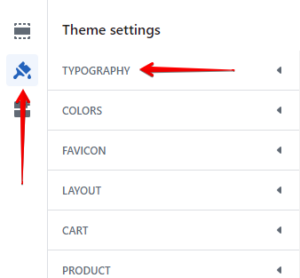
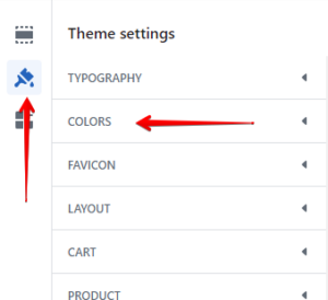
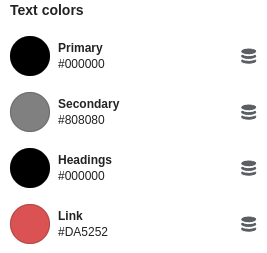
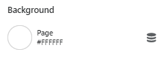
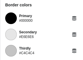
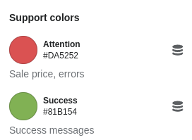
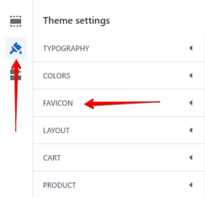
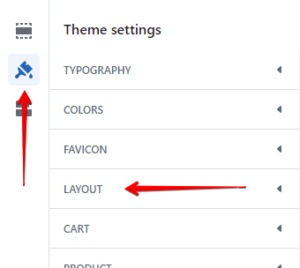
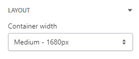
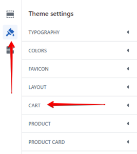
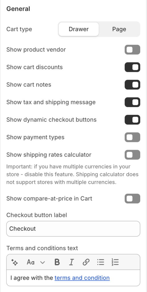
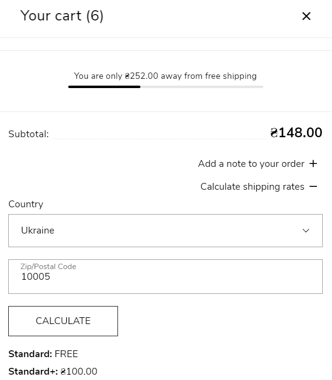
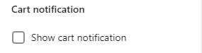
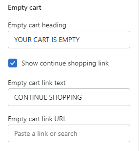
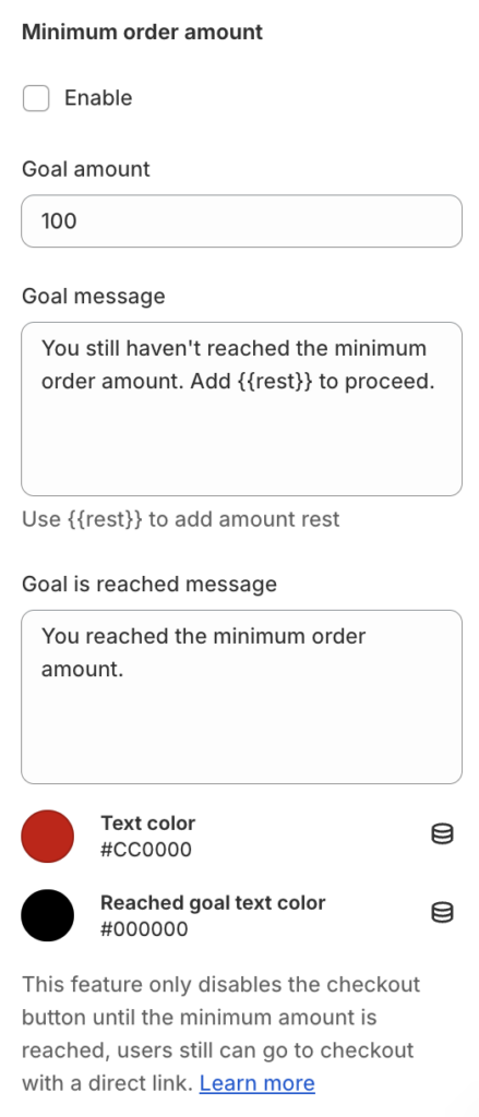

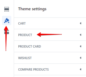
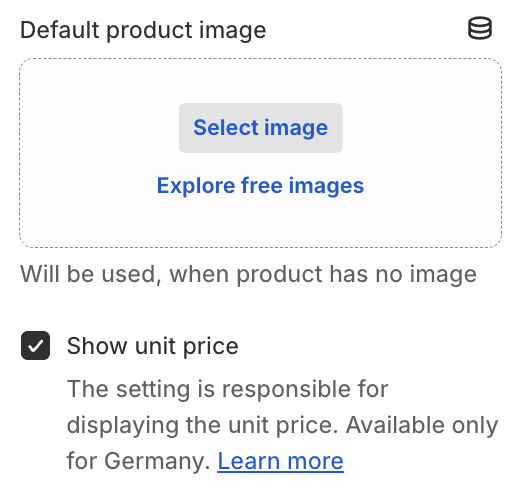
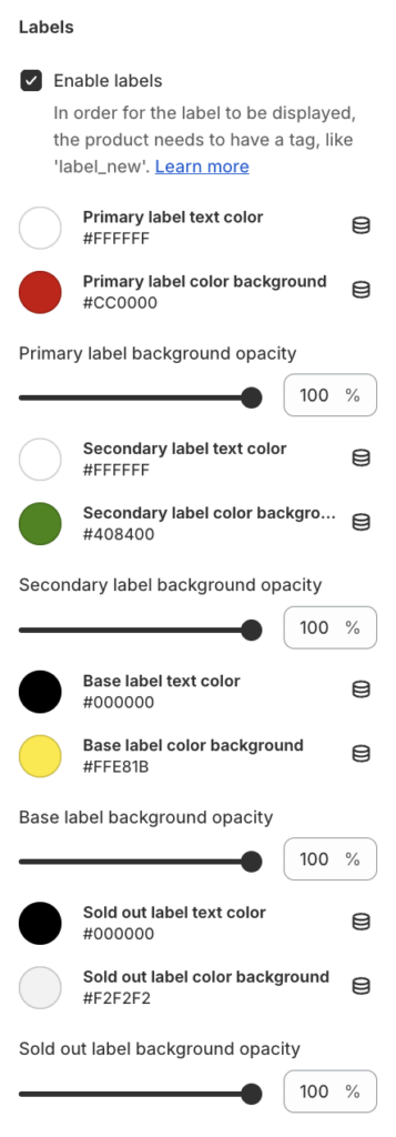
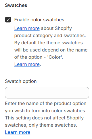
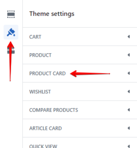
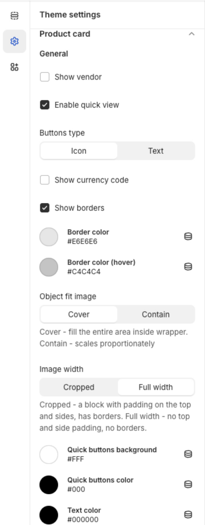
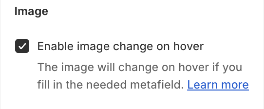
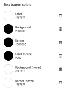
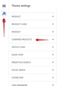
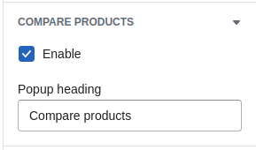

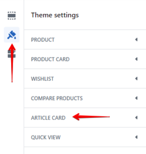
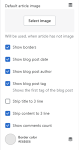

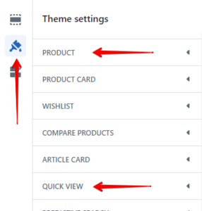
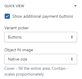
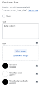
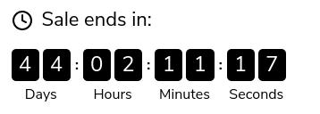
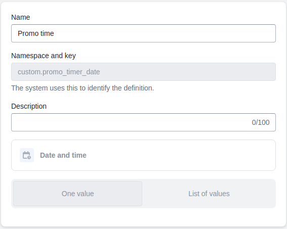
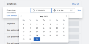
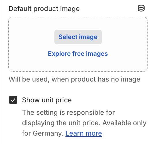
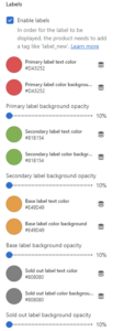
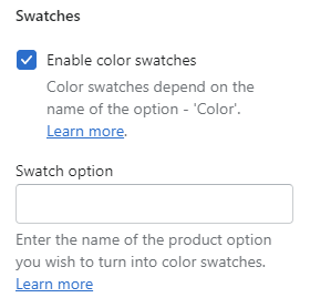
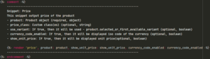
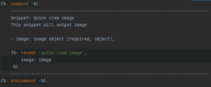
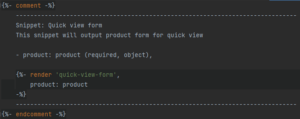
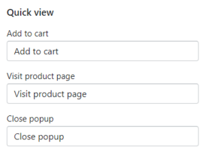
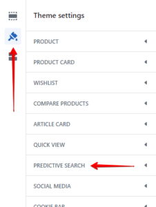
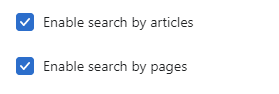
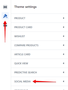
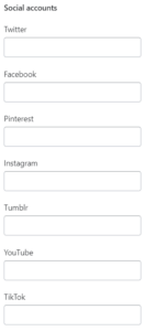
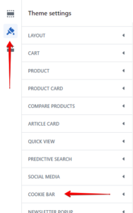
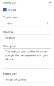
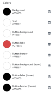
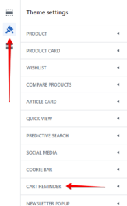
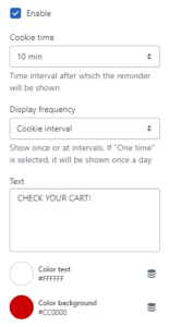
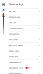
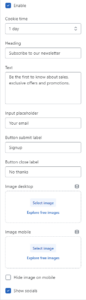
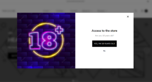
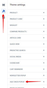
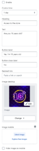

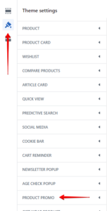
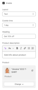
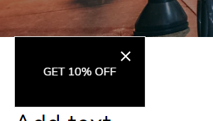
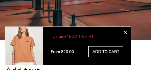
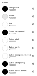
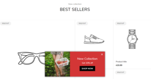
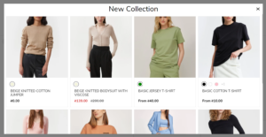
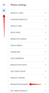
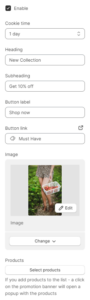
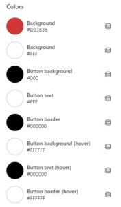

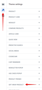
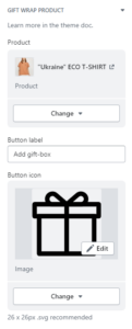
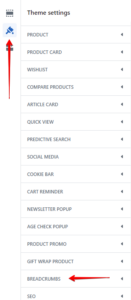

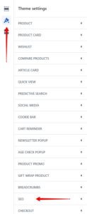

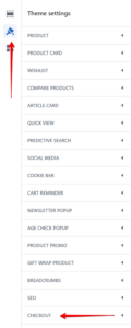
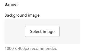
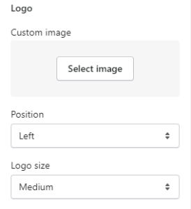
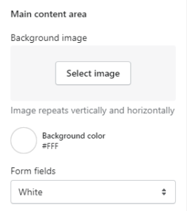
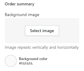
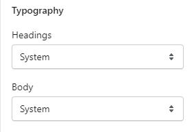
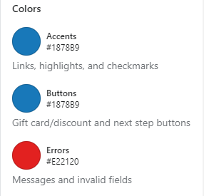
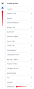
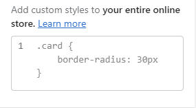
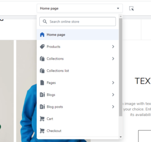
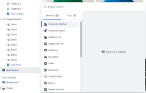
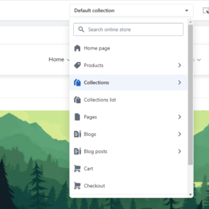

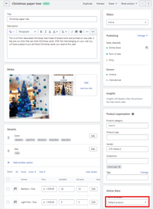

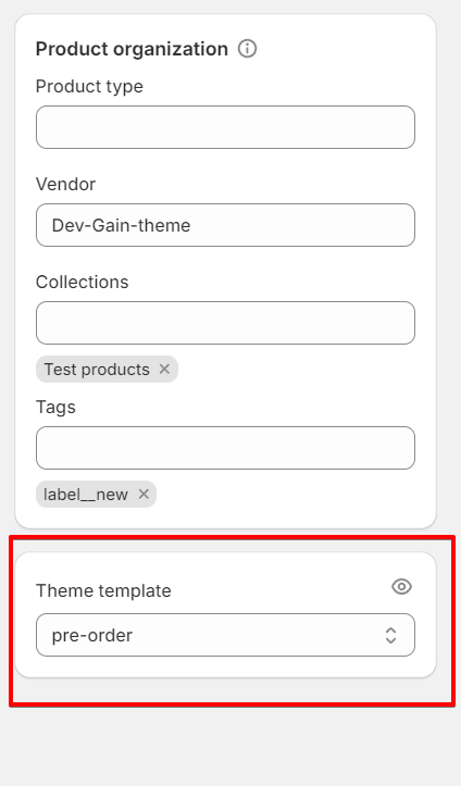
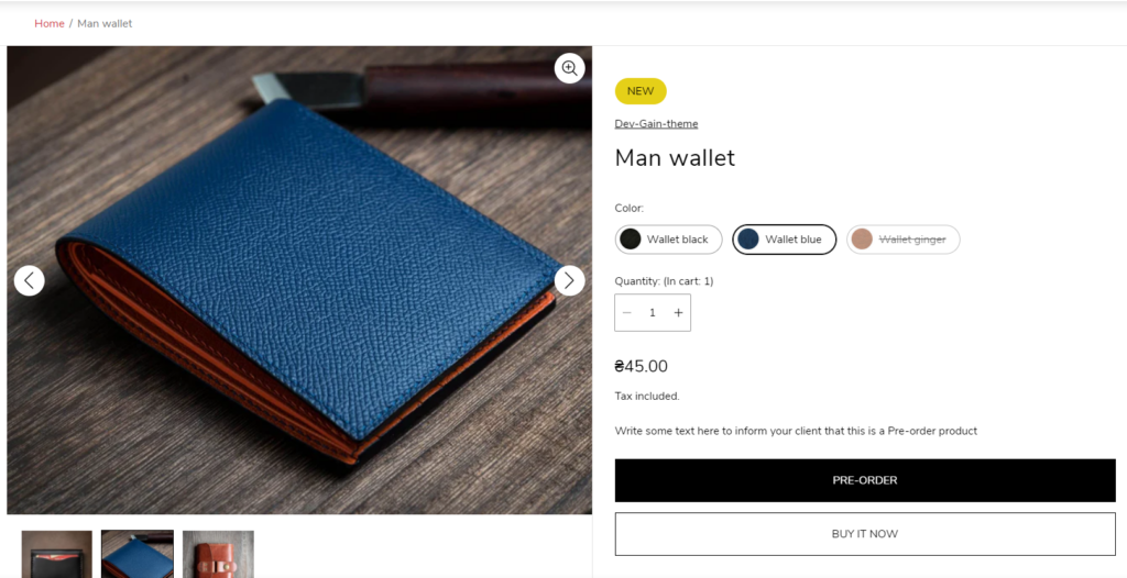
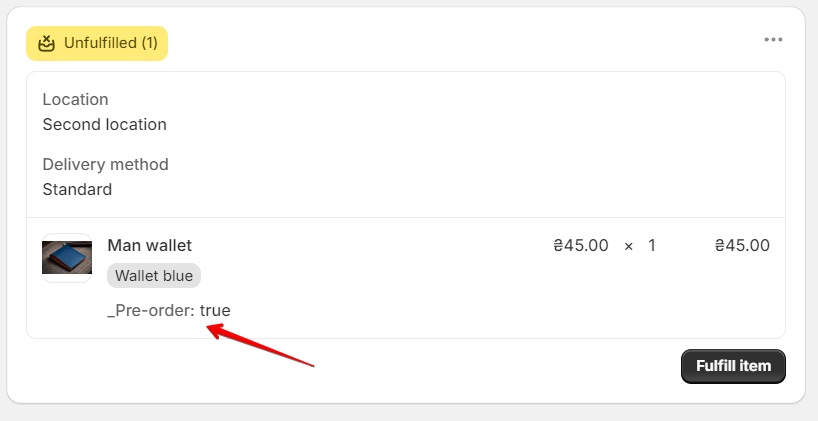
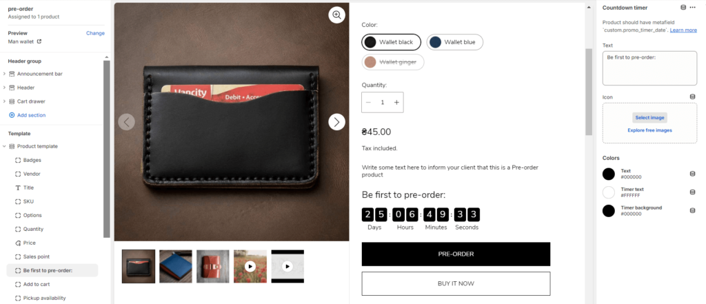
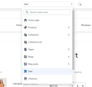
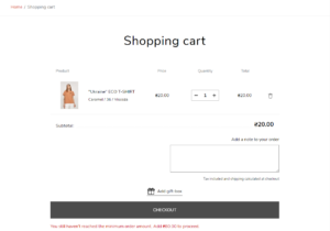
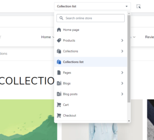

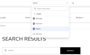
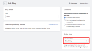

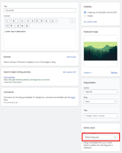

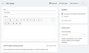
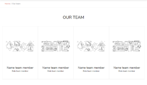
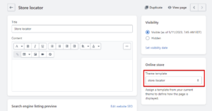
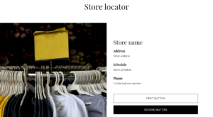
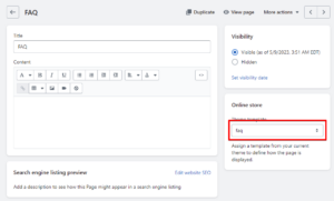
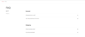
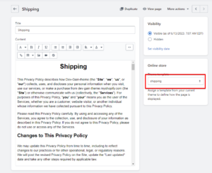
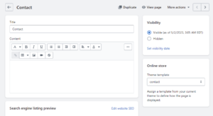
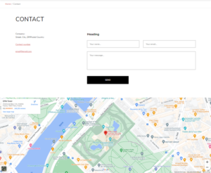
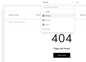
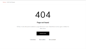
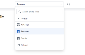
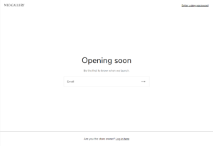
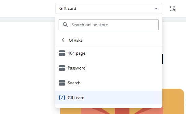
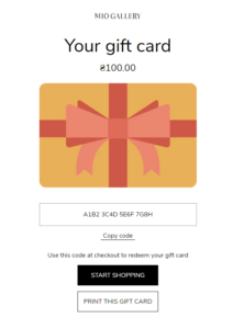
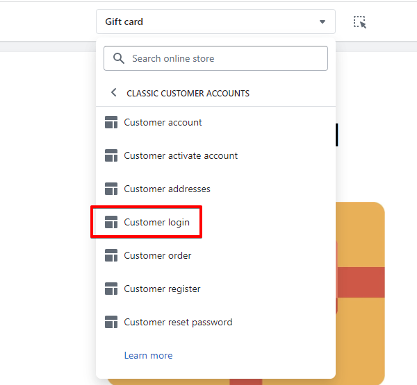
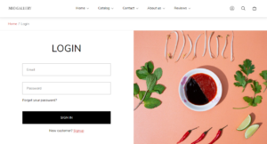
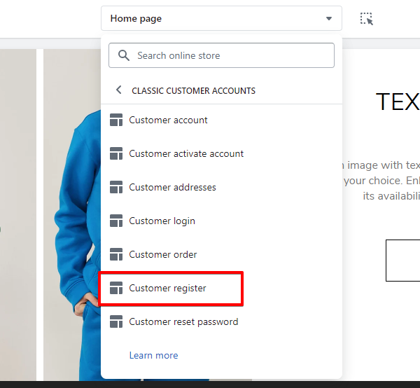
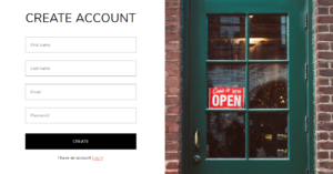
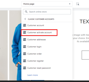
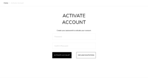
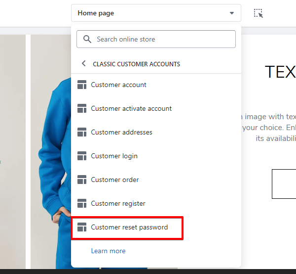
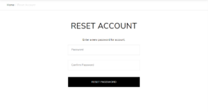
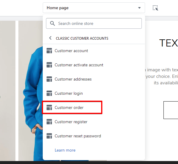
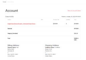
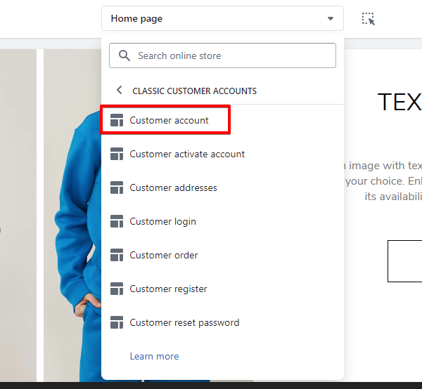
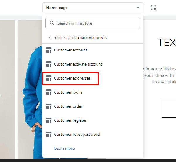
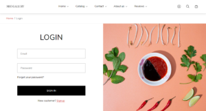




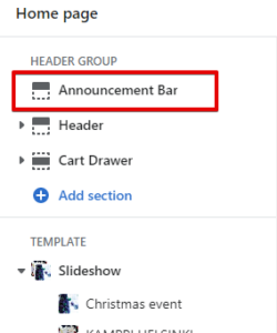
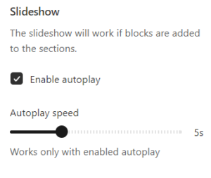
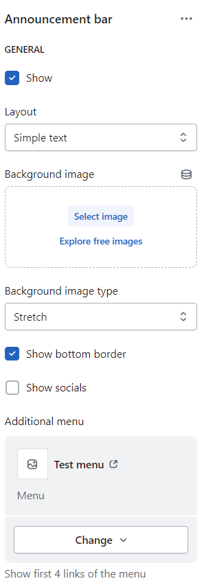
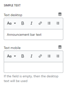
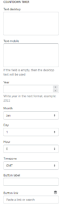
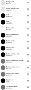
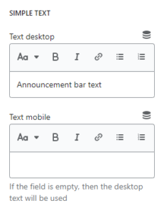
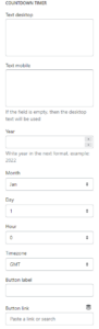

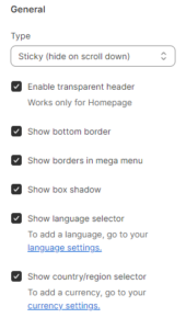

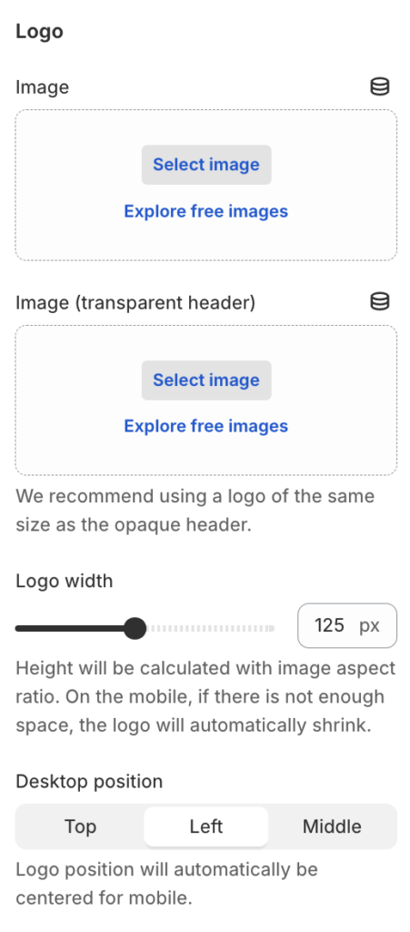




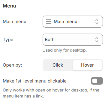


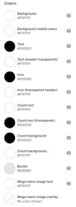

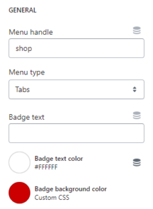
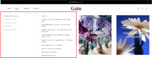
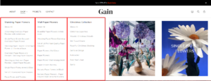
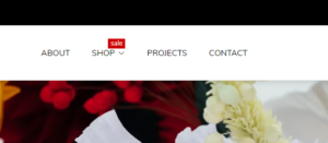
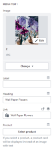
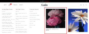
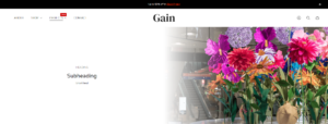
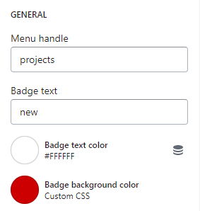
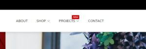
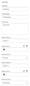
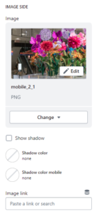
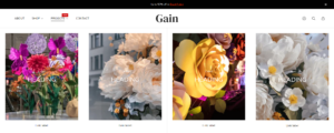
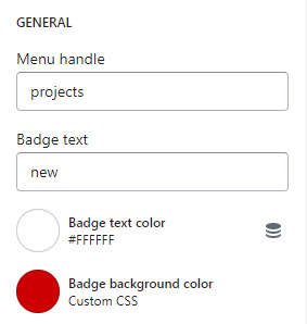
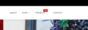
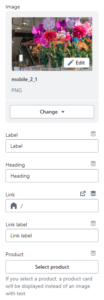
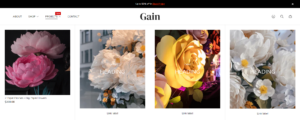
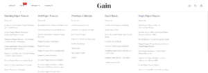
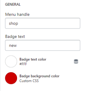
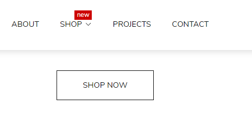
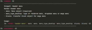
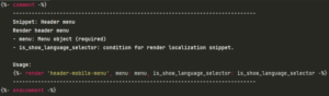
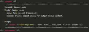
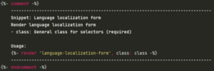
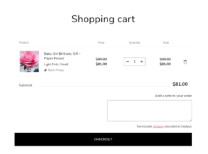
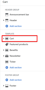
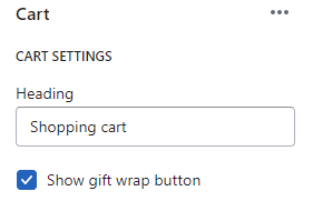
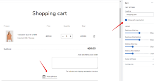
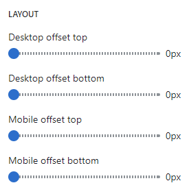

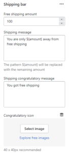
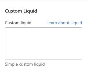
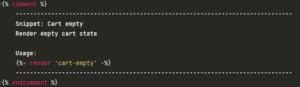
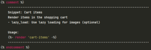
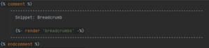

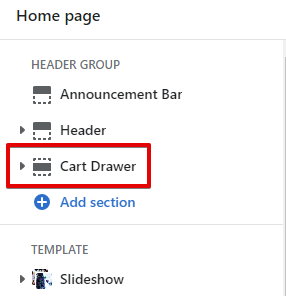
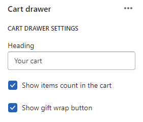
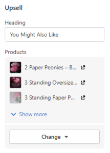
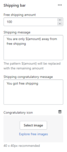
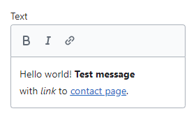
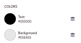
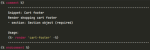
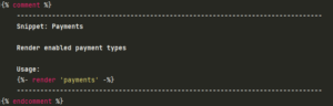
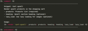
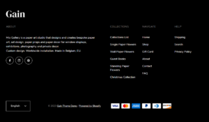
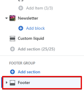
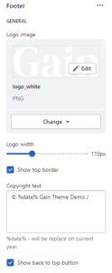
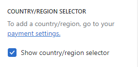
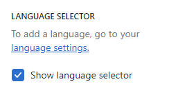
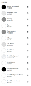
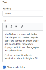
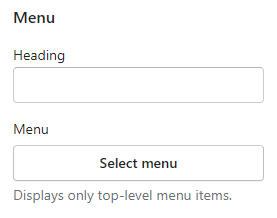
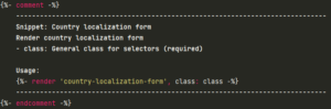

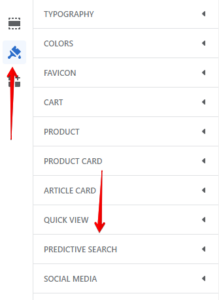
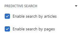
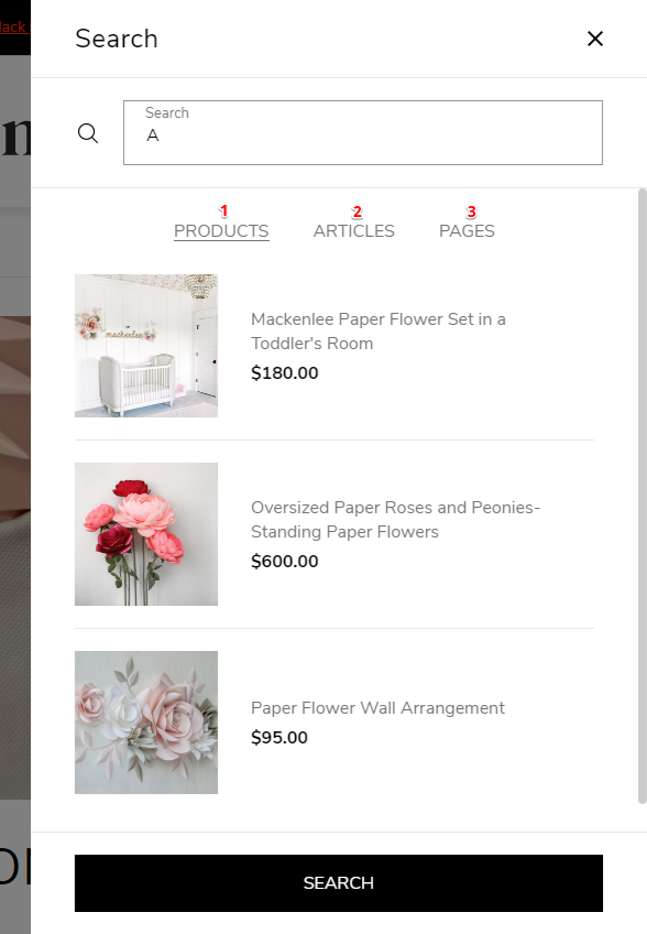
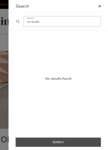

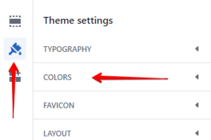
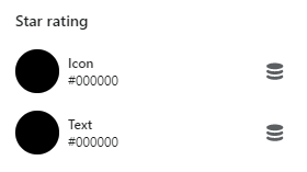
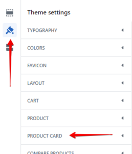
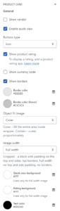
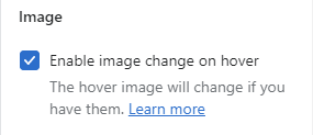
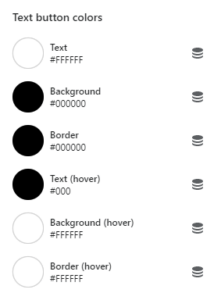
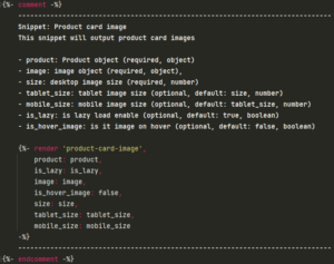
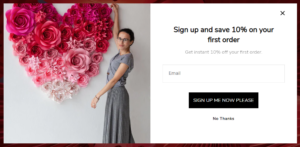
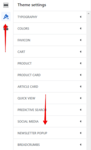
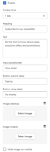
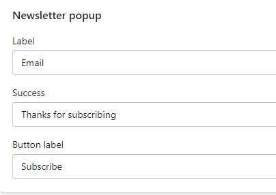

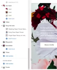
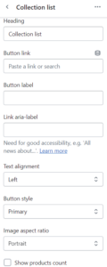
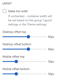
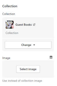

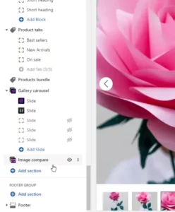
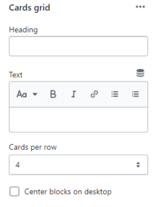
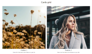
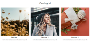
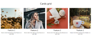
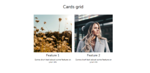
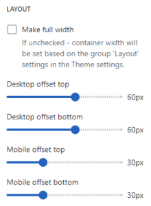
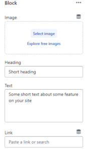

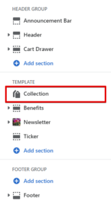
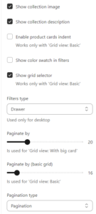
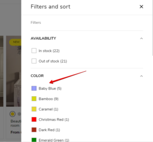
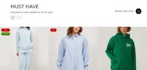
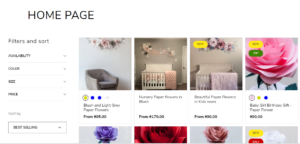
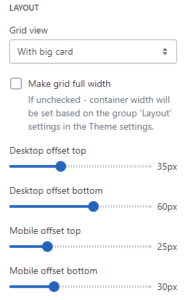

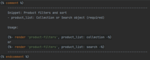
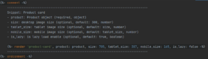

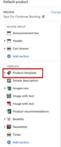
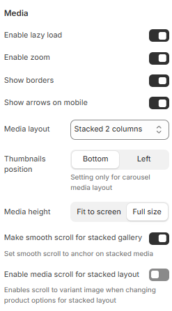


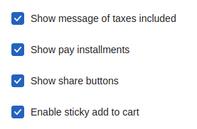

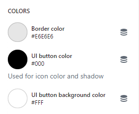
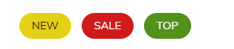
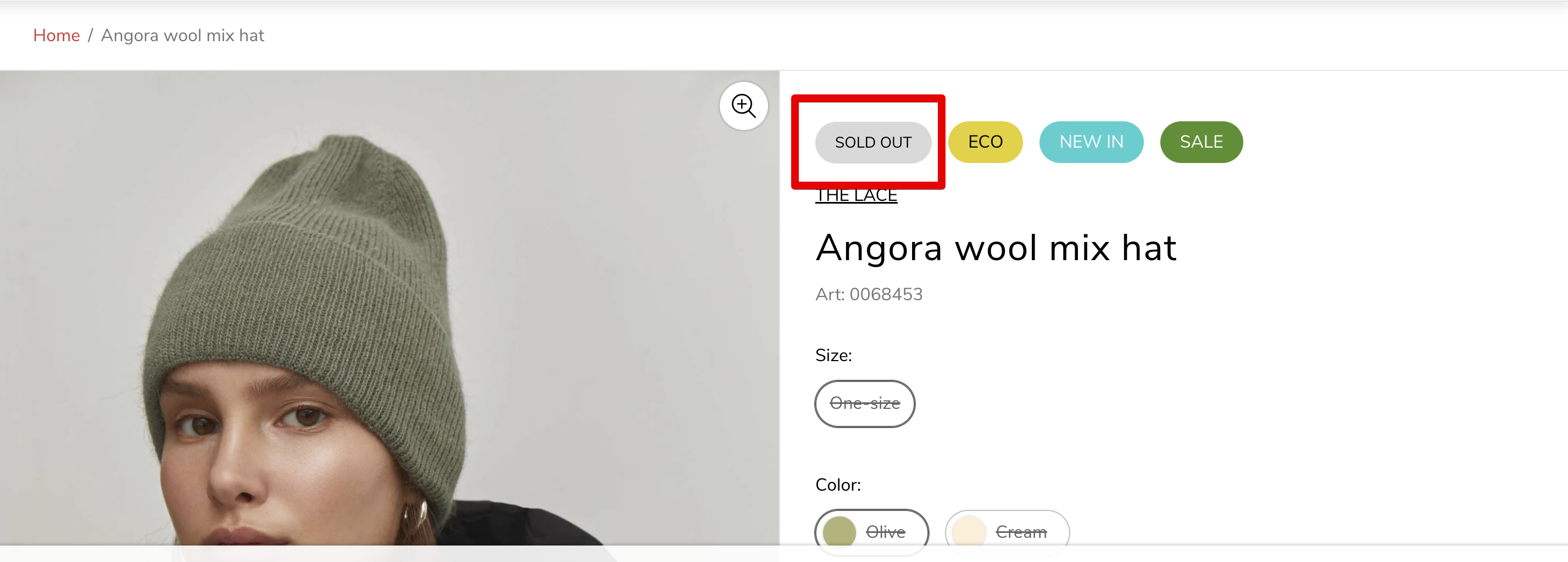

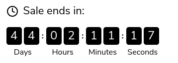
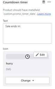
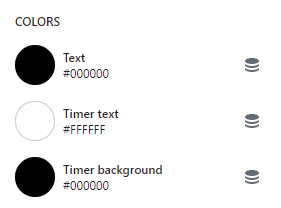
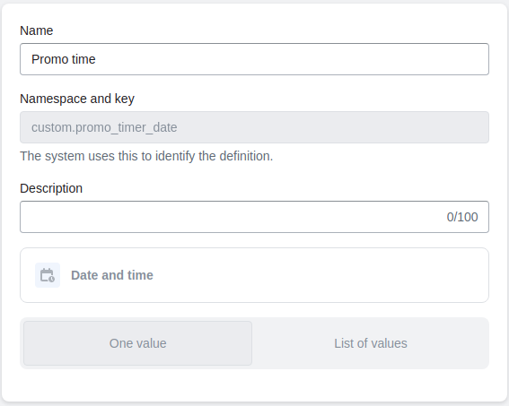
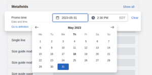
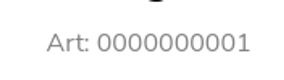
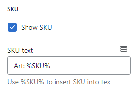
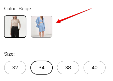
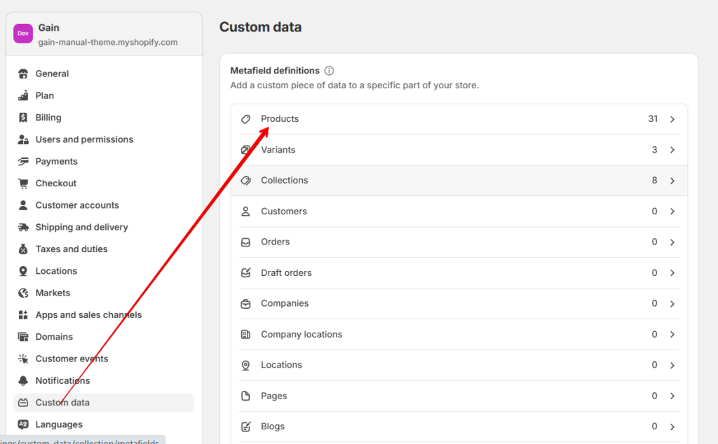
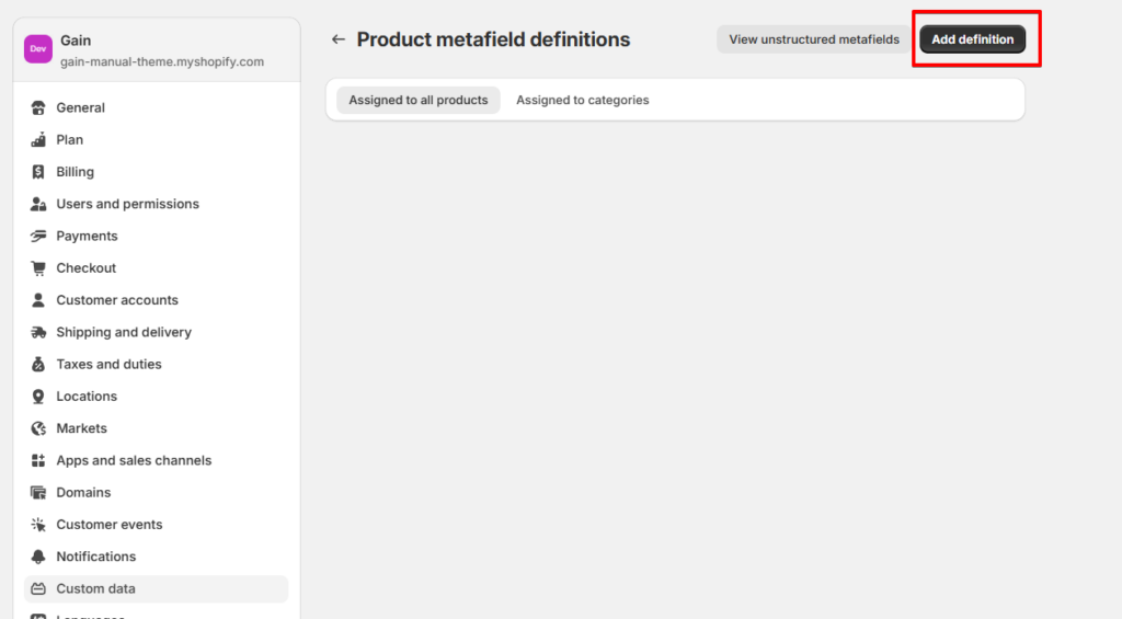
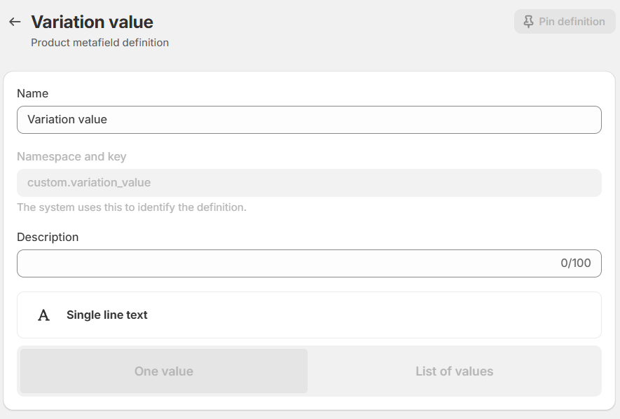
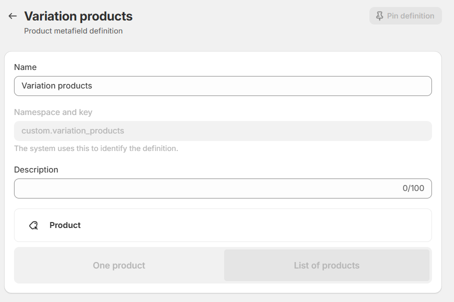
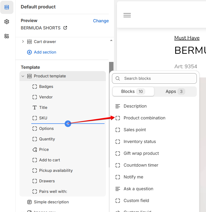
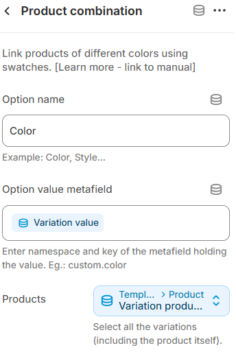
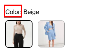
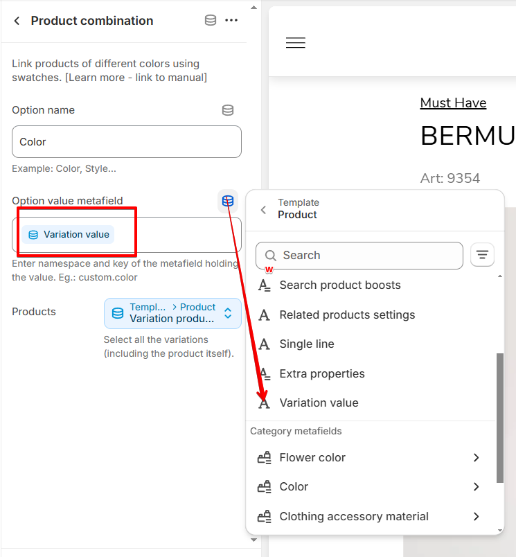
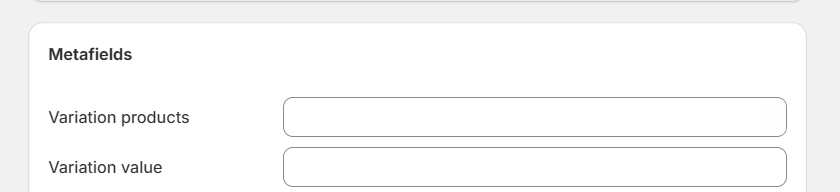 For “Variation value,” enter the option value for the variation (if you want to create variations based on the color, then the variation value should hold the actual color value for this product, such as “Red,” “Blue,” “Green” etc). For the “Variation products” metafields, select all the product variations that should appear in this product (make sure to include the product itself as well).Finally, repeat the same process for every variation product by adjusting the variation value for each product (the “Variation products” metafields, on the other hand, should contain the same list of products for every product within a group).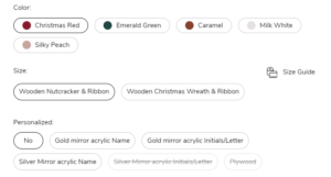
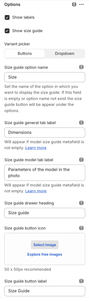

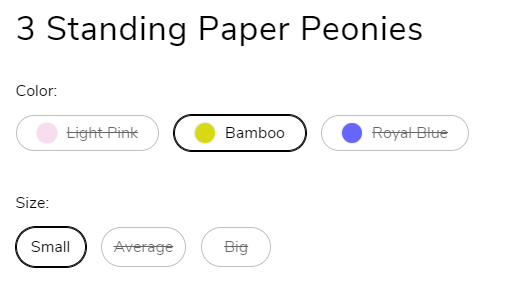
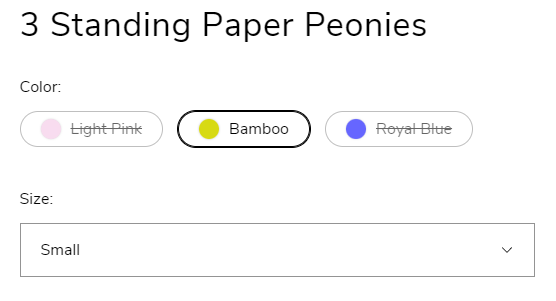
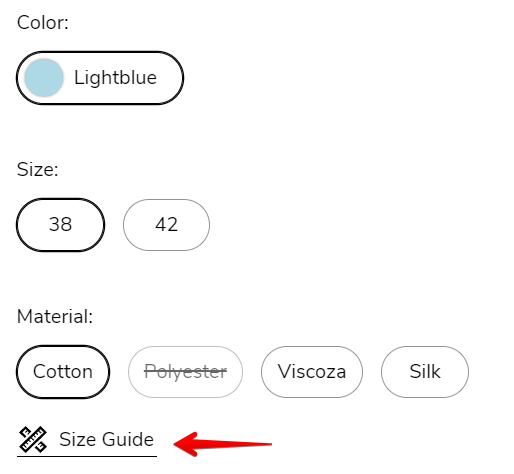
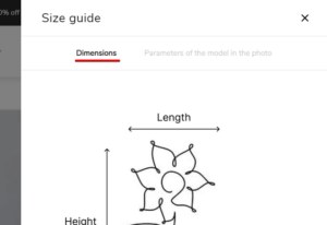
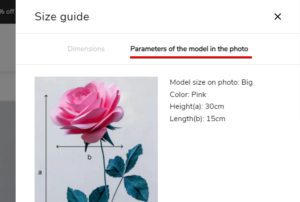
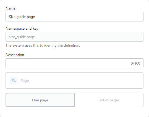
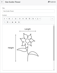
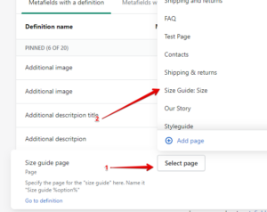
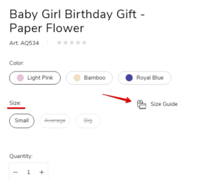 If field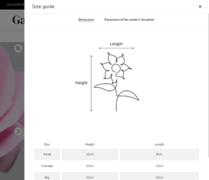
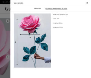
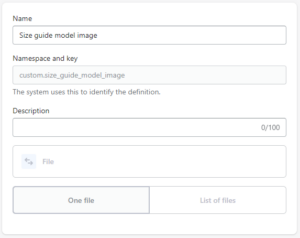
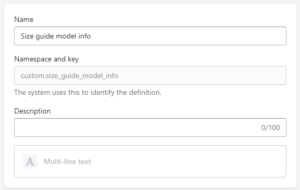
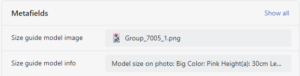

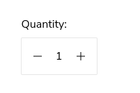
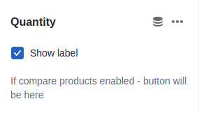
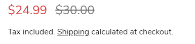
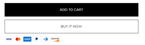
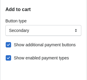
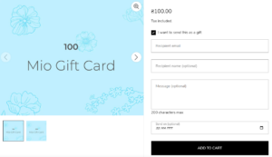
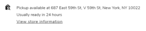
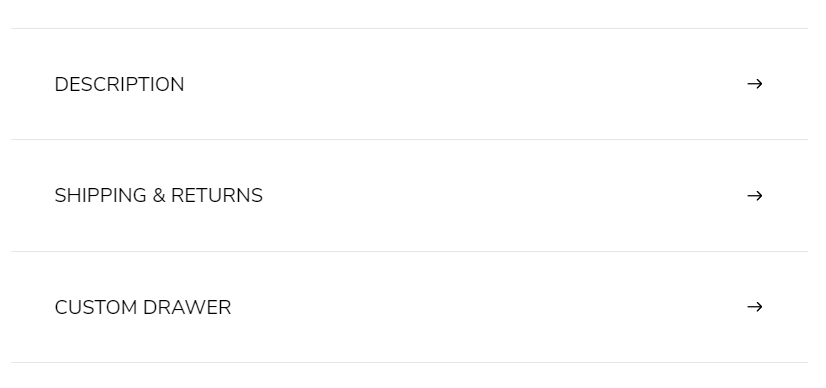
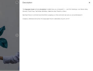
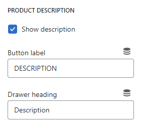
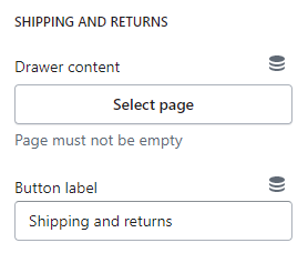
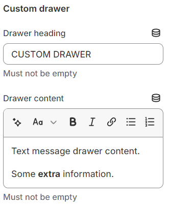
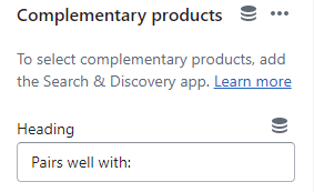
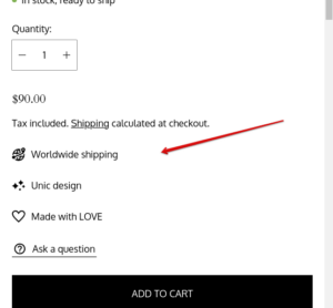
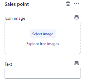
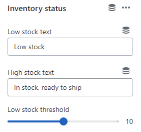

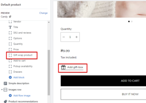
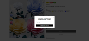
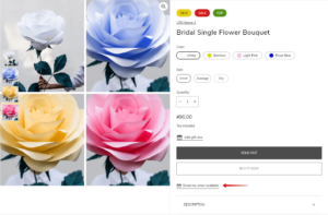
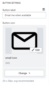
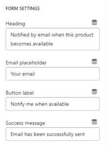

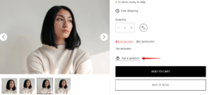
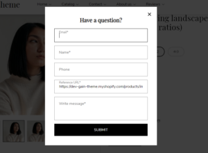
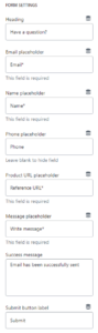
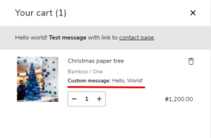
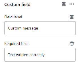
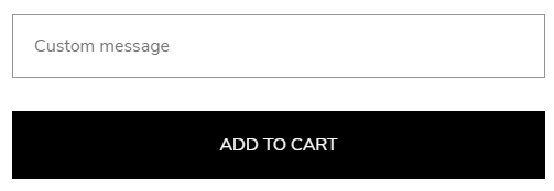
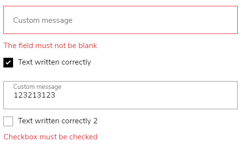
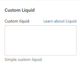
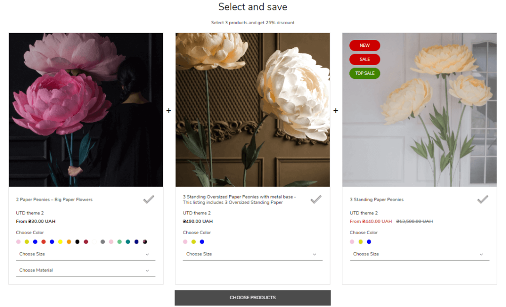
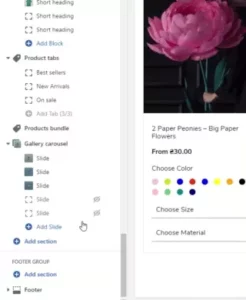
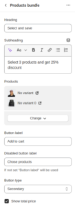
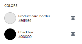
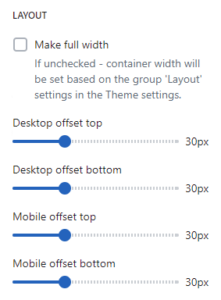

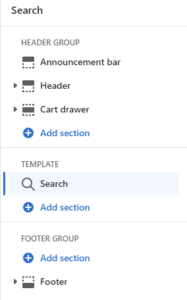
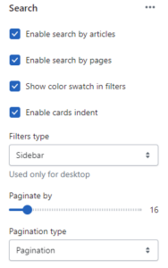
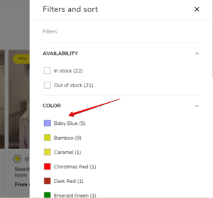
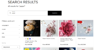
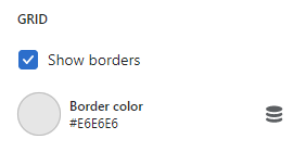
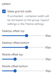
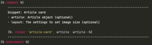
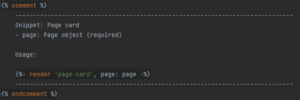

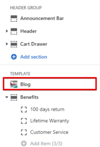
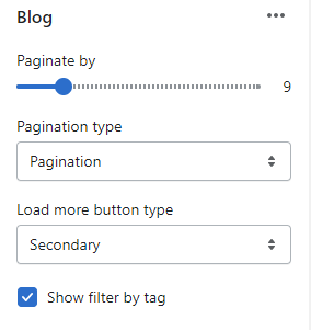
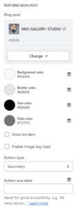
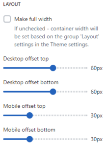
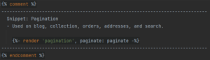

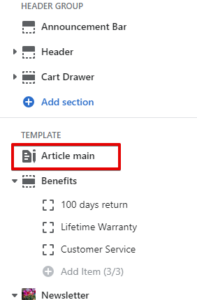
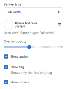

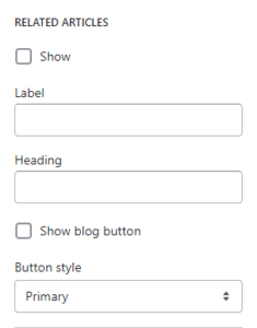
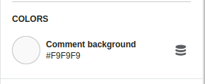
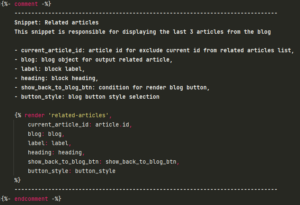
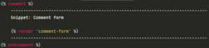
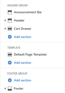
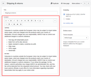

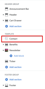
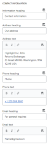
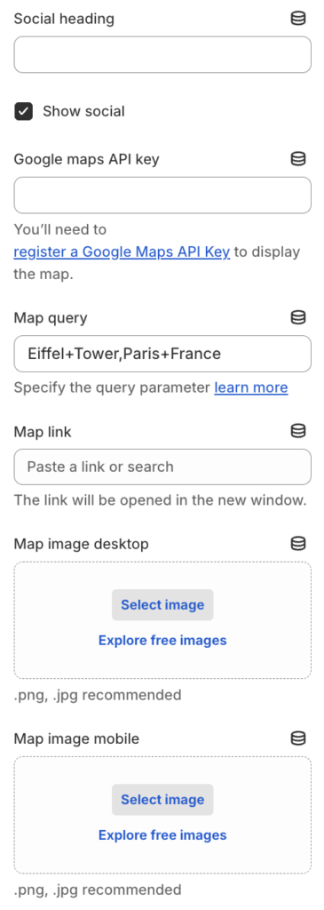
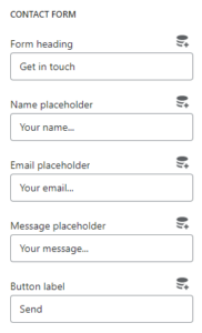
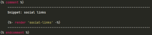

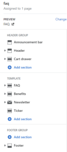
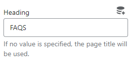
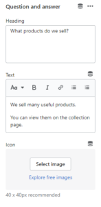

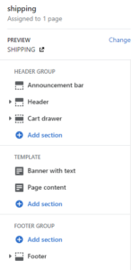
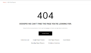
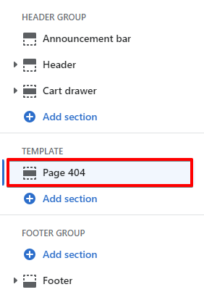
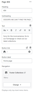
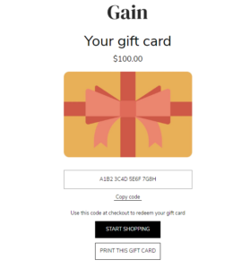
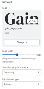

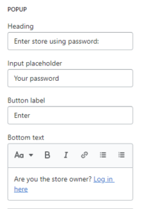
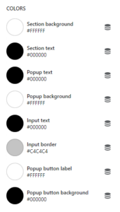
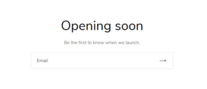
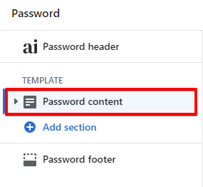
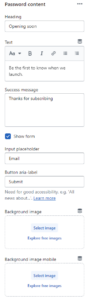
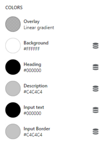

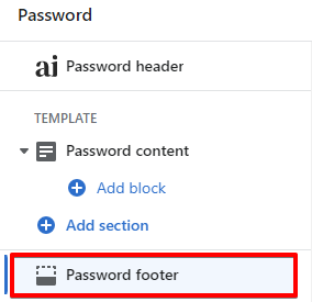
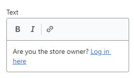
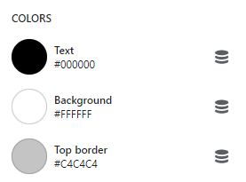

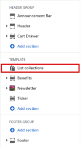
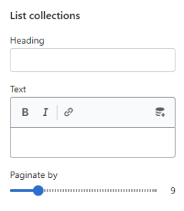
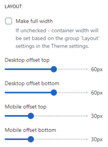
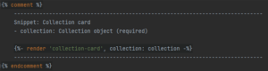
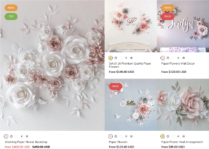
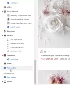
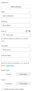
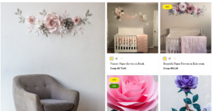
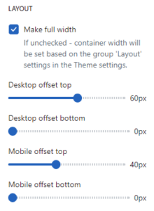
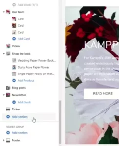
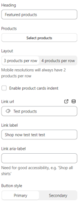
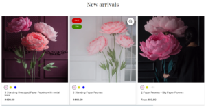
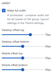
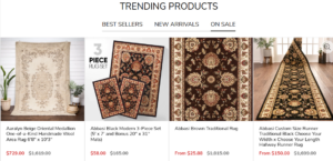
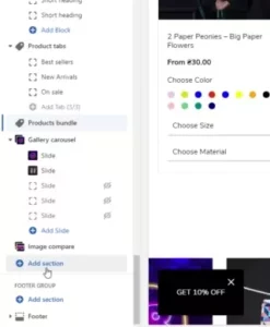
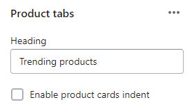
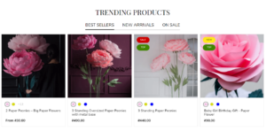
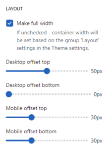
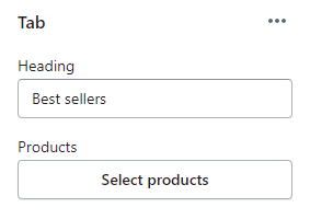
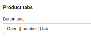
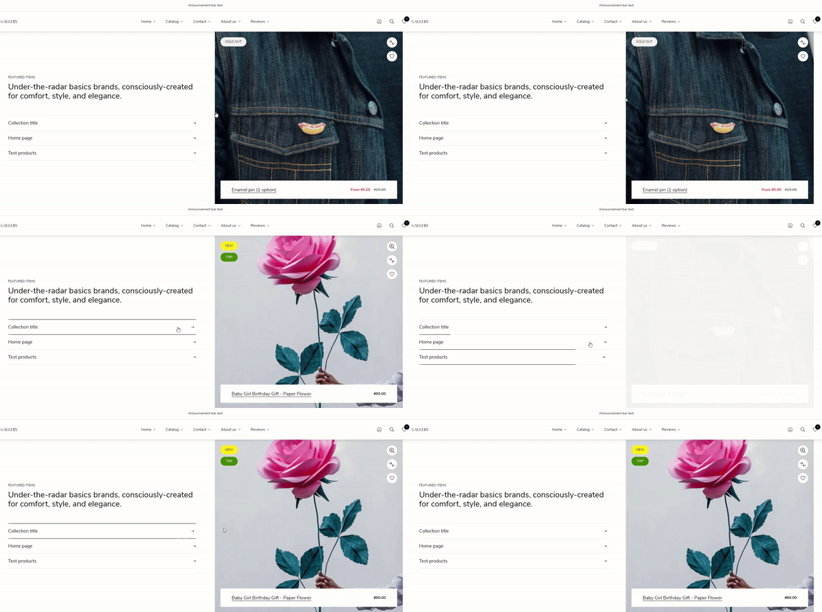
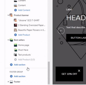
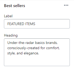
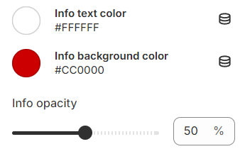
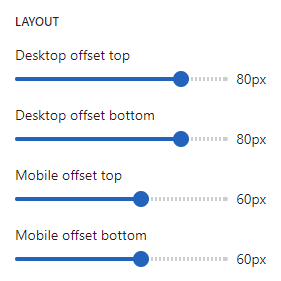
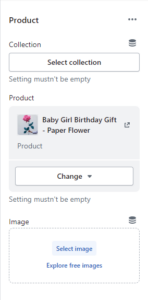

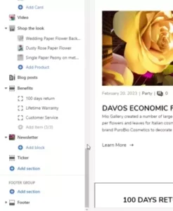
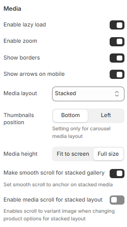


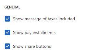


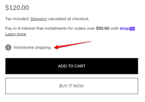
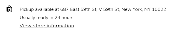
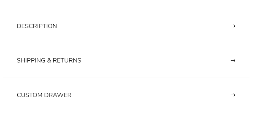
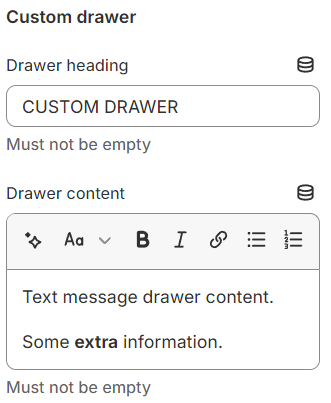
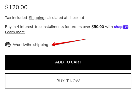
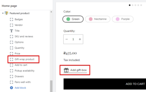
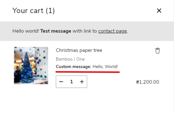
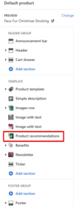
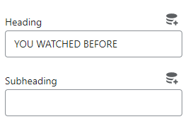
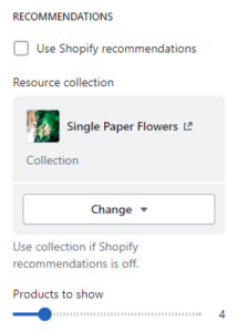
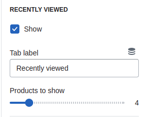
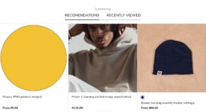
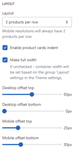


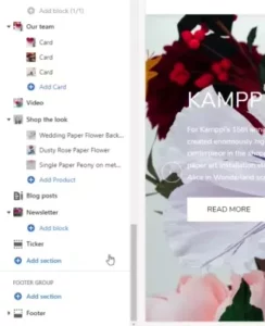
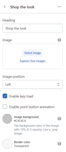
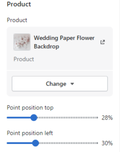
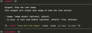

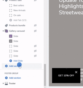
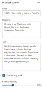
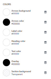
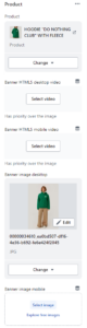
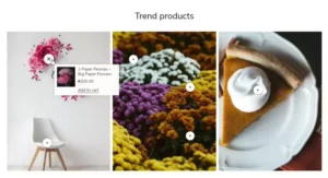
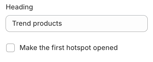
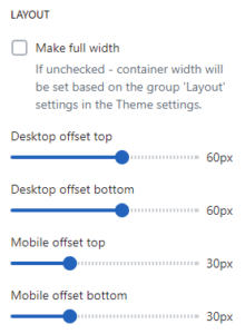
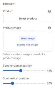
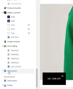
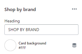
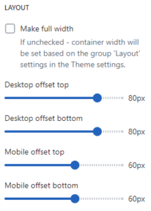
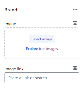

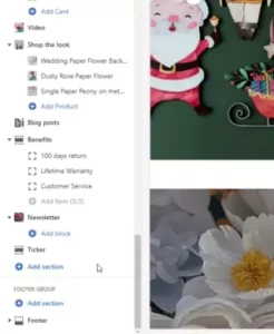
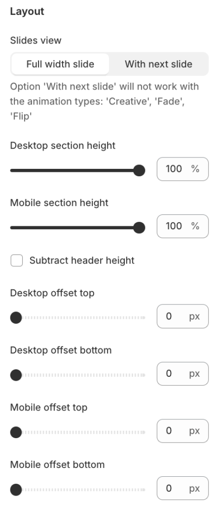


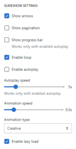





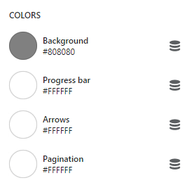
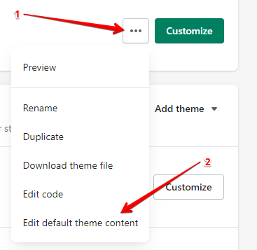
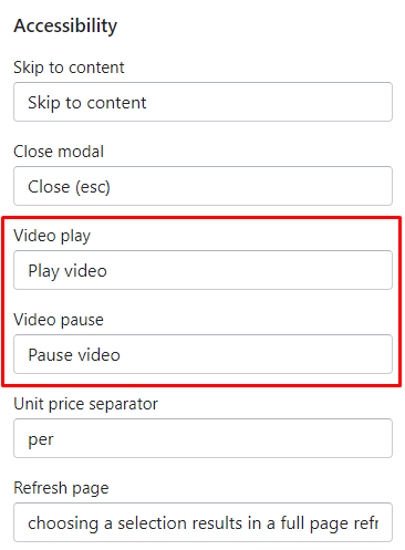
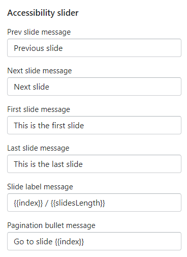
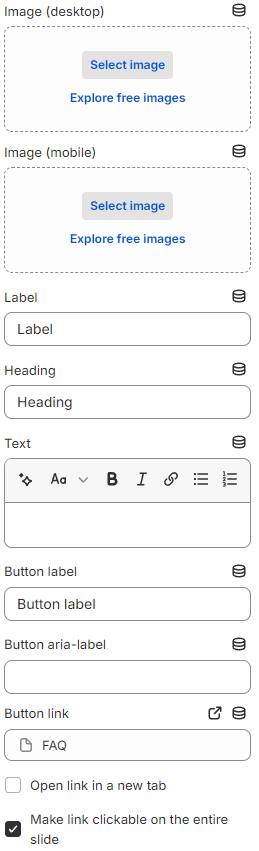
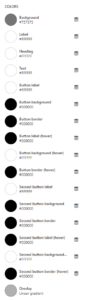
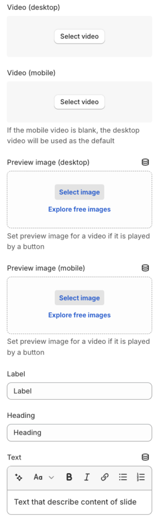
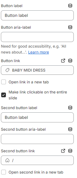
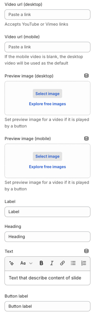
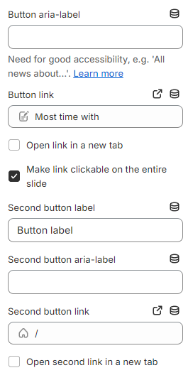
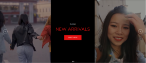
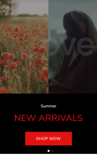
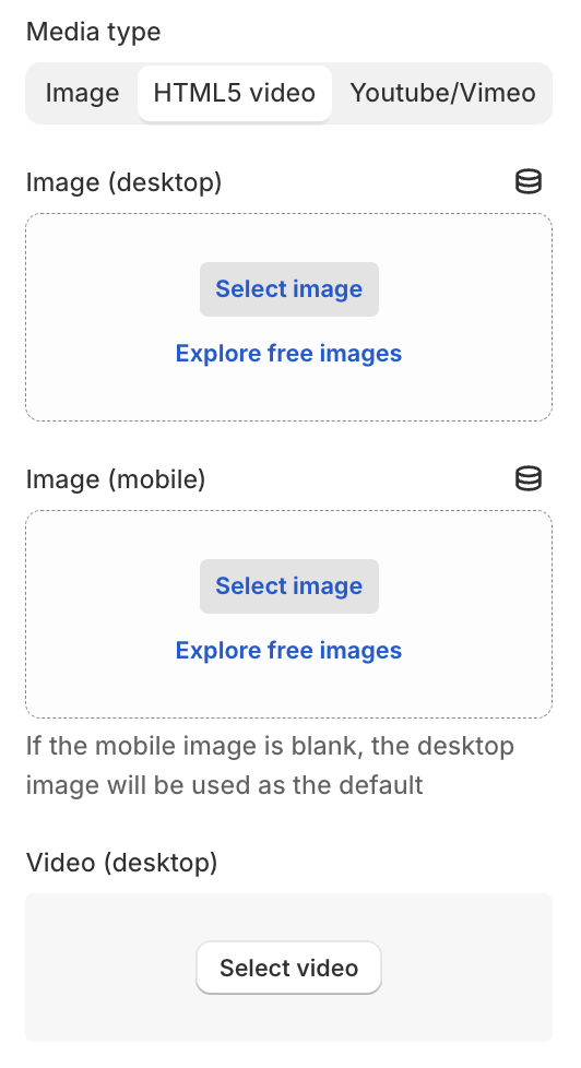
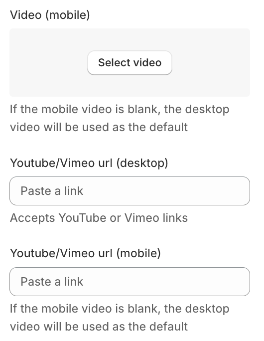
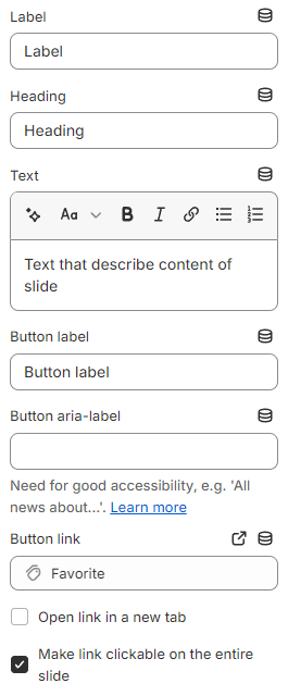
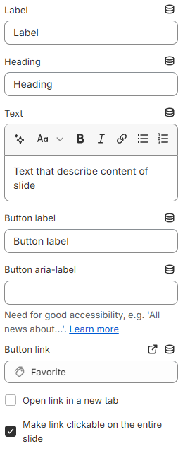
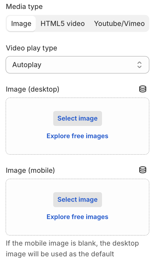
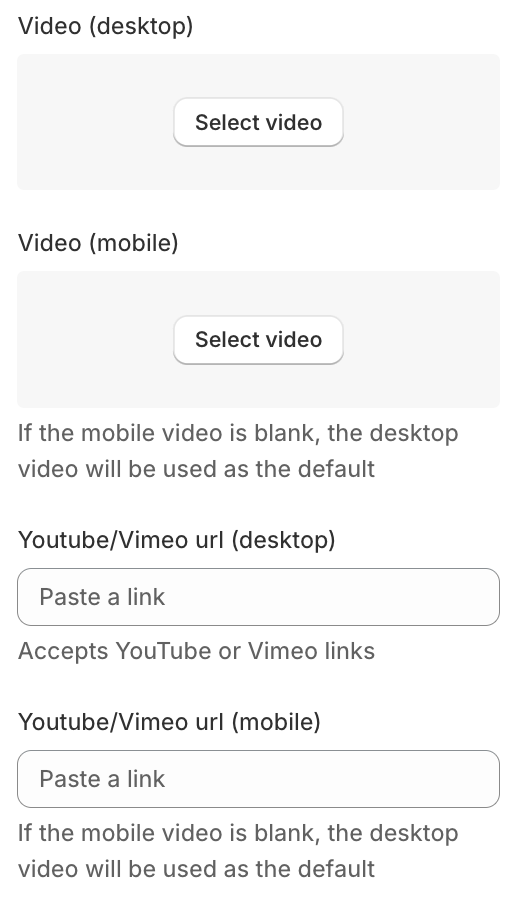
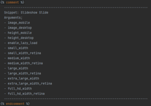

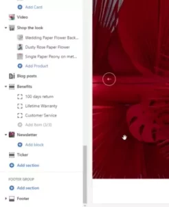
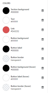
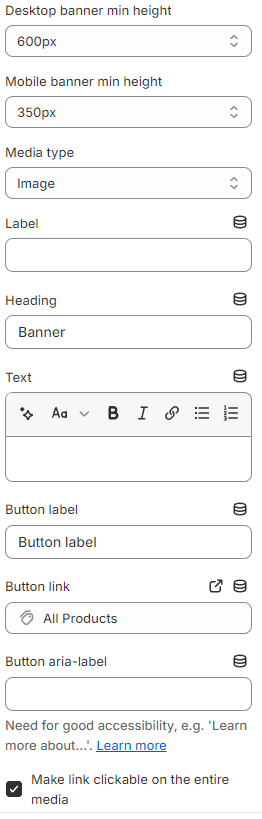
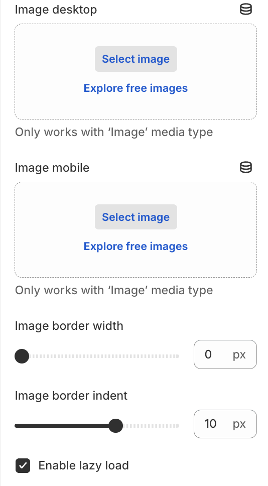
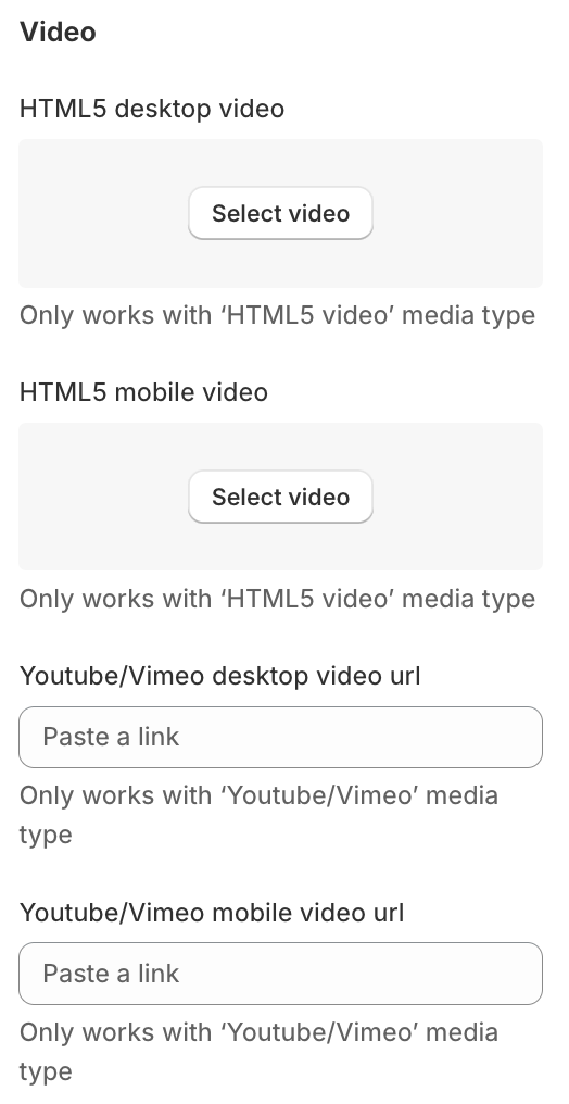
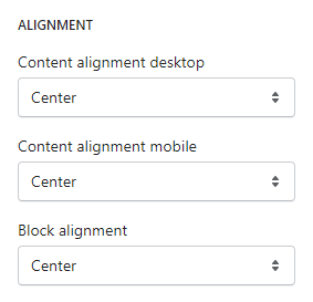
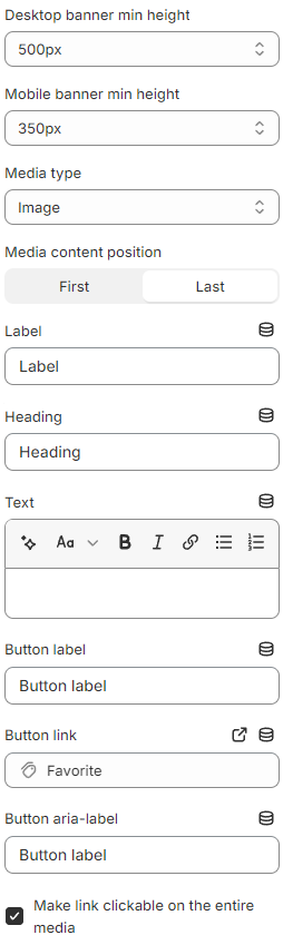
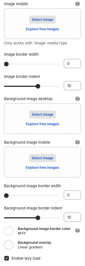
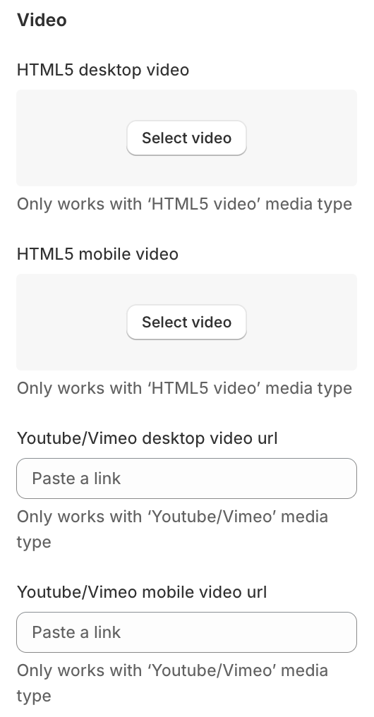
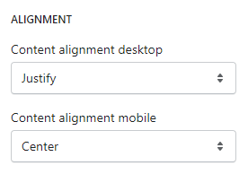
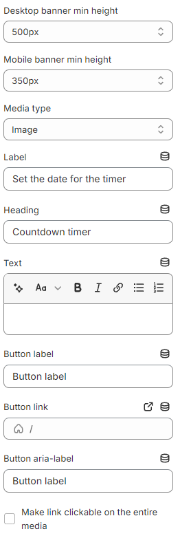
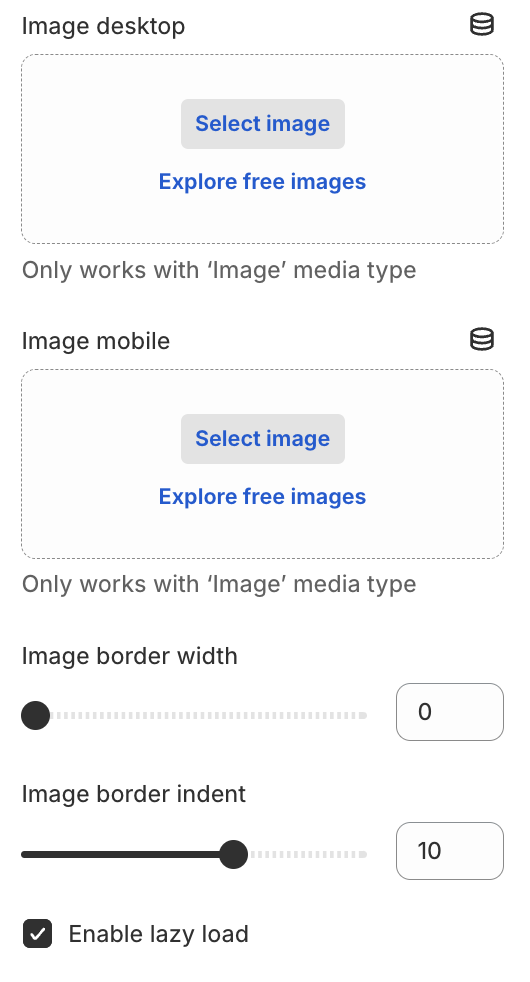
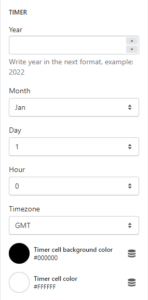
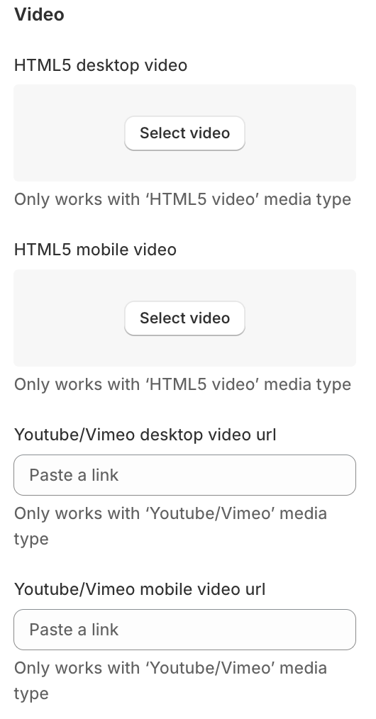
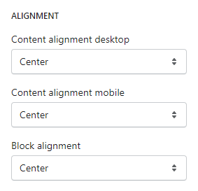
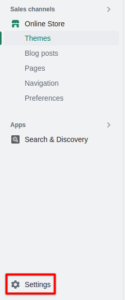
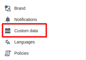 Go to ‘Collections’