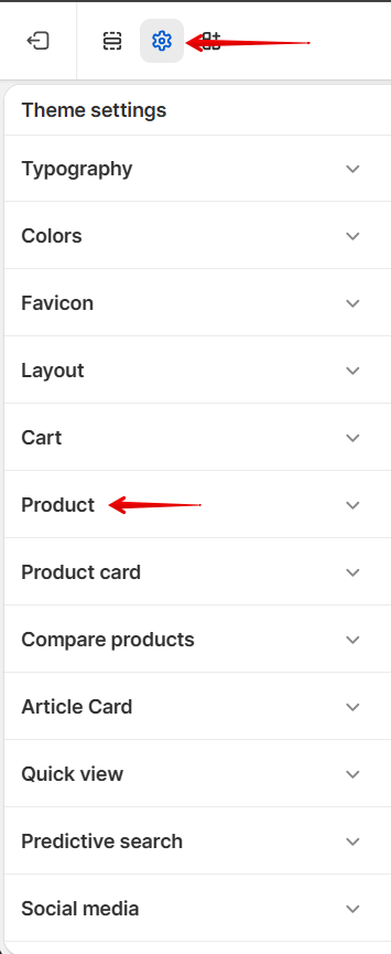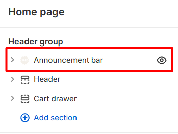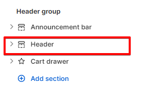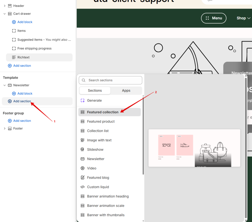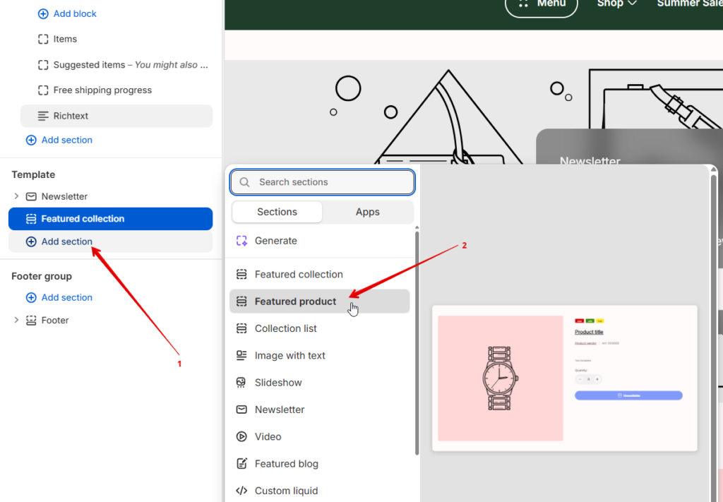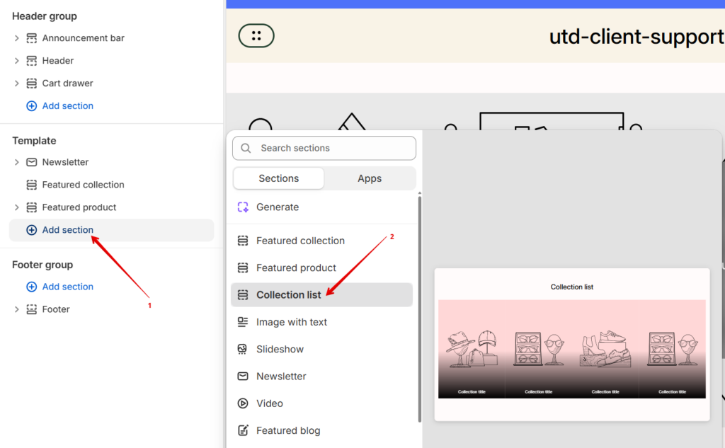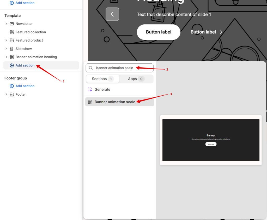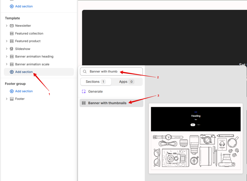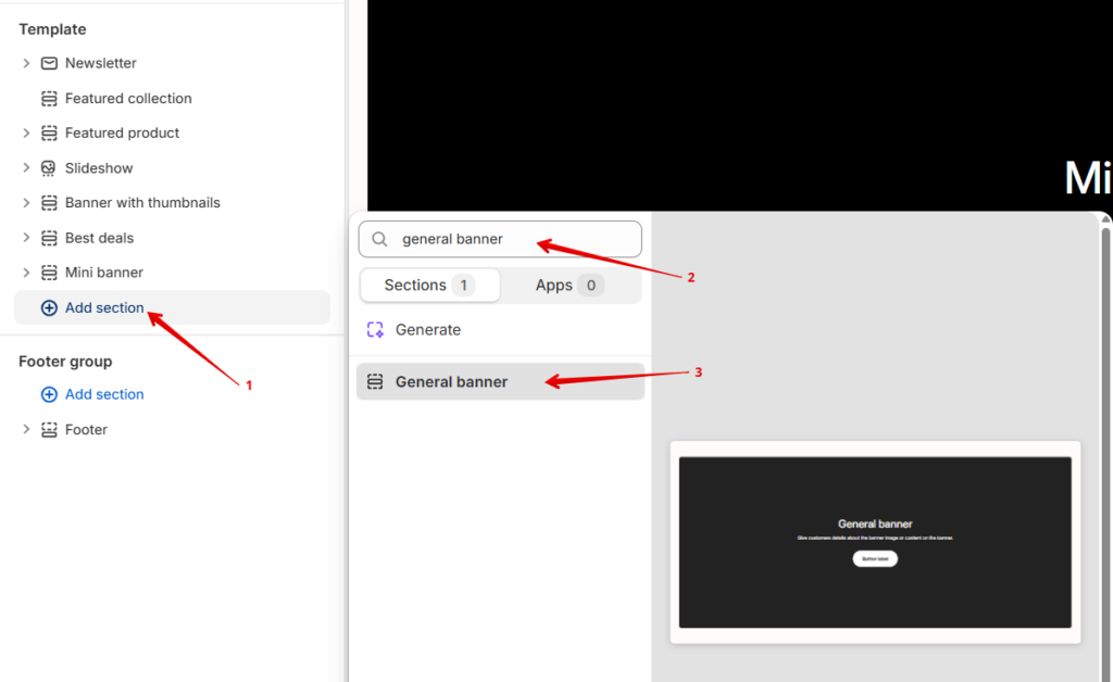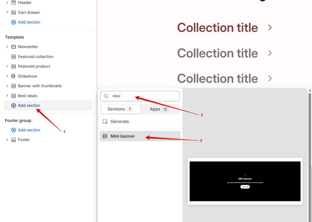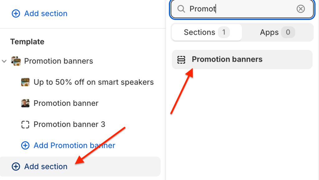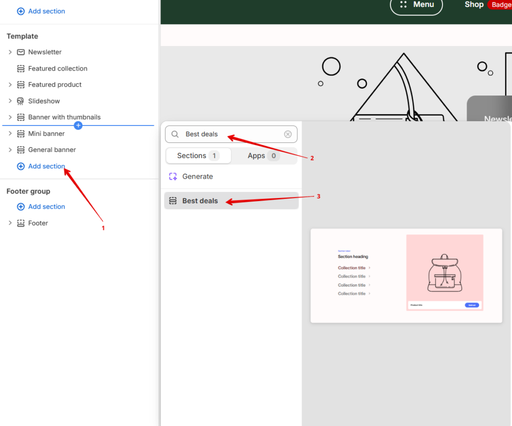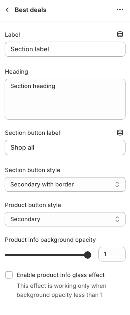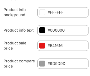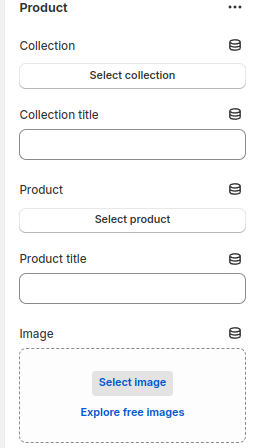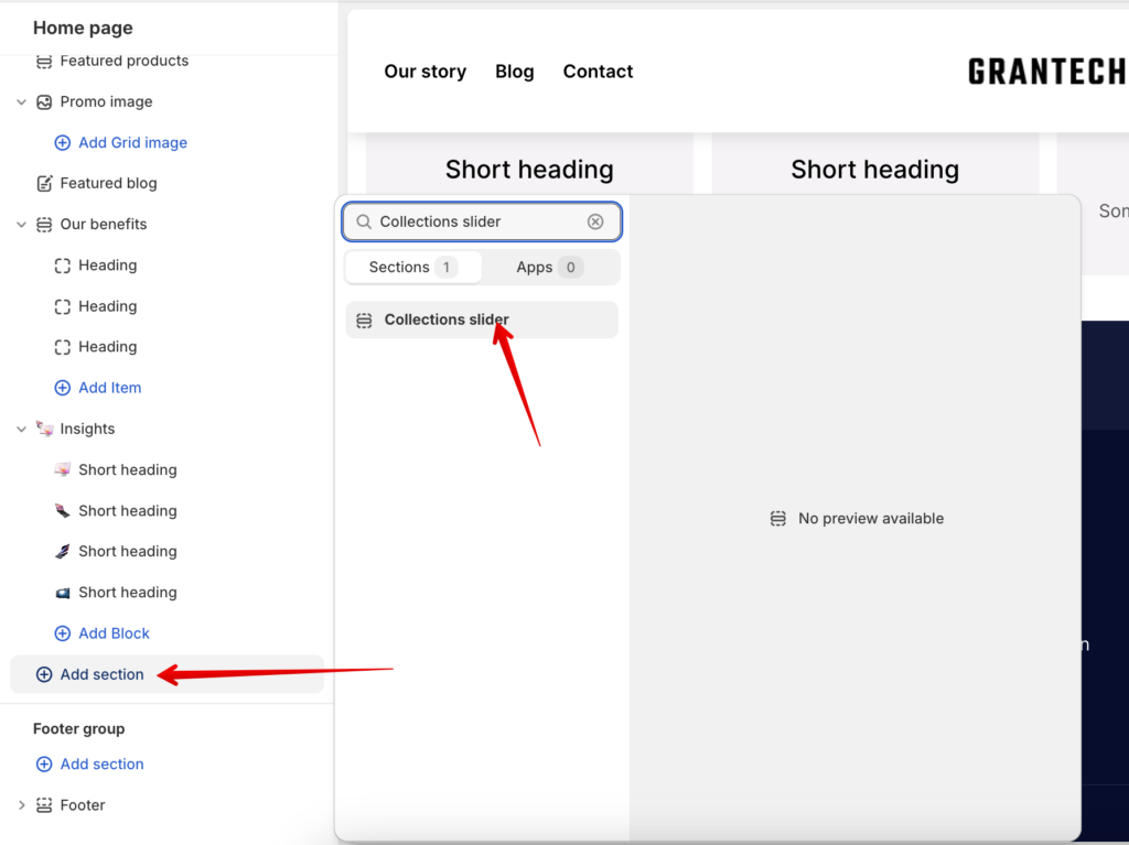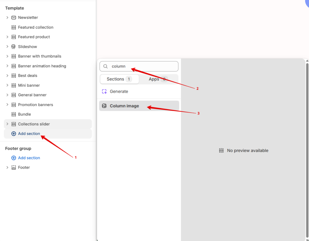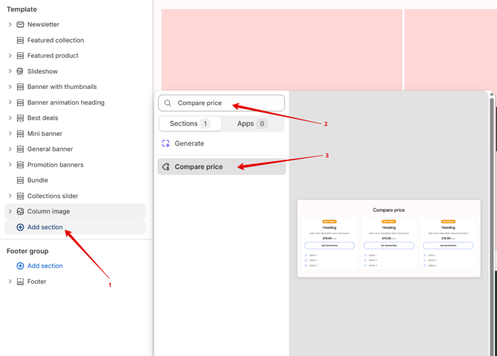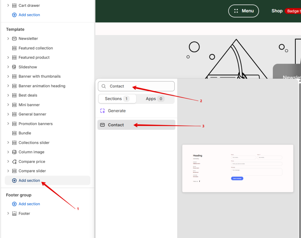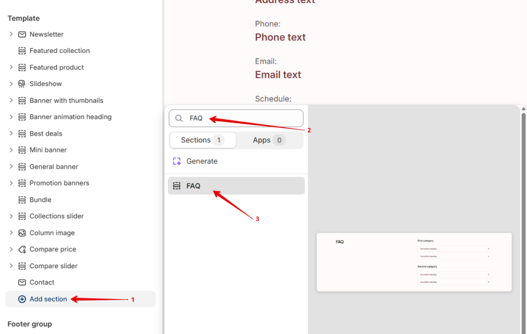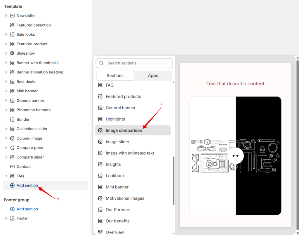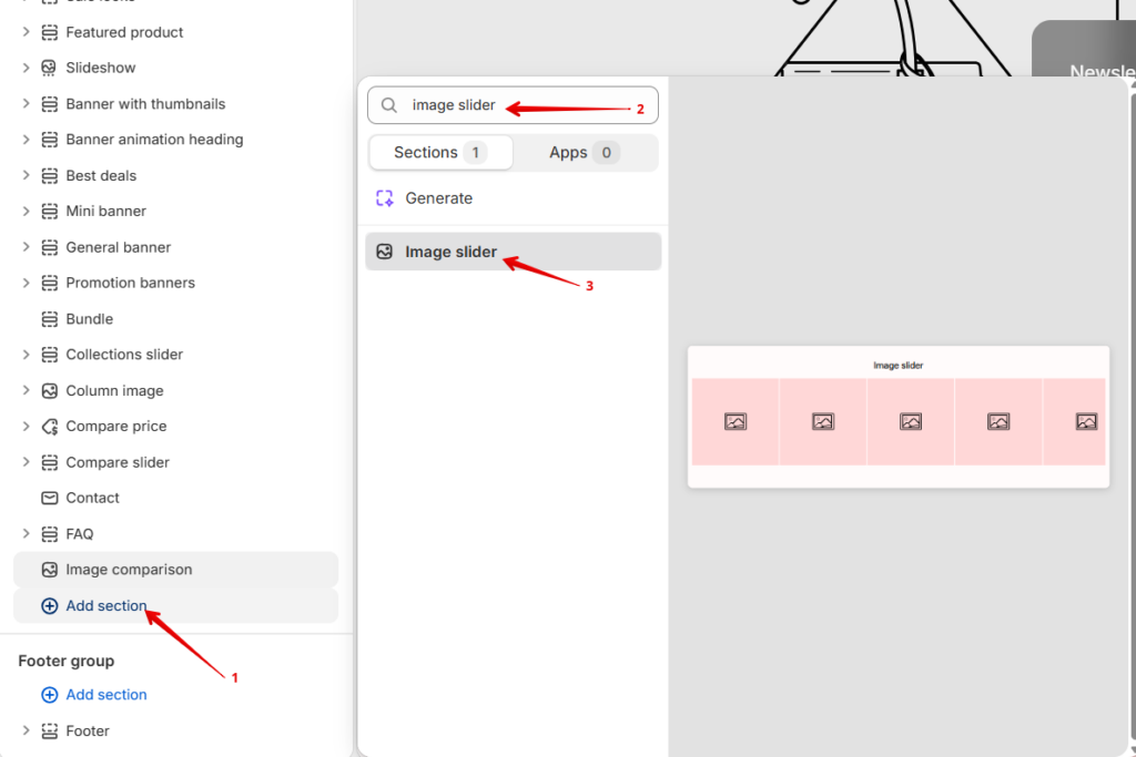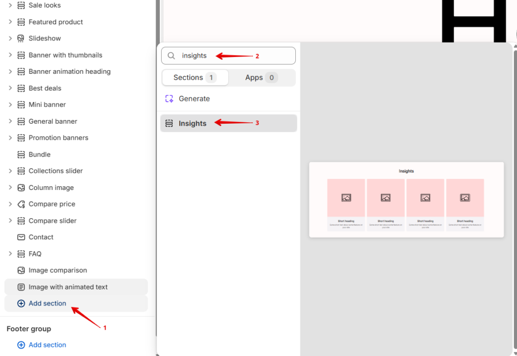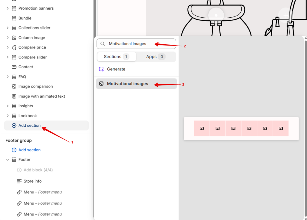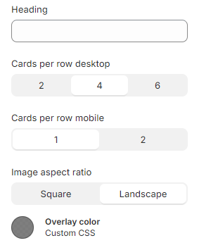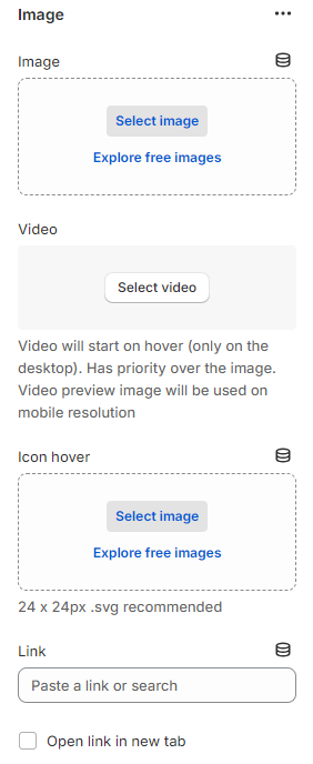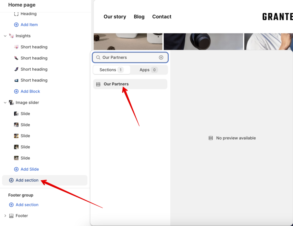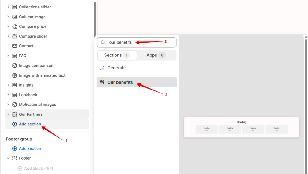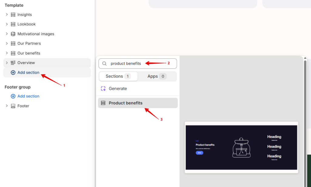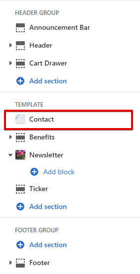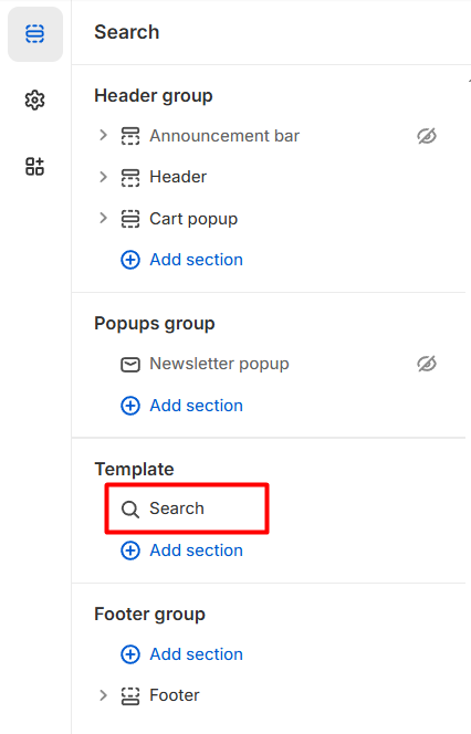
Adding a section
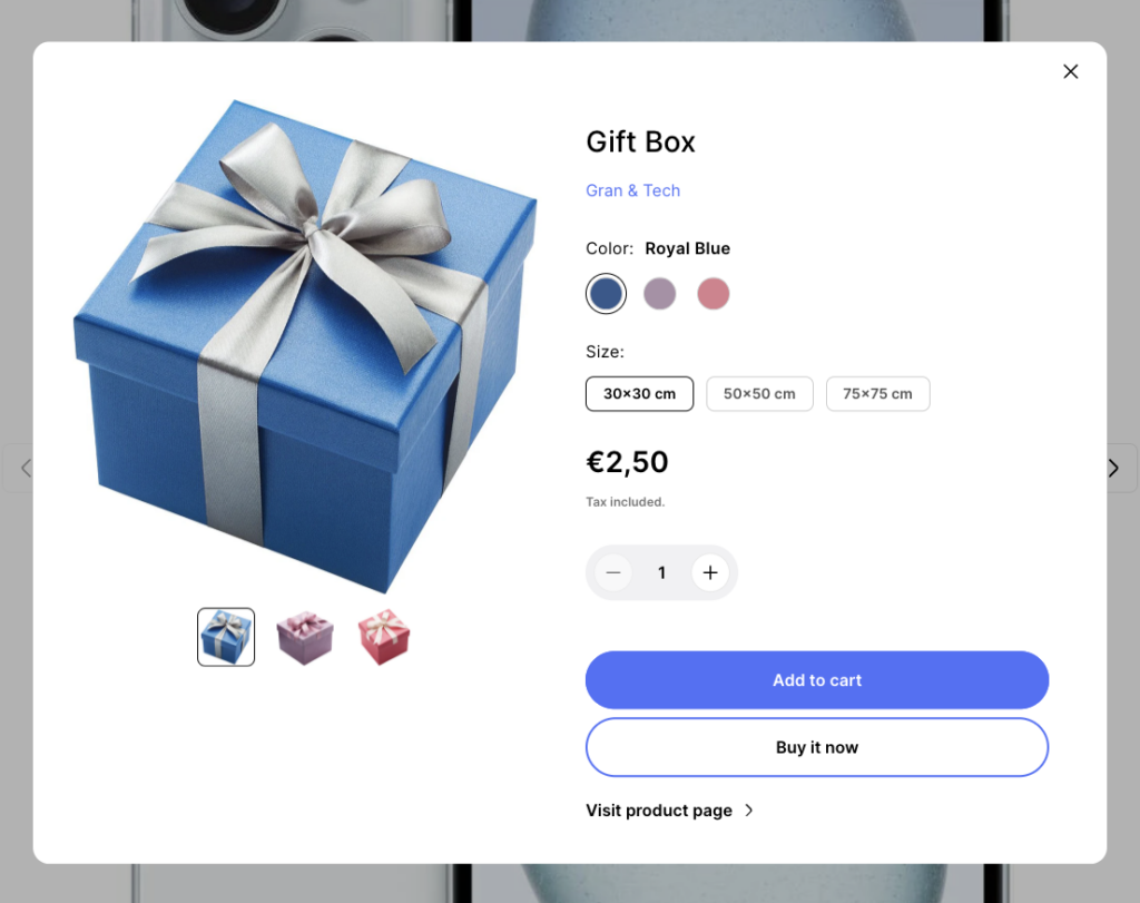
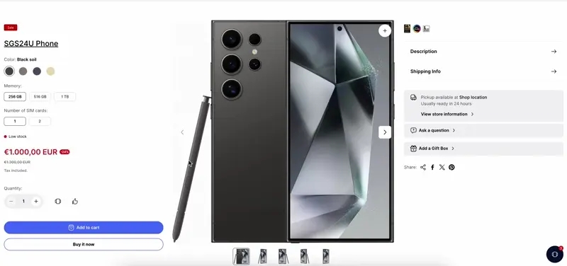
The section is static on a product page template, it was added initially and cannot be removed.
Section settings
Media
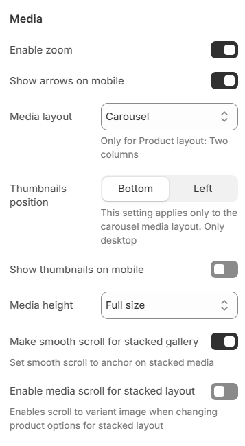
Enable zoom – the setting allows you to enable the Zoom function that appears when you click on the image;Show arrows on mobile – the setting is responsible for whether the slider arrows will be shown in the mobile version;Media layout – the setting allows you to choose the appearance of the product image gallery:Thumbnails position – setting allows you to select the location for the thumbnails, only works if the media layout is a carousel. Has two options: left and bottom;-
Show thumbnails on mobile – setting allows you to display image thumbnails on mobile view;
Media height – the setting allows you to select the size of the image. Has several options: Full size, Square, Fit to screen. Note: “Fit to screen” on the mobile will be the same as “Full size”.Make smooth scroll for stacked gallery – in the Stacked, Stacked 2 columns, Stacked 2 columns with big image gallery mode, it has Thumbnails on the left, clicking on which will scroll to the desired image. This parameter will determine whether the movement will be instantaneous or smooth.Enable media scroll for stacked layout – Enables scroll to variant image when changing product options for stacked layout.
General
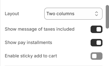
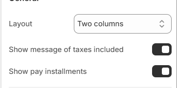
Layout – setting is responsible for the structure of the template:Show message of taxes included – if taxes are included in the price of the product in the store, then this parameter will control the visibility of the corresponding message;Show pay installments – if the store has the right to sell by installments and this feature is enabled in the store settings, then this parameter will control the visibility of the installment block;Enable sticky add to cart – if enabled, the sticky add to cart button will appear on the bottom of the page if the Add to cart block scrolls out of view of the top boundaries of the screen.
Size guide
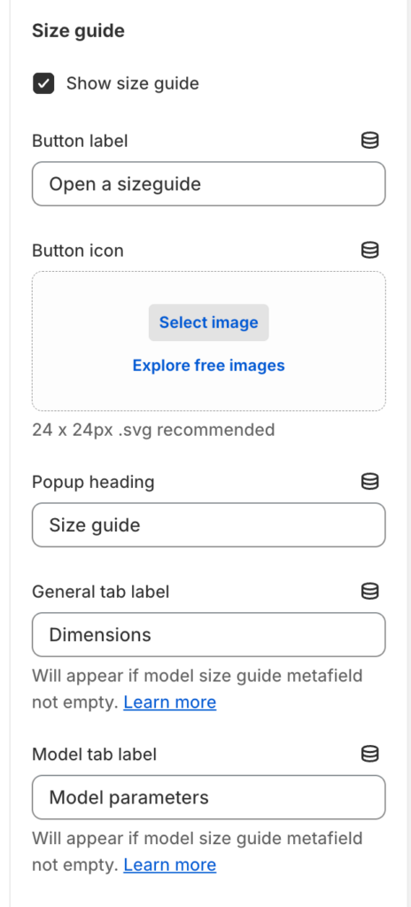
Show size guide – the setting is responsible for showing/hiding the popup and the button for opening the popup;Button label – popup button text;Button icon – the icon of the size guide button;Popup heading – the title of the size guide popup;General tab label – the text for size guide general tab;Model tab label – the text for the size guide model tab;
Colors
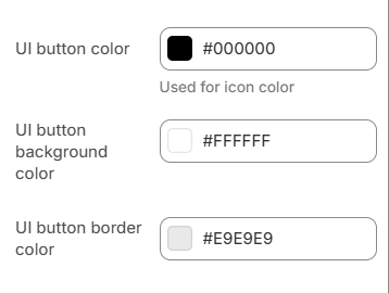
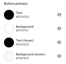
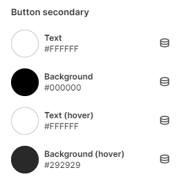
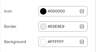
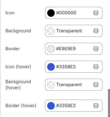
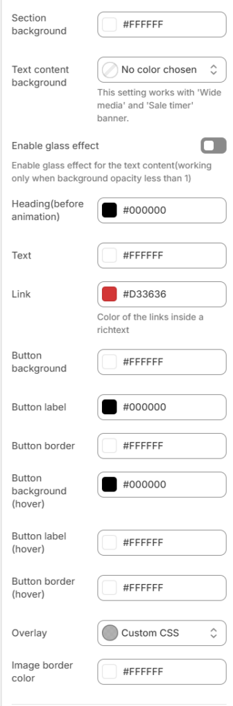
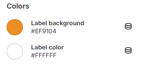
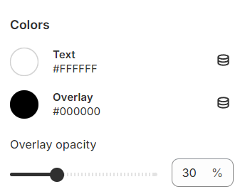
UI button color – the setting allows you to set the UI button’s color. Will also be used for shadow color;UI button background color – the setting allows you to set the UI button’s background color;UI buttom border color – the setting allows you to set the UI button’s border color.
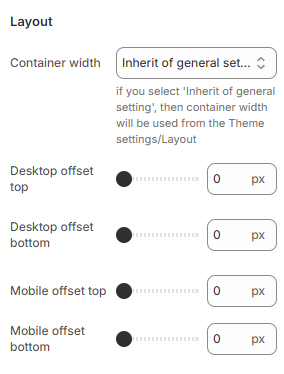
Layout
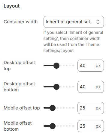
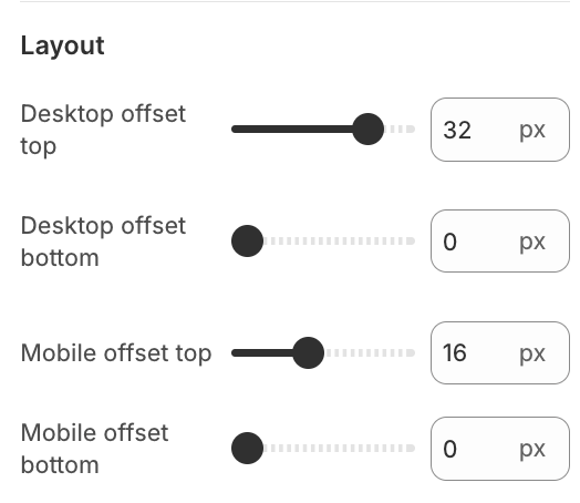
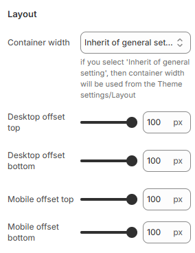
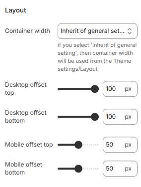
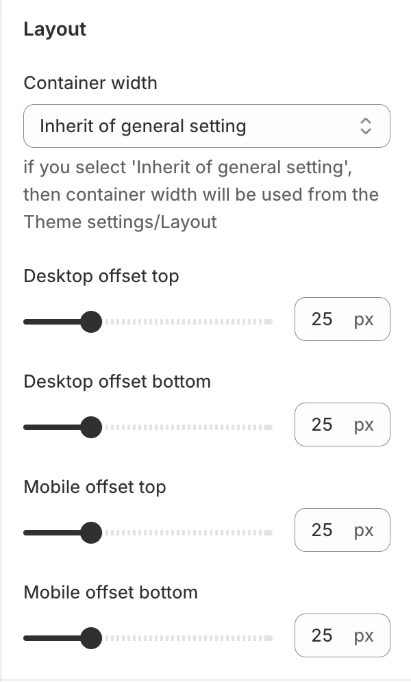
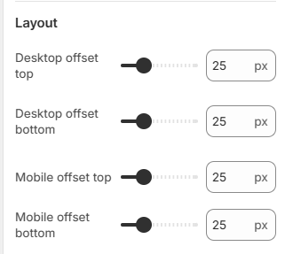
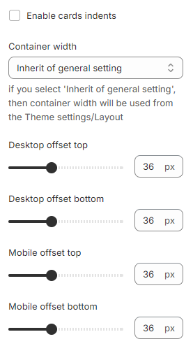
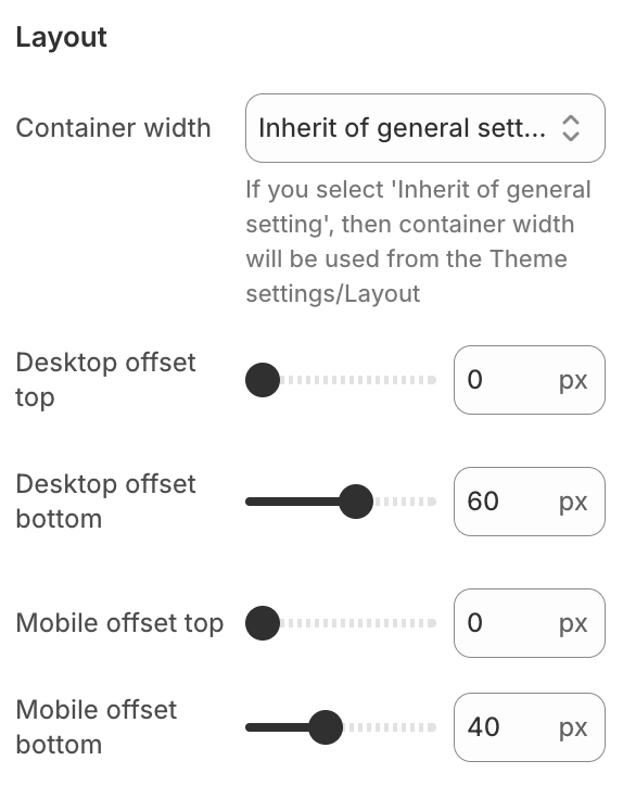
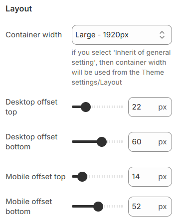
Container width – a container width of the section. If the “Inherit” value is selected then the container width is based on the group ‘Layout’ settings in the Theme settings;Desktop offset top – the top indent of the section on the desktop;Desktop offset bottom – the bottom indent of the section on the desktop;Mobile offset top – the top indent of the section on the mobile;Mobile offset bottom – the bottom indent of the section on the mobile.
Block settings
Block Badges
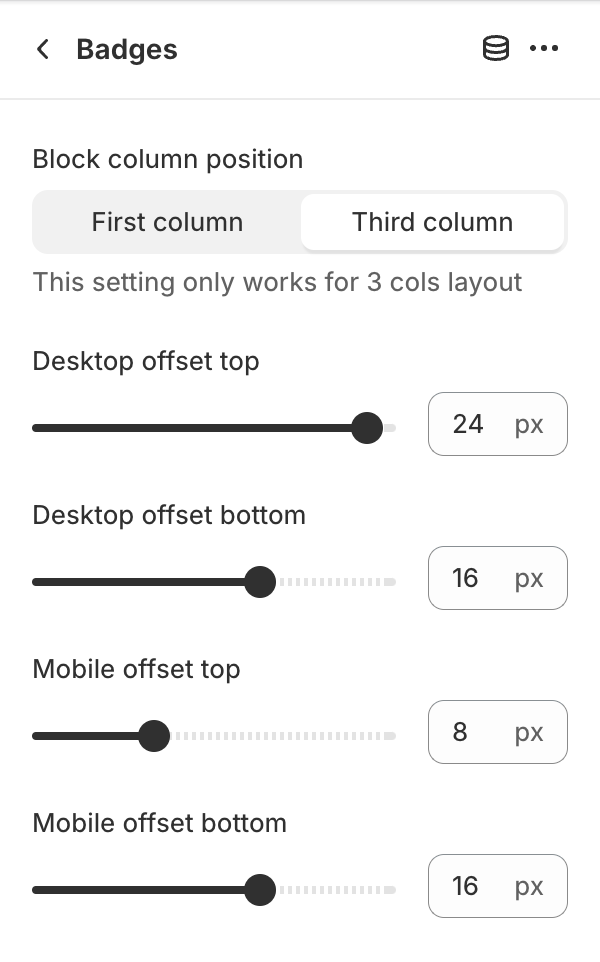
Block column position – specifies the column in which the block is located when the section setting Layout in value Three columns;Desktop offset top – the top indent of the section on the desktop;Desktop offset bottom – the bottom indent of the section on the desktop;Mobile offset top – the top indent of the section on the mobile;Mobile offset bottom – the bottom indent of the section on the mobile.
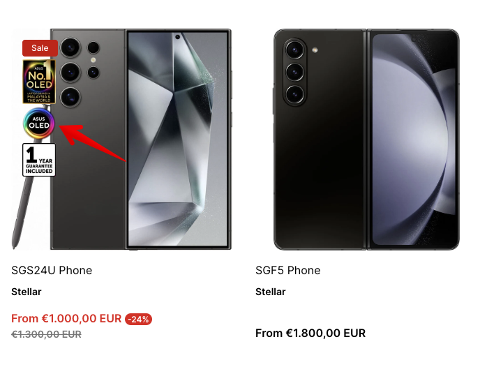
Block Badge images
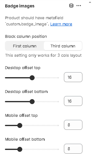
Block column position – specifies the column in which the block is located when the section setting Layout in value Three columns;Desktop offset top – the top indent of the section on the desktop;Desktop offset bottom – the bottom indent of the section on the desktop;Mobile offset top – the top indent of the section on the mobile;Mobile offset bottom – the bottom indent of the section on the mobile.
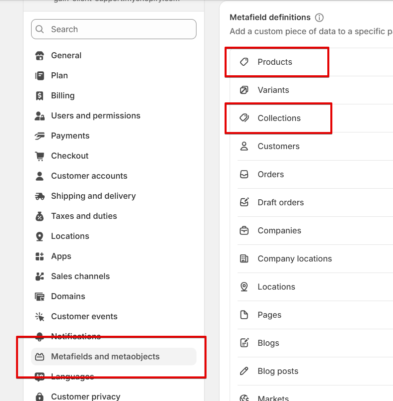
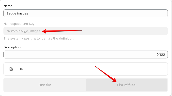
To show the badge images:
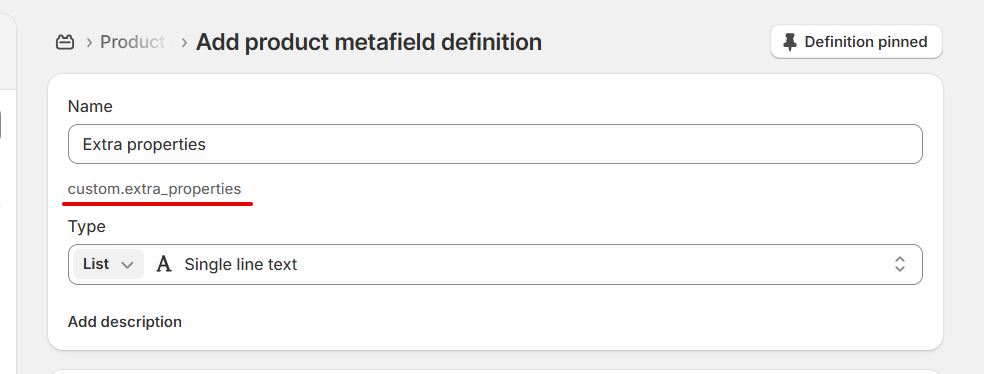
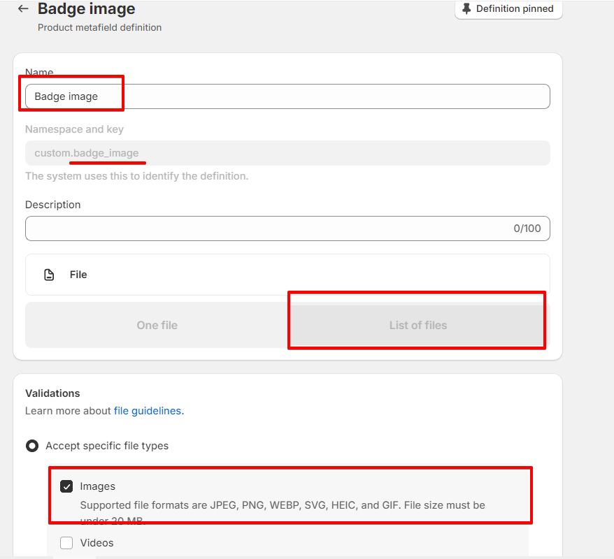
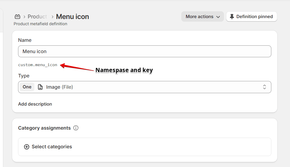
Create product metafield with Name: “Badge images”, Namespace and key: custom.badge_images. Content type must be File as List. After that, go to the corresponding product and add a list of images to the metafield.
Block Title
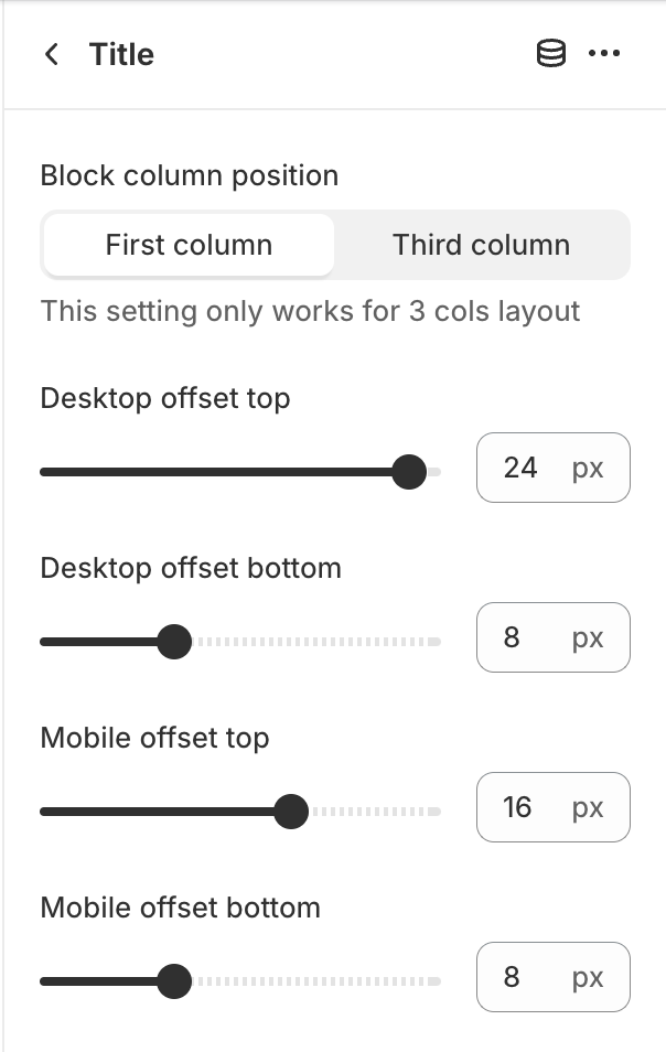
Block column position – specifies the column in which the block is located when the section setting Layout in value Three columns;Desktop offset top – the top indent of the section on the desktop;Desktop offset bottom – the bottom indent of the section on the desktop;Mobile offset top – the top indent of the section on the mobile;Mobile offset bottom – the bottom indent of the section on the mobile.
Block Vandor and SKU
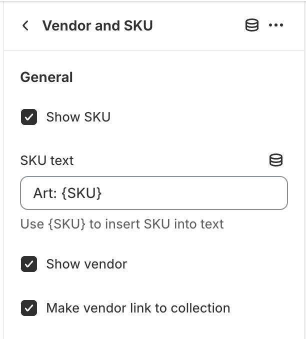
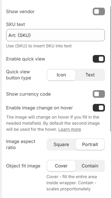
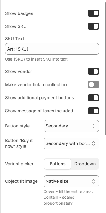
Show SKU – the setting that allows to show SKU of the product;SKU text – the text of the SKU field. You need to include the “{SKU}” in the text field, which will be replaced with the product’s SKU number;Show vendor – the setting that allows you to show the product’s vendor;Make vendor link to collection – the setting that allows to wrap a vendor into a link.
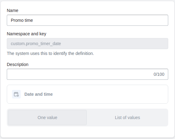
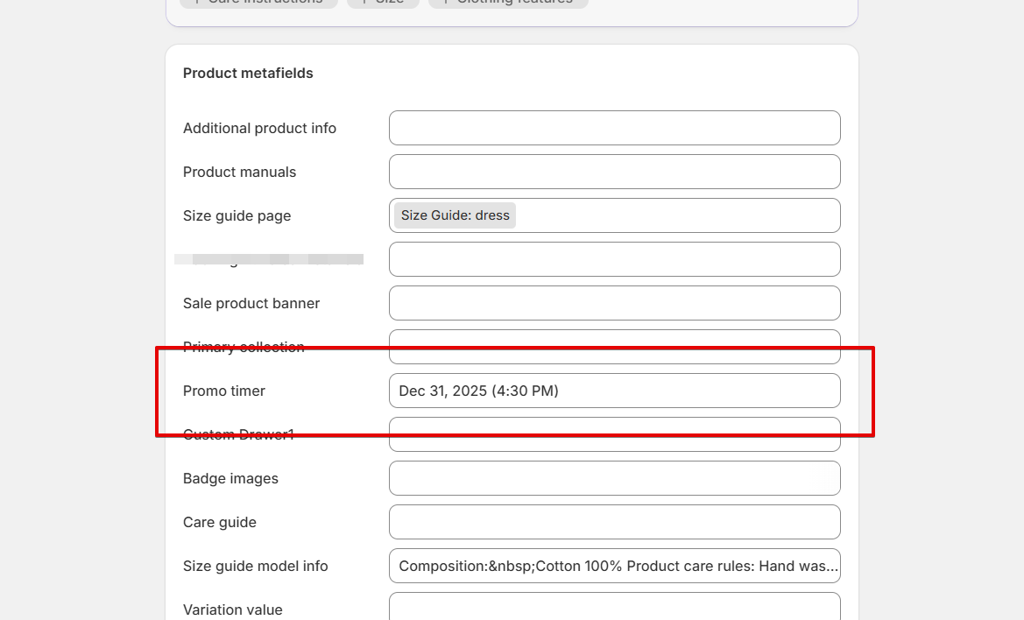
Block Sale timer
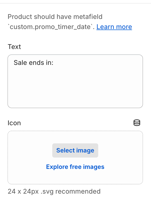
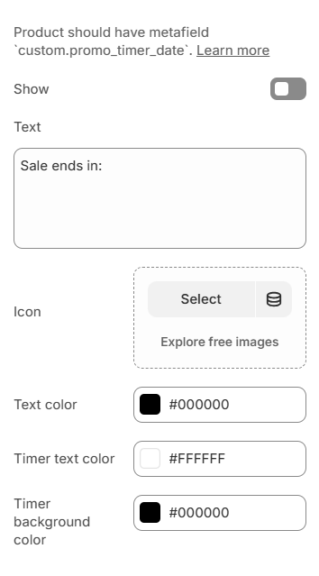
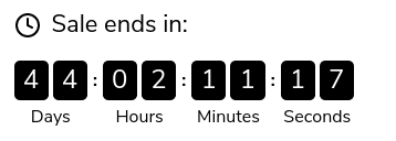
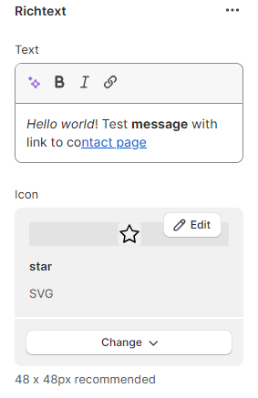
Text – the text before the countdown timer;Icon – the image before the countdown timer. (Recommended size 48×48 px).
Colors
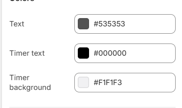
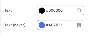
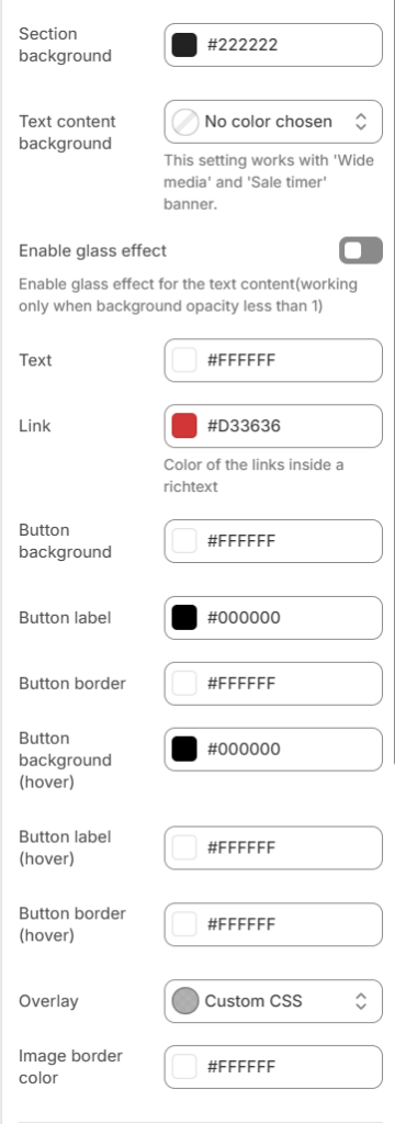
Text – the text before the countdown timer color;Timer text – the timer cells’ text color;Timer background – the timer cells’ background color.
Block Options
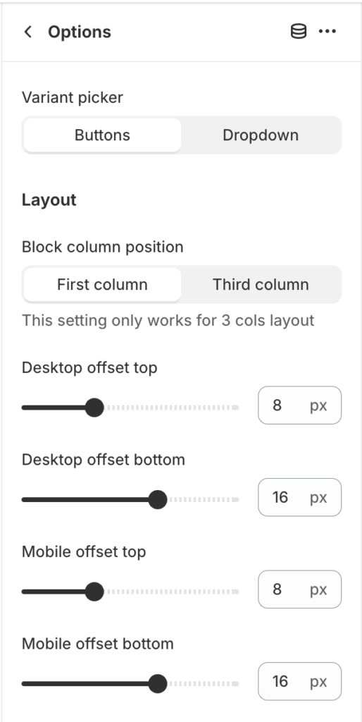
Block column position – specifies the column in which the block is located when the section setting Layout in value Three columns;Desktop offset top – the top indent of the section on the desktop;Desktop offset bottom – the bottom indent of the section on the desktop;Mobile offset top – the top indent of the section on the mobile;Mobile offset bottom – the bottom indent of the section on the mobile.
Block Quantity
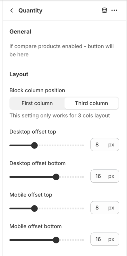
Block column position – specifies the column in which the block is located when the section setting Layout in value Three columns;Desktop offset top – the top indent of the section on the desktop;Desktop offset bottom – the bottom indent of the section on the desktop;Mobile offset top – the top indent of the section on the mobile;Mobile offset bottom – the bottom indent of the section on the mobile.
Block Price
It displays the price of the product or the selected option. Also outputs the unit cost if the product has a unit cost instead of a quantity cost.
-
In this block, a message will be displayed stating that taxes are included in the price;
-
In this block, the installment purchase form will be displayed.
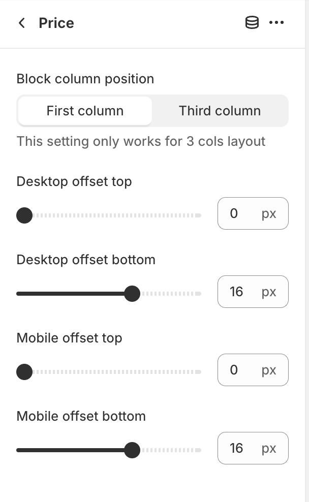
Block column position – specifies the column in which the block is located when the section setting Layout in value Three columns;Desktop offset top – the top indent of the section on the desktop;Desktop offset bottom – the bottom indent of the section on the desktop;Mobile offset top – the top indent of the section on the mobile;Mobile offset bottom – the bottom indent of the section on the mobile.
Block Add to cart
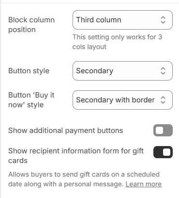
Block column position – specifies the column in which the block is located when the section setting Layout in value Three columns;Button style – add to cart button style;Button 'Buy it now' style – ‘Buy it now’ button style;Show additional payment buttons – enables the display of the “Buy it now” button;Show recipient information form for gift cards – allows customers to send gift cards on a scheduled date along with a personal message (works only on a gift product).
Block Pickup availability
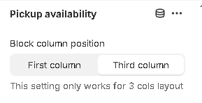
The block has no settings, it reflects the addresses where the product is available for pickup.
Block Drawers
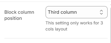
Block column position – specifies the column in which the block is located when the section setting Layout in value Three columns.
Product description
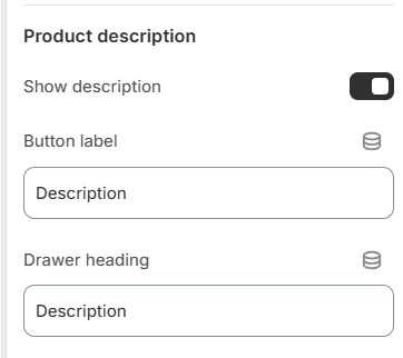
Show description – the setting allows you to show the product description button;Button label – the setting allows you to set the button label for the drawer toggler;Drawer heading – the setting allows you to set the heading for the drawer.
Custom drawers 1 – 2
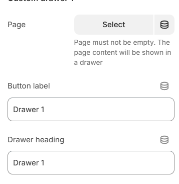
Page – the setting allows you to select a page to show its content in the drawer;Button label – the setting allows you to set the button label for the drawer toggler.Drawer heading – the setting allows you to set the drawer heading.
Custom drawers 3 – 4
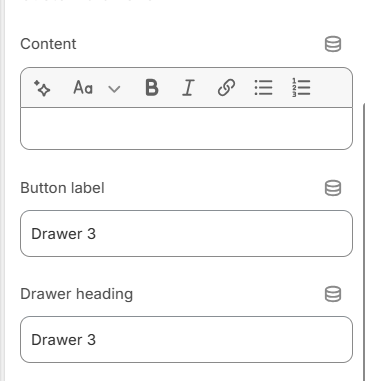
Content – the setting allows you to set a text content that will display in the drawer;Button label – the setting allows you to set the button label for the drawer toggler.Drawer heading – the setting allows you to set the drawer heading.
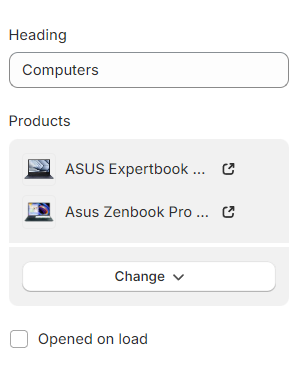
Block Complementary products
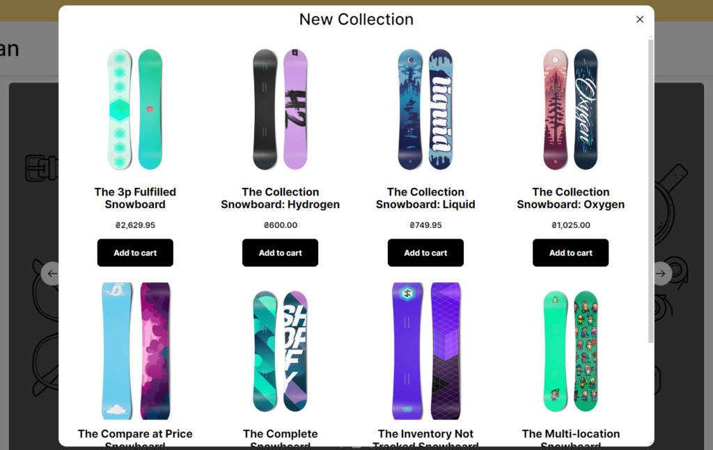
With this block, you can show complementary products of the current product. To configure upsell products you can use the “Search & Discovery” APP.
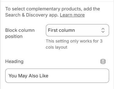
Block column position – specifies the column in which the block is located when the section setting Layout in value Three columns;Heading – setting allows you to set heading for the block.
Block Highlight Point
With this block, you can add simple text content with an icon.
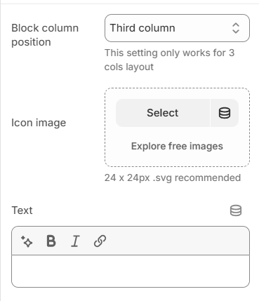
Block column position – specifies the column in which the block is located when section setting Layout in value Three column;Icon image – the setting allows you to set an icon for the message;Text – the text of the block.
Block Inventory status
With this block, you can show a message about product variant’s inventory status.
You can help customers detect which product variant has a low/high stock inventory.
If a variant is not available – the block will be hidden.
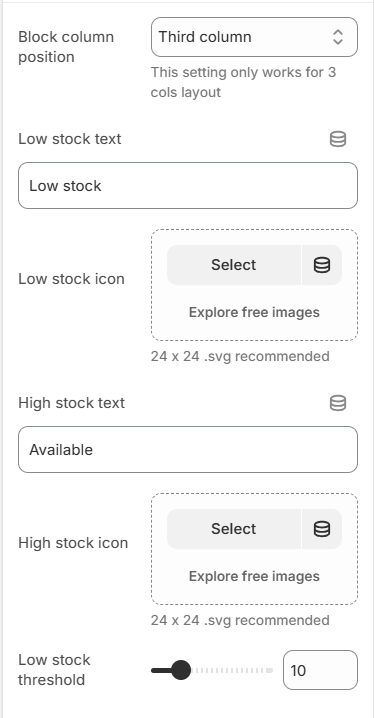
Block column position – specifies the column in which the block is located when section setting Layout in value Three column;Low stock text – the text that appears when variant inventory quantity is less or equals ”Low stock threshold” value;Low stock icon – the icon of the “Low stock text”;High stock text – the text that appears when variant inventory quantity is more than the “Low stock threshold” value;High stock icon – the icon of the “High stock text”;Low stock threshold – the setting that allows you to select the minimum number of variant inventory quantities to show a “Low stock text” message. If the variant inventory quantity is more than the value of the setting, then “High stock text” will appear.
Block Gift product
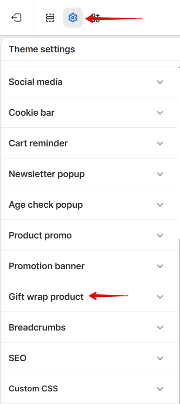
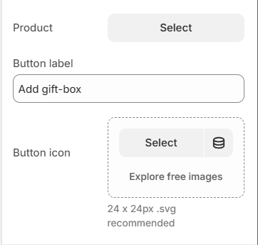
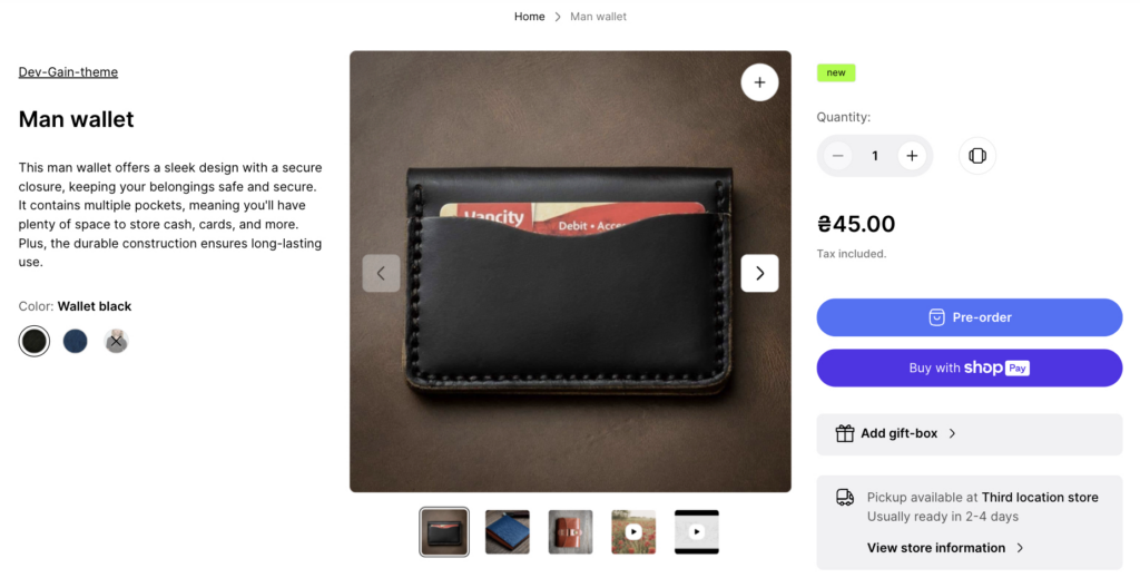
Add a block to show the “Add gift box” button in the product section. This block doesn’t have any settings. You can learn more about the “Gift wrap button” in the “Gift wrap product” section.
Block Stock Alert
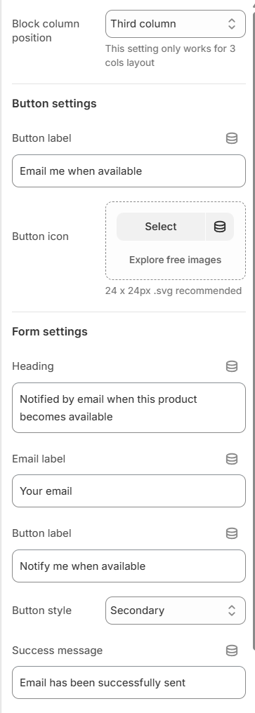
Button label – the text for the button. Required field;Button icon – the icon for the button.Heading – the popup title text field. Required field;Email label – the label for the input. Required field;Button label – the label for the submit button. Required field;Button style – style of the submit button;Success message – the message that the form was sent successfully. Required field.
Block Question Form
With this block, you can add a button to the product form that triggers a popup with the Shopify contact form (but with some additional fields).
That allows customers to send emails to you with questions about the current product. The field with the product URL is filled automatically based on the product and his selected variant.
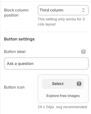
Block column position – specifies the column in which the block is located when the section setting Layout in value Three columns.Button label – the text for the button. Required field;Button icon – the icon for the button.
Form settings
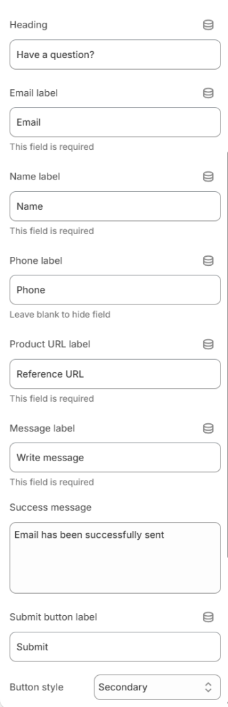
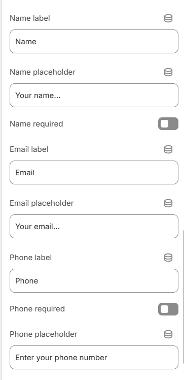
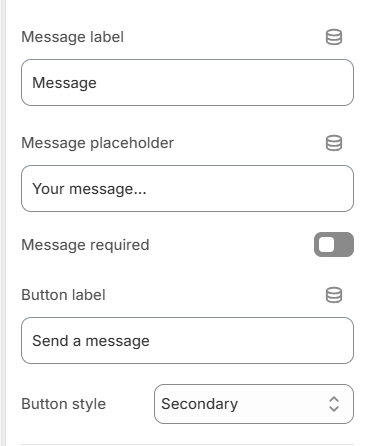
Heading – the heading for popup form;Email label – the label for the email field. Required field;Name label – the label for the name field. Required field;Phone label – the label for the phone field. Leave blank to hide;Product URL label – the label for the product URL field. Required field;Message label – the label for the message field;Success message – the text of the success message after the form is submitted;Submit button label – the text for the submit button.Button style – style of the submit button.
Block Custom Text Box
With this block, you can display a text field (input type='text‘), which will represent the line_item property of the product. When a product is added to a cart with a filled field, the value of this field will be added to the cart, checkout, and order.
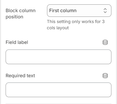
Block column position – specifies the column in which the block is located when the section setting Layout in value Three columns;Field label – the setting is responsible for the label text for the input;Required text – the setting is responsible for the label text for the checkbox.
Custom Text Box logic:
If the Required text is not filled in, only the text input will be displayed. In this case, if the field is filled – the user information will be added to the order.
If Required text is filled in, a checkbox will be displayed under the Custom Text Box with a message from that field. If the checkbox is not clicked OR the Custom Text Box is empty, the product cannot be added to the cart, and the corresponding error is displayed.
Block Share
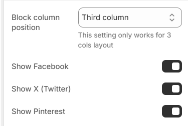
Block column position – specifies the column in which the block is located when the section setting Layout in value Three columns;Show Facebook – show a Facebook social share link;Show X (Twitter) – show a X(Twitter) social share link;Show Pinterest – show a Pinterest social share link.
Block Benefits
With this block, you can add three blocks with some short information about your services, guarantees, or something like that.
You can add max 2 blocks of this type and 3 “Benefit” items per block. They have the same settings:
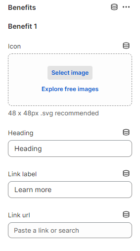
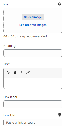
Block column position – specifies the column in which the block is located when section setting Layout in value Three column.Icon – the icon of the benefit item;Heading – the title of the benefit item;Link label – the link text of the benefit item;Link url – the link URL of the benefit item.
Block Custom liquid
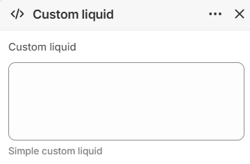
Block column position – specifies the column in which the block is located when section setting Layout in value Three column;Custom liquid – setting allows you to add your liquid code. You can learn more about liquid here – https://shopify.dev/api/liquid.
Layout
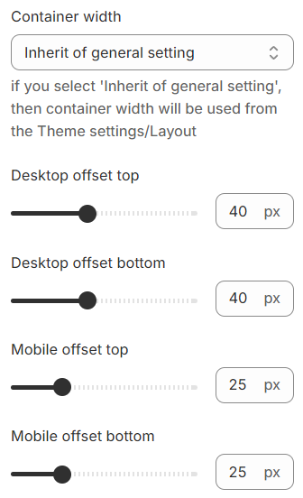
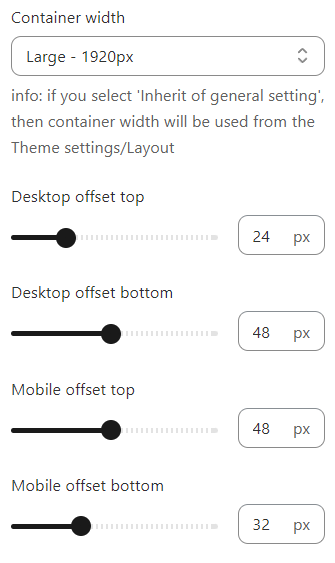
Container width – a container width of the section. If “Inherit” value is selected then container width based on the group ‘Layout’ settings in the Theme settings;Desktop offset top – the top indent of the section on the desktop;Desktop offset bottom – the bottom indent of the section on the desktop;Mobile offset top – the top indent of the section on the mobile;Mobile offset bottom – the bottom indent of the section on the mobile.